A slight misunderstanding about a weird pattern I posted to Twitter earlier made me wonder how easy it might be to present elevation data with real depth ™ as anaglyph 3D in QGIS. Anaglyph 3D, you know, those red and cyan glasses that rarely ever worked.
You might remember my post on fake chromatic aberration and dynamic label shadows in QGIS some months ago. Maybe with some small adjustments of the technique…?
Wikipedia has an detailed article on the topic if you are interested. It boils down to: One eye gets to see not the red but the cyan stuff. The other sees the red but not the cyan. By copying, coloring and shifting elements left-right increasingly the human vision gets tricked into seeing fake depth.
Got your anaglyph glasses? Oogled some images you found online to get in the mood? Excellent, let’s go!
Get some DEM data. I used a 10 meter DEM of Hamburg and a 200 meter DEM of Germany for testing. Make sure both your data and your project/canvas CRS match or you have a hard time with the math.
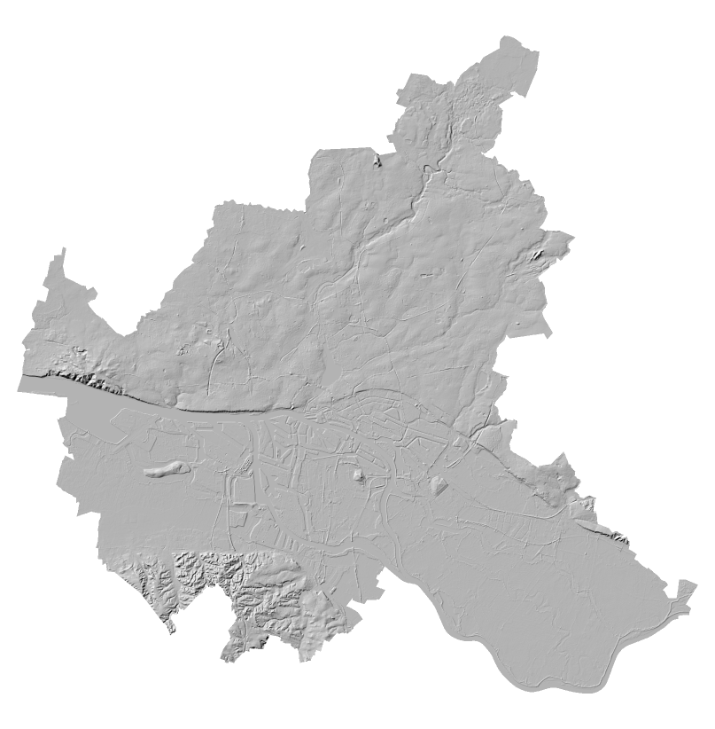
Extract contours at a reasonable interval. What’s reasonable depends on your data. I used an interval of 5 meters for the 10 meter DEM as Hamburg is rather flat (which you will NOT see here).
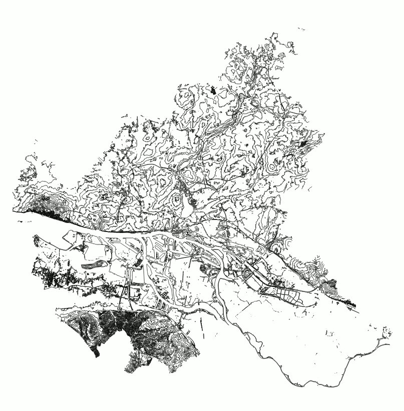
You may want to simplify or smooth this.
Now it’s time to zoom in, because the effect only works if the line density is appropriately light.
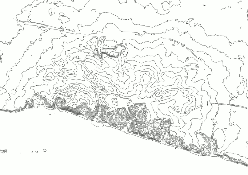
Now we need to duplicate those, color them and move them left and right.
Change the symbol layer of your contours to a Geometry Generator.
Let’s use that first layer for the left, red part. So change the color to red. Use a red that vanishes when you look through your left (red) eye but is clearly visible through the right (cyan) eye. The exact color depends on your glasses.
Set the Geometry Generator to LineString. I will now explain an intermediate step so if you just want the result, scroll a bit.
translate(
  $geometry,
  -  -- there is a minus here!
  (
    x_max(@map_extent) - x(centroid($geometry))
  )
  /100  -- magic scale value…
  ,
  0  -- no translation in y
)
This moves each contour line to the left for a value that increases with the geometry’s distance to the right side. Since we don’t want to move the geometries too far, a magic scale factor needs to be added and adjusted according to your coordinate values.
(Yes, that is a bug right here (centroid is a bad metric and some of the contours are huge geometries) but hey it works well enough. Segmentizing could fix this. Or just extract the vertices, that looks cool too TODO imagelink)
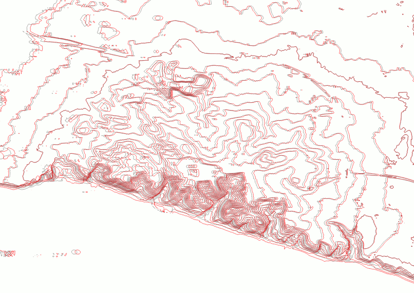
For the right, cyan side we need to add another Geometry Generator symbol layer, color it in cyan (so that you can only see it through your left eye) and do the geometry expression the other way around:
translate(
  $geometry,
  (
    x(centroid($geometry))-x_min(@map_extent)
  )
  /100  -- magic scale value…
  ,
  0  -- no translation in y
)
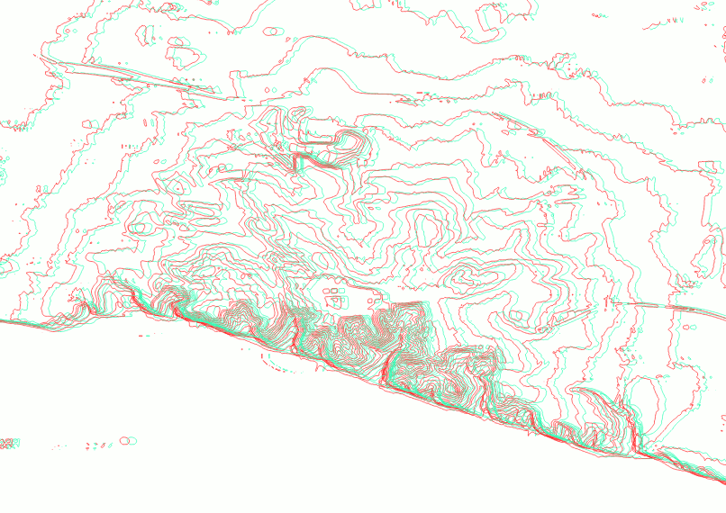
Cool! But this is lacking a certain depth, don’t you think? We need to scale the amount of horizontal shift by the elevation value of the contour lines. And then we also need to adjust the magic scale value again because reasons.
For the red symbol layer:
translate(
  $geometry,
  -- move to the LEFT
  -- scaled by the distance to the RIGHT side of the map
  -- scaled by the elevation

  -- minus so it goes to the left
  -
  "ELEV" -- the attribute field with the elevation values
  *
  (x_max(@map_extent)-x(centroid($geometry)))

  -- MAGIC scale value according to CRS and whatever
  /10000
  ,
  -- no change for y
  0
)
For the cyan symbol layer:
translate(
  $geometry,
  -- move to the RIGHT
  -- scaled by the distance to the LEFT side of the map
  -- scaled by the elevation

  "ELEV" -- the attribute field with the elevation values
  *
  (x(centroid($geometry))-x_min(@map_extent))

  -- MAGIC scale value according to CRS and whatever
  /10000
  ,
  -- no change for y
  0
)
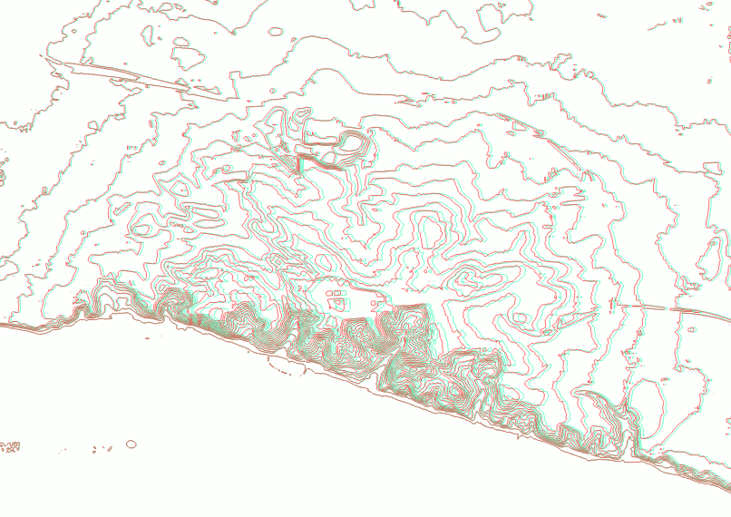
That’s it!
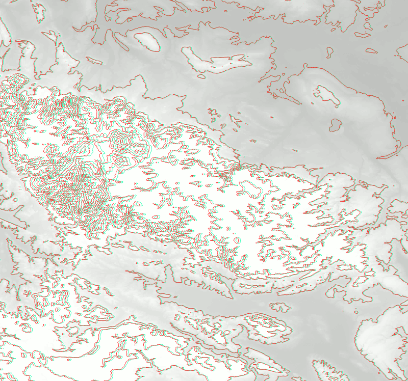
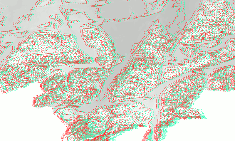
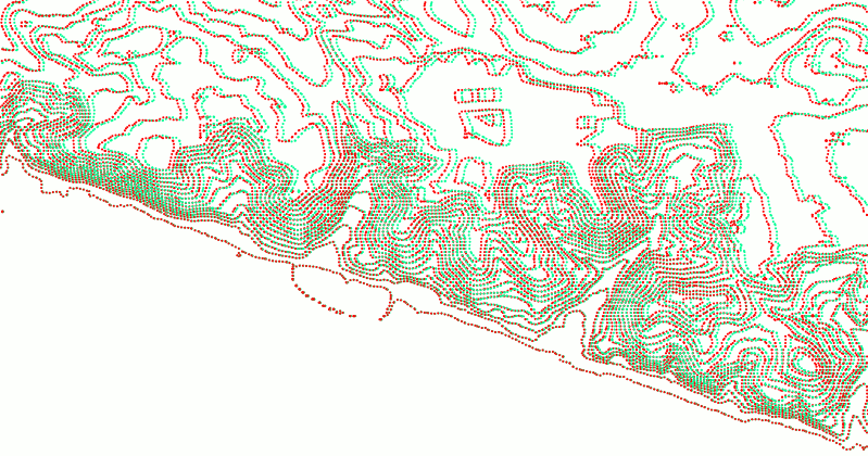

Now, who is going to do Autostereograms? Also check out http://elasticterrain.xyz.