This was the final expression (with lots of opportunity to improve):
with_variable(
  'point_at_top_of_canvas',
  densify_by_count(
    make_line(
      point_n( @map_extent, 3),  -- no idea if these indexes are stable
      point_n( @map_extent, 4)
    ),
    42  -- number of trajectories
  ),
  collect_geometries(
    array_foreach(
      generate_series(1, num_points(@point_at_top_of_canvas)),
      with_variable(
        'point_n_of_top_line',
        point_n(@point_at_top_of_canvas, @element),
        point_n(
          wave_randomized(
            make_line(
              @point_n_of_top_line,
              -- make it at least touch the bottom of the canvas:
              translate(@point_n_of_top_line, 0, -@map_extent_height)
            ),
            -- fairly stupid frequency and wavelength but hey, works in any crs
            1, @map_extent_width/5,
            1, @map_extent_width/100,
            seed:=@element  -- stable waves \o/
          ),
          floor(epoch(now())%10000/50)  -- TODO make it loop around according to num_points of each line
        )
      )
    )
  )
)
Use it on an empty polygon layer with an inverted polygon style and set it to refresh at a high interval (0.01s?). Or use this QGIS project (I included some intermediate steps of the style as layer styles if you want to learn about this kind of stuff):
Not sure why I never posted this last year but I did the #30DayMapChallenge in a single day, streamed live via a self-hosted Owncast instance. It was … insane and fun. This year I will do it again, on the 26th of November.
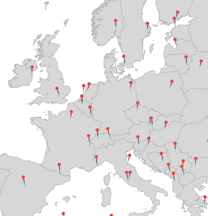
Here are most of the maps I made last year:
Some notes I kept, please bug me about recovering the others from my Twitter archive (I deleted old tweets a bit too early):
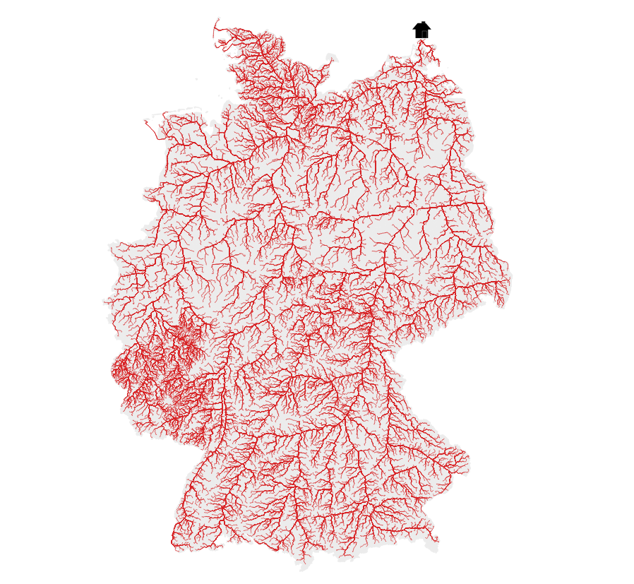
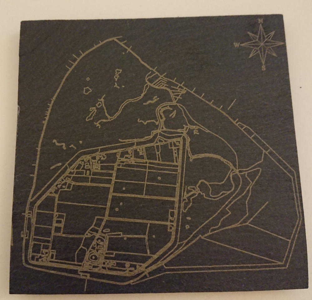
18 Water (DGM-W 2010 Unter- und Außenelbe, Wasserstraßen- und Schifffahrtsverwaltung des Bundes, http://kuestendaten.de, 2010)
20 Movement: Emojitions on a curvy trajectory. State changes depending on the curvyness ahead. Background: (C) OpenStreetMap Contributors <3
21 Elevation with qgis2threejs (It’s art, I swear!
22 Boundaries: Inspired by Command and Conquer Red Alert. Background by Spiney (CC-BY 3.0 / CC-BY-SA 3.0, https://opengameart.org/node/12098)
24 Historical: Buildings in Hamburg that were built before the war (at least to some not so great dataset). Data Lizenz: Datenlizenz Deutschland Namensnennung 2.0 (Freie und Hansestadt Hamburg, Landesbetrieb Geoinformation und Vermessung (LGV))
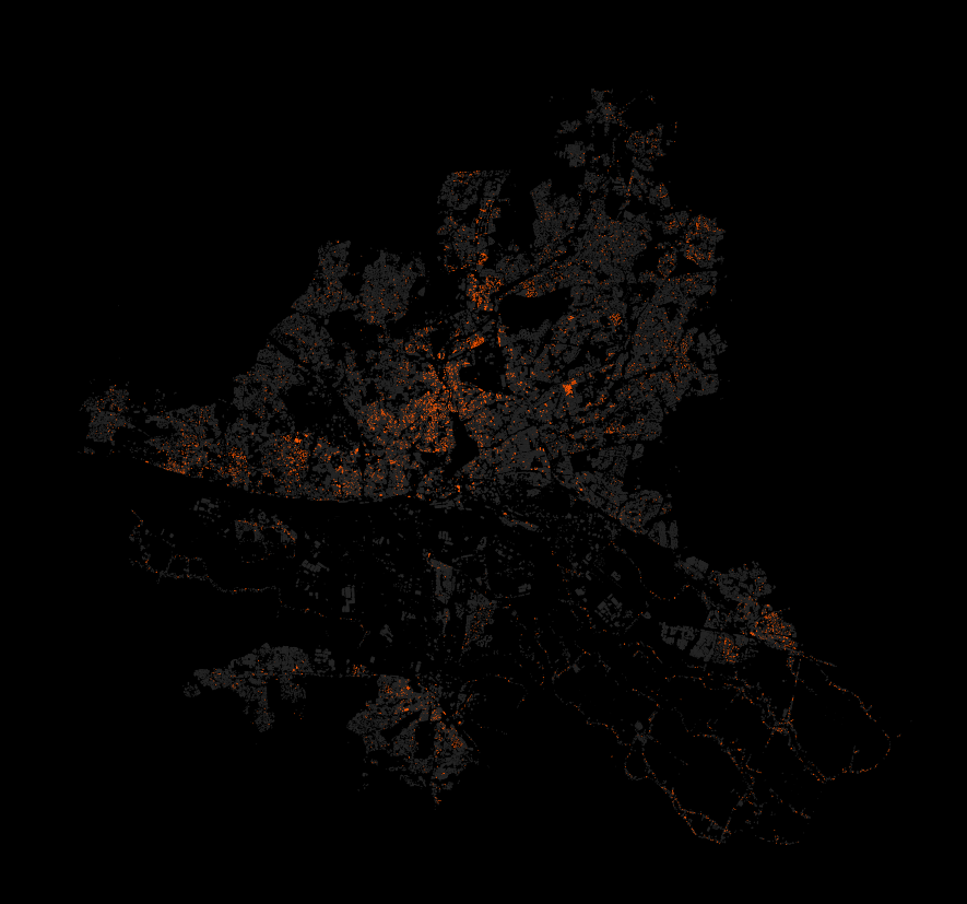
27 Heatmap: Outdoor advertisements (or something like that) in Hamburg. Fuck everything about that! Data Lizenz: Datenlizenz Deutschland Namensnennung 2.0 (Freie und Hansestadt Hamburg, Behörde für Verkehr und Mobilitätswende, (BVM))
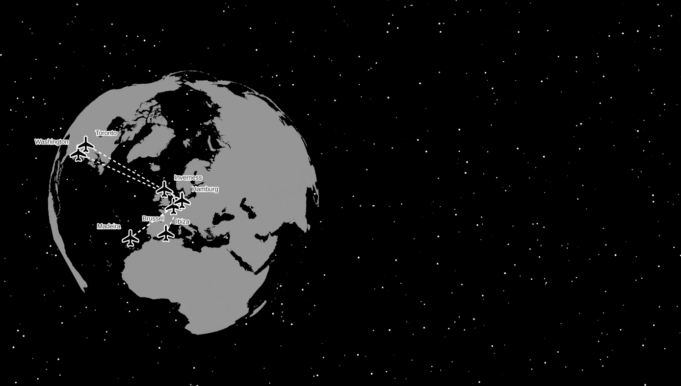
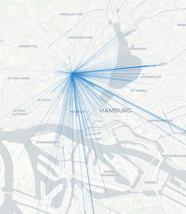
28 Earth not flat. Using my colleague’s Beeline plugin to create lines between the airports I have flown too and the Globe Builder plugin by @gispofinland to make a globe.
Raster Image Marker with https://opengameart.org/content/character-spritesheet-duck, vertical anchor at bottom, sprite choice between walking and running (doesn’t actually work) plus the frame via
LERC is a kick-ass approach to 2D raster data compression, supported in GDAL since version 3.3. You can use it for lossless compression but it is also able to throw away some bits of information for smaller data sizes. You tell it which level of Z error is acceptable for your values and it will use that freedom to change the values of neighboring cells to do its magic. Z means the “data” axis here, of a single-band in a 2D raster, X and Y are the coordinates, or rather the locations of the data values in the raster, which are obviously not changed.
I used a global SRTM DEM with a Z value in full meters (no floating point values but integers) and applied LERC on it in three ways: Lossless, with a maximum Z error of 1 meter and a maximum Z error of 10 meters. Zstandard compression was always used.
The original GeoTIFF file was already very well compressed with Zstandard level 15 and a horizontal predictor; at ~1296000 x ~417600 pixels it has a size of 86 gigabytes including overviews.
Original (ZSTD level 15): 86 GB
LERC_ZSTD (lossless): 105G
LERC_ZSTD (maximum Z error of 1): 81G
LERC_ZSTD (maximum Z error of 10): 21G
Cool, so if we don’t care about an error of 10 meters, we can have a global DEM (well, as global as SRTM is with its 60° cut-off) at ~30 meters pixel resolution in 21 gigabytes. But what does that actually look like then and how will this error appear? Well, check it out:
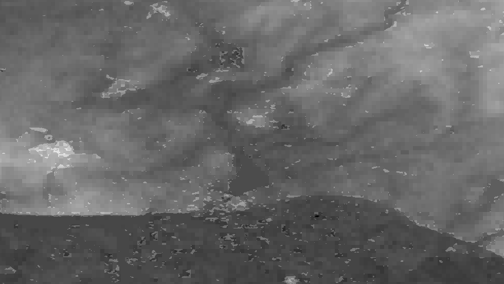
Here are some samples visualised with a greyscale color ramp (locally adjusted, so the lowest value in the image is black, the highest value is white). They are shown at a 1:1 resolution, one pixel in the image (if you look at it at 100%) is one cell of the DEM data. The left image is lossless, the middle one was allowed an Z error of 1 meter, the right one 10 meters.
Mountainous, here the values range from 0 meters to about 2000 meters:
You can hardly see a difference, at least visually.
“Mediumish”, values between ~100 and ~500 meters:
At the 10 meter error level you can see a significant terracing effect.
Plains, values all around 100 meters:
You can see some structures collapsing into flat areas in the 1 meter version and oh wow that 10 meters version looks like upscaled pixels.
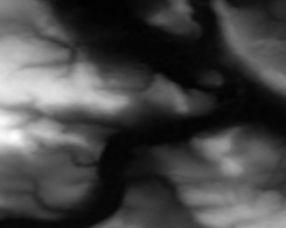
Time to zoom in! I picked a less flat area again because it makes it easier to understand. Here the values are between ~100 and ~300 meters:
So what do we see here? Neighboring cells with the same values compress better so LERC is shifting the values around (within the allowed error), creating terraces of same-valued cells. If you look closely you can see that there is also a visible pattern of squarish structures. Those are the blocks or windows in which LERC looks at the data and does its adjustments, in this case they were 8×8 pixels wide. Note: What LERC does exactly is a bit more complex than “try to make neighboring values the same”, it actually looks at the bits required to store the values within a block and optimized that within the error tolerance.
And now you know what LERC can do, if you give it a error level to play with.
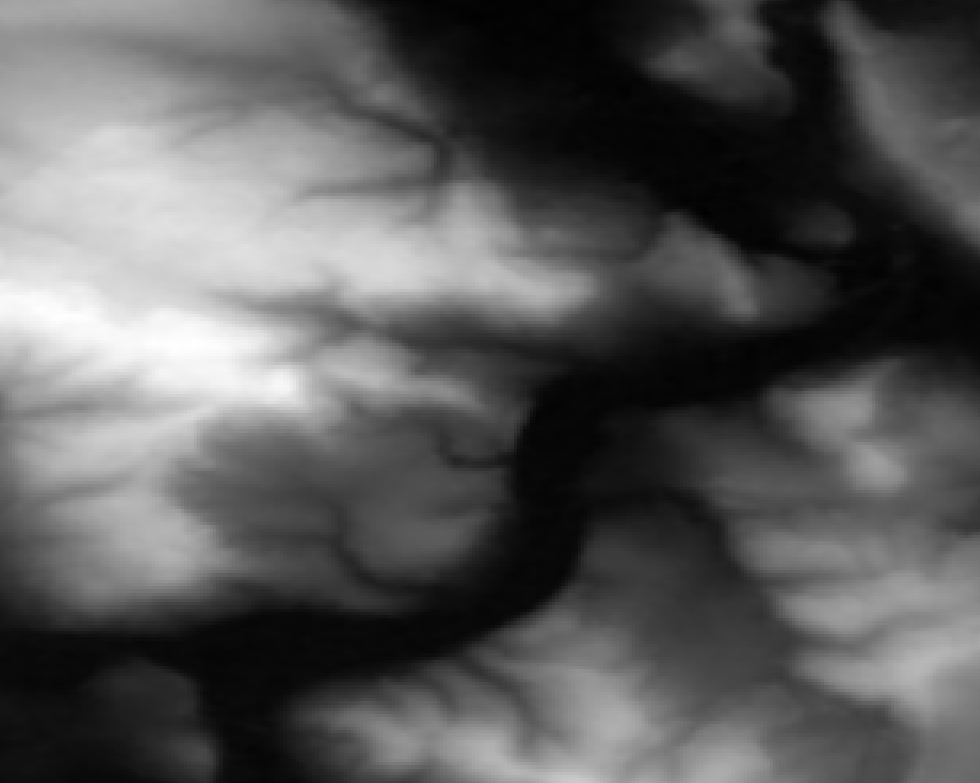
For reference, here is that same-ish area with the error tolerance at 1 meter:
You have to zoom in quite a bit more to be able to see the effects here due to the nature of the data in this extent in combination with the particular error tolerance:
The larger the zonal differences of your Z values are to each other and in relation to the error tolerance, the less distinguished will this effect be. If there are steps of 100 meters between neighboring pixels, an extra error of 10 meters won’t do much of a difference. But in more flat areas it will have significant “terracing” effects as you could see above. This is similar to “banding” effects in images where there is little variation in color, e. g. a blue sky or an artificial color gradient, and you look at it in a setup that has a color bit depth on a resolution your human eyes can distinguish.
So if you want to use LERC with a lossy approach, think hard about what is going to happen with your data later. What kind of analysis will be performed, how will it be “looked” at, what will be calculated. Do it smart and you can have a predictable/controllable lossy compression with seriously small file sizes, do it without thinking and your data will lead to misinterpretation and apocalypse.
Recorded by placing two windows side by side and zoom into separate, non-cached regions using: "xte "mousemove 640 440" "mouseclick 4" && xte "mousemove 1080 440" "mouseclick 4" in a loop.
Ungefiltert und voller Mist, aber man kann z. B. toll sehen, wie einladend die Brückem vorm Kuhmühlenteich für Fotos sind.
Kostenlose Internetpunkteabsahnidee: Dasselbe mit dem Eiffelturm, dem Londoner Dildo u. ä. machen, Konkave Hülle außen drum, schick aufbereiten, als “Nur wo man $Wahrzeichen sieht, ist $Stadt” vermarkten, €€€€.
Did this for an ex-colleague some months ago and forgot to share the how-to publically. We needed a visual representation of the current time in a layout that showed both a raster map (different layer per timeslice) and a timeseries plot of an aspect of the data (this was created outside QGIS).
Have lots of raster layers you want to iterate through. I have:
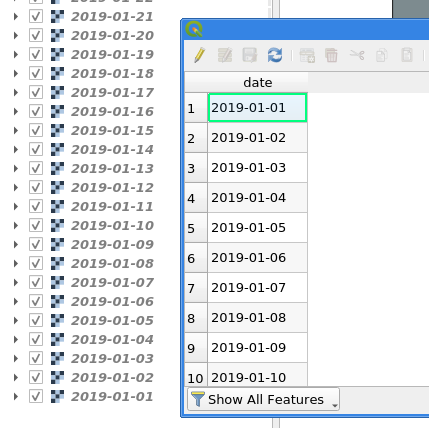
Create a new layer for your map extent. Draw your extent as geometry. Duplicate that geometry as many times as you have days. Alternatively you could of course have different geometries per day. Whatever you do, you need a layer with one feature per timeslice for the Atlas to iterate though. I have 30 days to visualise so I duplicated my extent 30 times.
Open the Field Calculator. Add a new field called date as string type (not as date type until some bug is fixed (sorry, did not make a note here, maybe sorting is/was broken?)) with an expression that represents time and orders chronologically if sorted by QGIS. For example: '2019-01-' || lpad(@row_number,2,0) (assuming your records are in the correct order if you have different geometries…)
Have your raster layers named the same way as the date attribute values.
Make a new layout.
For your Layout map check “Lock layers” and use date as expression for the “Lock layers” override. This will now select the appropriate raster layer, based on the attribute value <-> layer name, to display for each Atlas page.
Cool, if you preview the Atlas now you got a nice animation through your raster layers. Let’s do part 2:
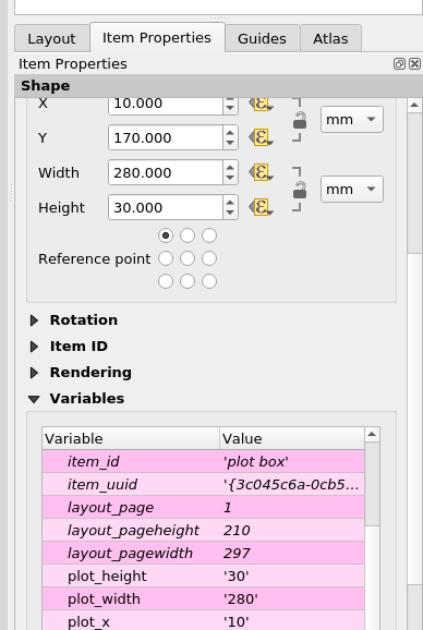
In your layout add your timeseries graph. Give it a unique ID, e. g. “plot box”. Set its width and height via new variables (until you can get those via an expression this is needed for calculations below).
Create a box to visualise the timeslice. Set its width to map_get(item_variables('plot box'), 'plot_width') / @atlas_totalfeatures. For the height and y use/adjust this expression: map_get(item_variables('plot box'), 'plot_height'). For x comes the magic:
with_variable(
     'days_total',
     day(to_date(maximum("date"))-to_date(minimum("date")))+1,
       -- number of days in timespan
       -- +1 because we need the number of days in total
       -- not the inbetween, day() to just get the number of days
     with_variable(
         'mm_per_day',
         map_get(item_variables('plot box'), 'plot_width') / @days_total,
         with_variable(
             'days',
             day(to_date(attribute(@atlas_feature, 'date'))-to_date(minimum("date"))),
               -- number of days the current feature is from the first day
               -- to_date because BUG attribute() returns datetime for date field
             @mm_per_day * @days + map_get(item_variables('plot box'), 'plot_x')
         )
     )
 )
This will move the box along the x axis accordingly.
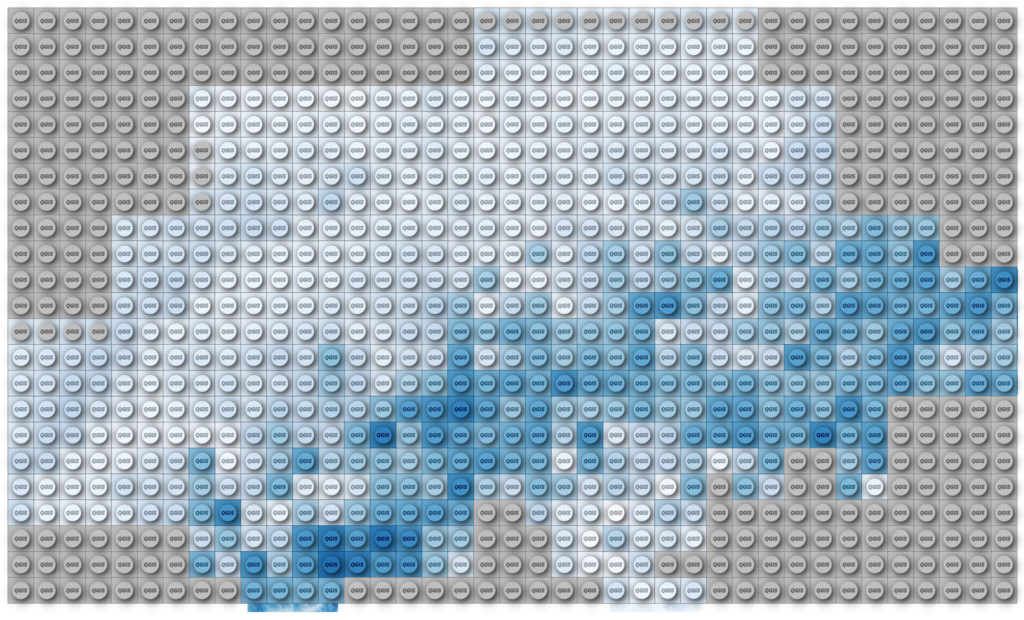
Processing -> Create Grid, covering it with points in a spacing of your choice. Use the same CRS as your raster (unless you want to figure out expression-based geometry transformations on your own, like in my elevation lines code)
Change the Symbol layer type to Geometry Generator and enter
where radius should be a value about one third of your spacing.
You should see circles!
For the fill color use this expression and adjust the name of your raster layer:
with_variable(
    'raster_layer',
    'DHM200.xyz',
    ramp_color('Blues',  -- change to an other named ramp here if you like
        scale_linear(
            raster_value(
                @raster_layer, 1,
                centroid($geometry)  -- back to our point
            ),
            raster_statistic(
                @raster_layer, 1,
                'min'
            ),
            raster_statistic(
                @raster_layer, 1,
                'max'
            ),
            0, 1  -- new scale as color ramps go 0 to 1
        )
    )
)
This will get the raster value below our grid point and fit it onto a color ramp between the min and max of all the raster values.
For the stroke use the same expression but wrap darker(..., 150) around it so you get a darker color.
Using Draw Effects add a small Drop Shadow to your circles. I used an offset of 0.5 mm and a blur radius of 1 mm.
Now add another Geometry Generator symbol layer below your existing one and use the following expression: