I have a raster where each cell is categorized with a value of either 1, 2 or 3.
In #QGIS, how would I determine the percentage of cells in each category?
This piqued my curiosity so here you go!
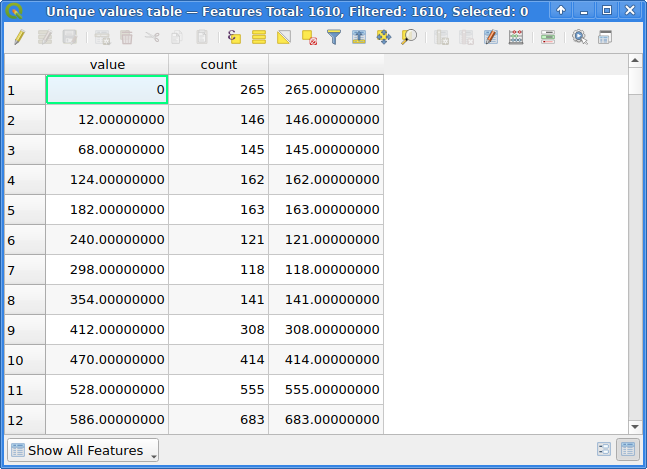
The Raster layer unique values report tool provides both a table containing value & count columns and a number of outputs, among other things TOTAL_PIXEL_COUNT and NODATA_PIXEL_COUNT.
Unique values tables for a UInt16 raster
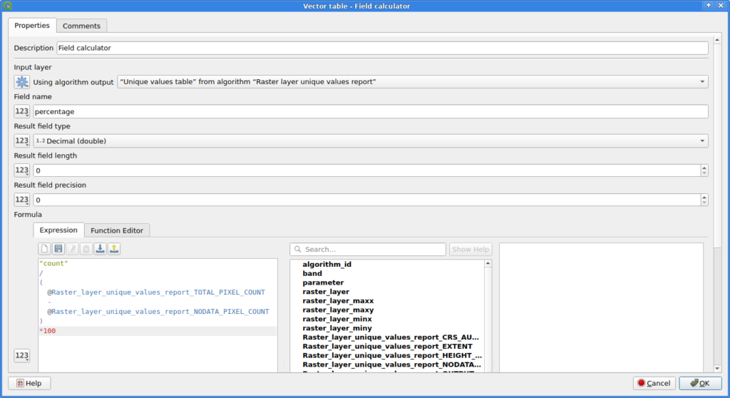
The Field calculator can be used to calculate an additional column for the table. Note that I decided for NODATA pixels to not count towards the total number of pixels here!
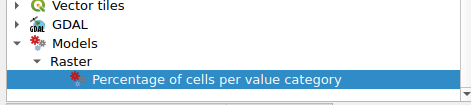
Combine them in a model, add appropriate inputs and you have a fancy new QGIS tool to calculate the percentages of each value in a raster image:
Then (if you really want to do it), uncomment the function call in the last line and execute the script. Follow the instructions.
To clean up remove or restore the QGIS/QGISCUSTOMIZATION3.ini file in your profile and remove the license directory from your profile, restore the previous value of UI/Customization/enabled in your profile (just remove the line or disable Settings -> Interface Customization).
If you want to hate yourself in the future, put it in a file called startup.py in QStandardPaths.standardLocations(QStandardPaths.AppDataLocation) aka the directory which contains the profiles directory itself.
BTW: If you end up with QGIS crashing and lines like these in the error output:
...
Warning: QPaintDevice: Cannot destroy paint device that is being painted
QGIS died on signal 11
...
It is probably not a Qt issue that caused the crash. The QPaintDevice warning might just be Qt telling you about your painter being an issue during clean up of the actual crash (which might just be a wrong name or indentation somewhere in your code, cough).
This was the final expression (with lots of opportunity to improve):
with_variable(
  'point_at_top_of_canvas',
  densify_by_count(
    make_line(
      point_n( @map_extent, 3),  -- no idea if these indexes are stable
      point_n( @map_extent, 4)
    ),
    42  -- number of trajectories
  ),
  collect_geometries(
    array_foreach(
      generate_series(1, num_points(@point_at_top_of_canvas)),
      with_variable(
        'point_n_of_top_line',
        point_n(@point_at_top_of_canvas, @element),
        point_n(
          wave_randomized(
            make_line(
              @point_n_of_top_line,
              -- make it at least touch the bottom of the canvas:
              translate(@point_n_of_top_line, 0, -@map_extent_height)
            ),
            -- fairly stupid frequency and wavelength but hey, works in any crs
            1, @map_extent_width/5,
            1, @map_extent_width/100,
            seed:=@element  -- stable waves \o/
          ),
          floor(epoch(now())%10000/50)  -- TODO make it loop around according to num_points of each line
        )
      )
    )
  )
)
Use it on an empty polygon layer with an inverted polygon style and set it to refresh at a high interval (0.01s?). Or use this QGIS project (I included some intermediate steps of the style as layer styles if you want to learn about this kind of stuff):
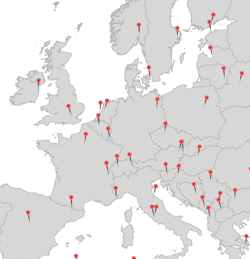
Not sure why I never posted this last year but I did the #30DayMapChallenge in a single day, streamed live via a self-hosted Owncast instance. It was … insane and fun. This year I will do it again, on the 26th of November.
Here are most of the maps I made last year:
Some notes I kept, please bug me about recovering the others from my Twitter archive (I deleted old tweets a bit too early):
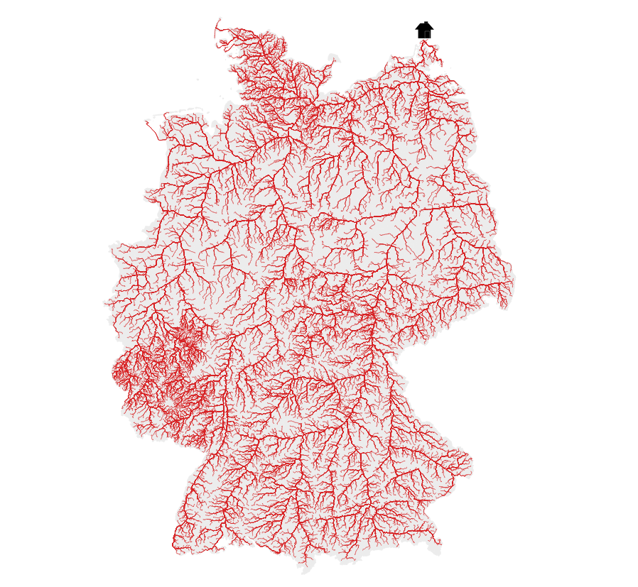
18 Water (DGM-W 2010 Unter- und Außenelbe, Wasserstraßen- und Schifffahrtsverwaltung des Bundes, http://kuestendaten.de, 2010)
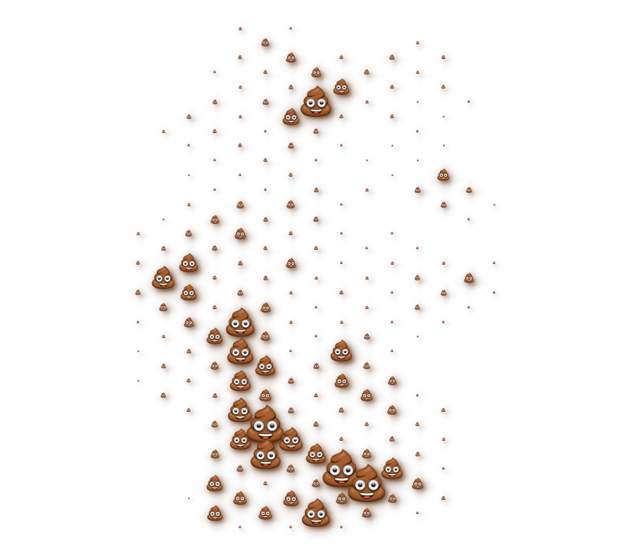
20 Movement: Emojitions on a curvy trajectory. State changes depending on the curvyness ahead. Background: (C) OpenStreetMap Contributors <3
21 Elevation with qgis2threejs (It’s art, I swear!
22 Boundaries: Inspired by Command and Conquer Red Alert. Background by Spiney (CC-BY 3.0 / CC-BY-SA 3.0, https://opengameart.org/node/12098)
24 Historical: Buildings in Hamburg that were built before the war (at least to some not so great dataset). Data Lizenz: Datenlizenz Deutschland Namensnennung 2.0 (Freie und Hansestadt Hamburg, Landesbetrieb Geoinformation und Vermessung (LGV))
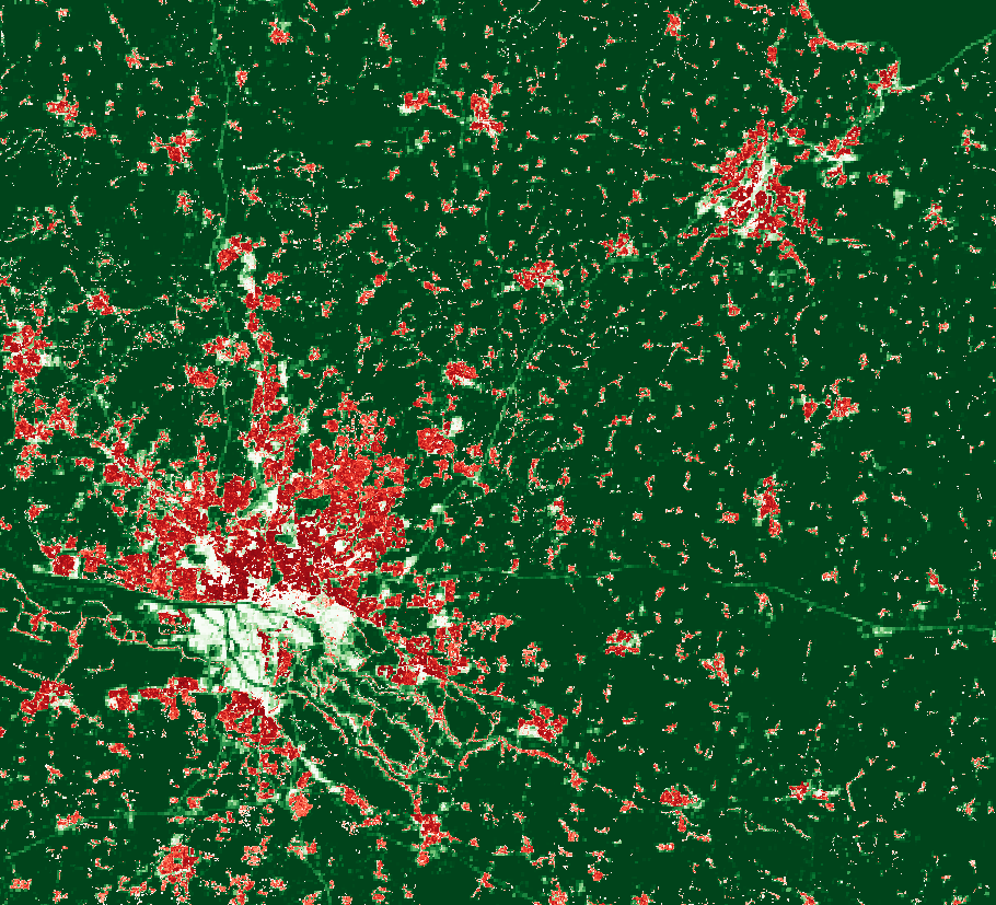
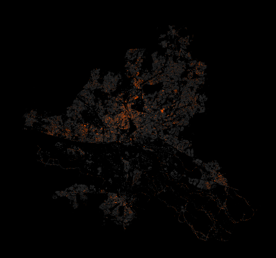
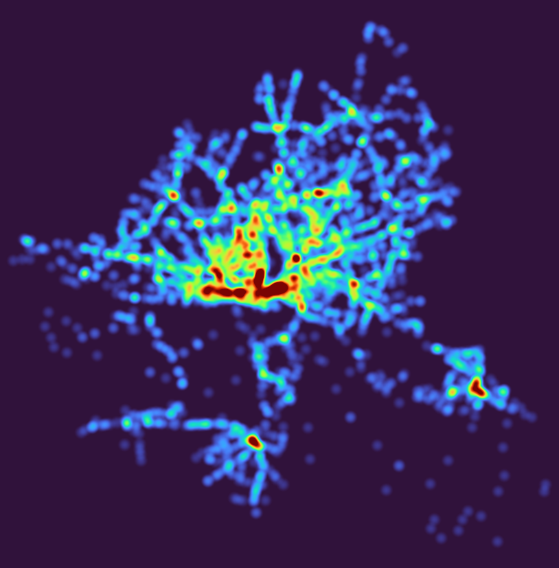
27 Heatmap: Outdoor advertisements (or something like that) in Hamburg. Fuck everything about that! Data Lizenz: Datenlizenz Deutschland Namensnennung 2.0 (Freie und Hansestadt Hamburg, Behörde für Verkehr und Mobilitätswende, (BVM))
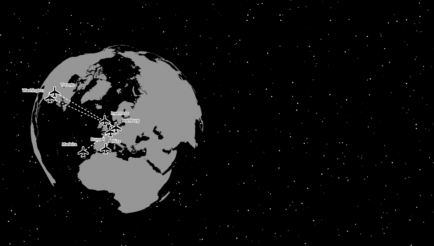
28 Earth not flat. Using my colleague’s Beeline plugin to create lines between the airports I have flown too and the Globe Builder plugin by @gispofinland to make a globe.
Raster Image Marker with https://opengameart.org/content/character-spritesheet-duck, vertical anchor at bottom, sprite choice between walking and running (doesn’t actually work) plus the frame via
if it is a one band raster you want to convert. For others you will have to adjust the readers.gdal.header part, e.g. to --readers.gdal.header="Red, Green, Blue". See https://pdal.io/stages/readers.gdal.html.
LERC is a kick-ass approach to 2D raster data compression, supported in GDAL since version 3.3. You can use it for lossless compression but it is also able to throw away some bits of information for smaller data sizes. You tell it which level of Z error is acceptable for your values and it will use that freedom to change the values of neighboring cells to do its magic. Z means the “data” axis here, of a single-band in a 2D raster, X and Y are the coordinates, or rather the locations of the data values in the raster, which are obviously not changed.
I used a global SRTM DEM with a Z value in full meters (no floating point values but integers) and applied LERC on it in three ways: Lossless, with a maximum Z error of 1 meter and a maximum Z error of 10 meters. Zstandard compression was always used.
The original GeoTIFF file was already very well compressed with Zstandard level 15 and a horizontal predictor; at ~1296000 x ~417600 pixels it has a size of 86 gigabytes including overviews.
Original (ZSTD level 15): 86 GB
LERC_ZSTD (lossless): 105G
LERC_ZSTD (maximum Z error of 1): 81G
LERC_ZSTD (maximum Z error of 10): 21G
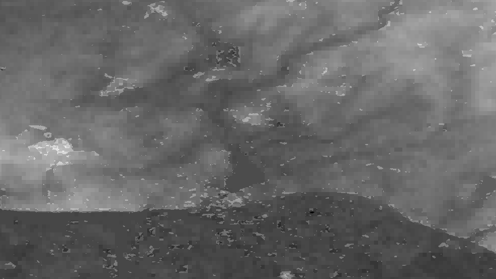
Cool, so if we don’t care about an error of 10 meters, we can have a global DEM (well, as global as SRTM is with its 60° cut-off) at ~30 meters pixel resolution in 21 gigabytes. But what does that actually look like then and how will this error appear? Well, check it out:
Here are some samples visualised with a greyscale color ramp (locally adjusted, so the lowest value in the image is black, the highest value is white). They are shown at a 1:1 resolution, one pixel in the image (if you look at it at 100%) is one cell of the DEM data. The left image is lossless, the middle one was allowed an Z error of 1 meter, the right one 10 meters.
Mountainous, here the values range from 0 meters to about 2000 meters:
You can hardly see a difference, at least visually.
“Mediumish”, values between ~100 and ~500 meters:
At the 10 meter error level you can see a significant terracing effect.
Plains, values all around 100 meters:
You can see some structures collapsing into flat areas in the 1 meter version and oh wow that 10 meters version looks like upscaled pixels.
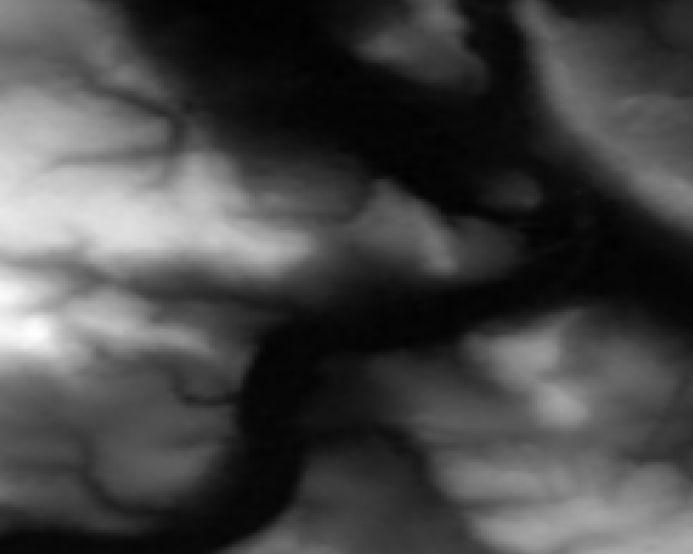
Time to zoom in! I picked a less flat area again because it makes it easier to understand. Here the values are between ~100 and ~300 meters:
So what do we see here? Neighboring cells with the same values compress better so LERC is shifting the values around (within the allowed error), creating terraces of same-valued cells. If you look closely you can see that there is also a visible pattern of squarish structures. Those are the blocks or windows in which LERC looks at the data and does its adjustments, in this case they were 8×8 pixels wide. Note: What LERC does exactly is a bit more complex than “try to make neighboring values the same”, it actually looks at the bits required to store the values within a block and optimized that within the error tolerance.
And now you know what LERC can do, if you give it a error level to play with.
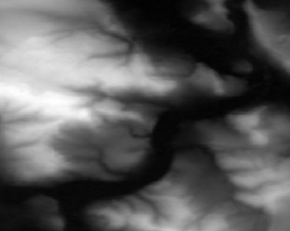
For reference, here is that same-ish area with the error tolerance at 1 meter:
You have to zoom in quite a bit more to be able to see the effects here due to the nature of the data in this extent in combination with the particular error tolerance:
The larger the zonal differences of your Z values are to each other and in relation to the error tolerance, the less distinguished will this effect be. If there are steps of 100 meters between neighboring pixels, an extra error of 10 meters won’t do much of a difference. But in more flat areas it will have significant “terracing” effects as you could see above. This is similar to “banding” effects in images where there is little variation in color, e. g. a blue sky or an artificial color gradient, and you look at it in a setup that has a color bit depth on a resolution your human eyes can distinguish.
So if you want to use LERC with a lossy approach, think hard about what is going to happen with your data later. What kind of analysis will be performed, how will it be “looked” at, what will be calculated. Do it smart and you can have a predictable/controllable lossy compression with seriously small file sizes, do it without thinking and your data will lead to misinterpretation and apocalypse.
Egal. Das ist ja großartig! Da werden eine Menge von Anwendungen ermöglicht (Sichtachsen! Verschattungen! Vermaschung! VR! AR!) und verschiedenste Akteure werden die Daten absolut feiern. Auch wenn es mit 1 Meter Auflösung wirklich mies grob ist, auf ein 1 Meter Gitter gerastert ist (nicht ausgedünnt, d. h. es ist teilweise stärker verfälscht und “daneben”) und “nur” bildbasiert (nicht gescannt) ist, geht da schon einiges mit.
Ausprobieren! Im Browser!
Achtung, frickelige Bedienung! Am besten den WASD-Möwen-Modus nutzen, mit Speed 1000. Oder mit einem Doppelklick irgendwo hinzoomen.
Für 2018 liegen die Daten als 12768 einzelne XYZ-Kacheln vor, also als super ineffiziente Textdateien. Insgesamt sind es rund 22 Gigabyte. Für 2020 sind es stattdessen 827 größere Kacheln, aber ebenfalls in XYZ mit einem ähnlichem Platzbedarf.
Schönerweise gibt es freie Tools wie LAStools‘ txt2las, was sie schnell und einfach ins super effiziente LAZ-Format umwandeln kann:
und 4 Minuten später ist die interaktive 3D-Webanwendung fertig, wegen der zusätzlichen Octree-Struktur jetzt bei rund 3 Gigabyte.
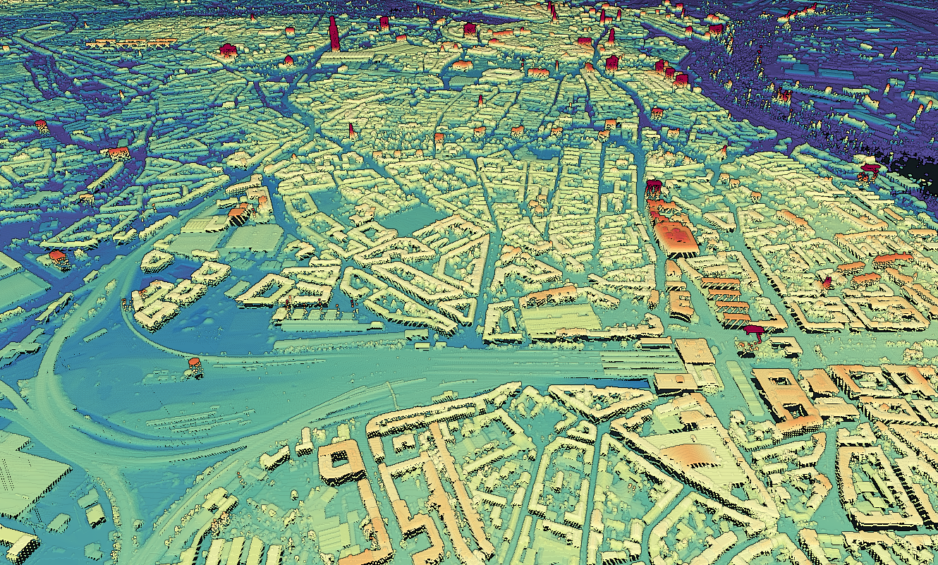
Punktwolke mit Farben aus Orthophoto einfärben
Die bereitgestellten Oberflächenmodelle sind so schlicht wie es nur geht, es sind reine XYZ-Daten ohne weitere Dimensionen wie Farbe o. ä.
Glücklicherweise gibt es ja auch die Orthophotos, eventuell wurde sogar dasselbe Bildmaterial genutzt? Da müsste mal jemand durch den Datenwust wühlen, die bei den DOPs werden die relevanten Metadaten nicht mitgeliefert…
Theoretisch könnte man sie also einfärben. Leider ist lascolor proprietär und kommt mit gruseligen, bösartigen Optionen, wenn man es wagt es “unlizenziert” zu nutzen (“Please note that the unlicensed version will (…) slightly change the LAS point order, and randomly add a tiny bit of white noise to the points coordinates once you exceed a certain number of points in the input file.”) und kann JPEG in GeoTIFF nicht lesen (so hab ich mir die DOPs aufbereitet). Eine Alternative ist das geniale PDAL. Mit einer Pipeline wie
ist die Punktwolke innerhalb von Minuten coloriert und kann dann wie gehabt mit PotreeConverter in einen interaktiven 3D-Viewer gesteckt werden.
Update 2023: "minor_version": "2" -> "minor_version": "4", damit LAS 1.4 rauskommt, um dann einfach COPC draus bauen zu können (Farben als 16-Bit, nicht 8-Bit). Und entsprechend noch ein Filter, um die Farben auf den 16-Bit-Wertebereich zu skalieren, das passiert leider nicht automatisch.
Das Ergebnis ist besser als erwartet, da es scheinbar tatsächlich die selben Bilddaten sind (für beide Jahre). Andererseits ist es auch nicht wirklich schick, da die DOPs nicht als True Orthophoto vorliegen und damit höhere Gebäude gekippt in den Bilder abgebildet sind. Sieht man hier schön am Planetarium.
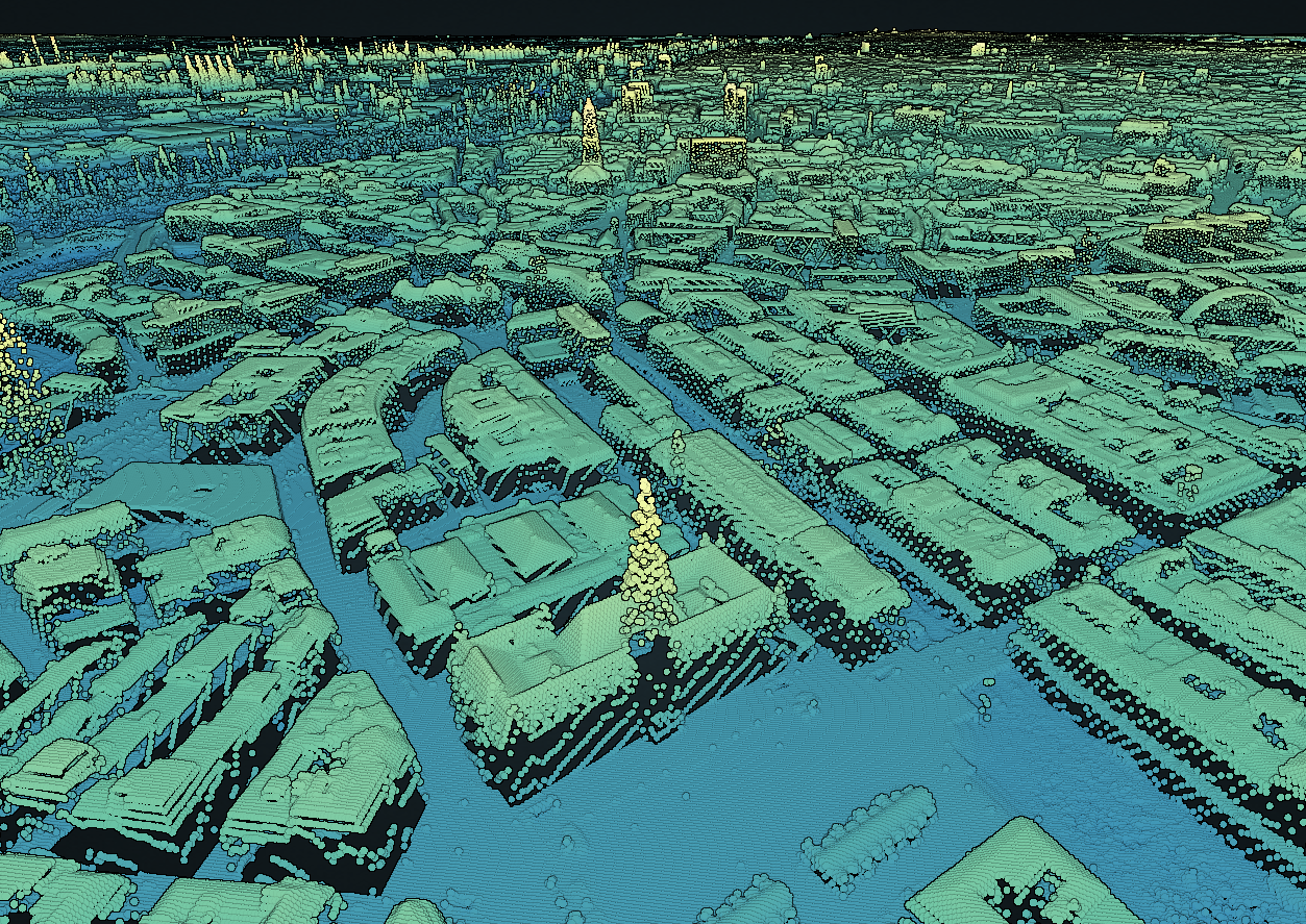
Cloud-Optimized Point Cloud
Als Cloud-Optimized Point Cloud umwandeln kann man das Resultat einfach mit untwine (mit pdal pipeline braucht man immens viel RAM (>64GB), da die Umwandlung nach COPC hier nicht den Streaming Mode nutzen kann):
Anschließend auf einem Server (mit entsprechenden Access-Control-Allow-Headern) gelagert, kann die Punktwolke super einfach mit https://viewer.copc.io/?resources=https://example.com/pointcloud.copc.laz im Browser verwendet werden. Ganz ohne Umwandlung in viele Unterdateien wie beim PotreeConverter.
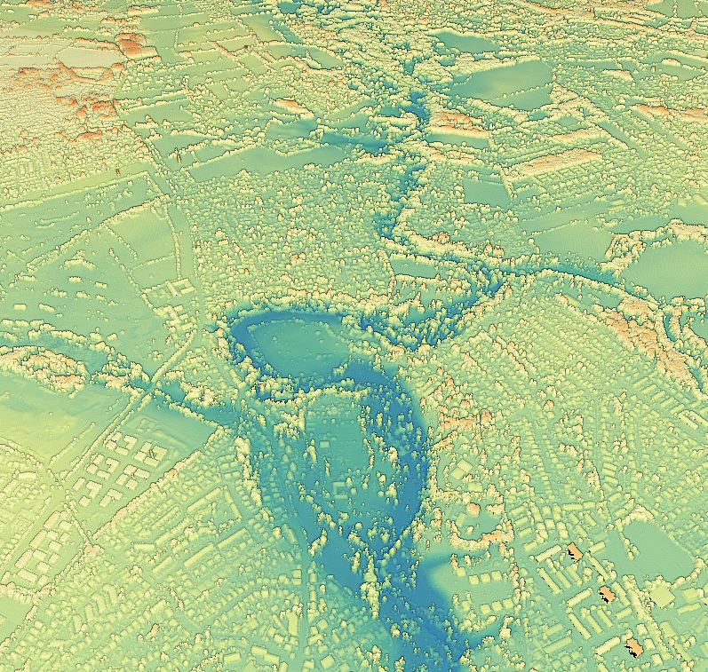
DOM als GeoTIFF
Wer es lieber als GeoTIFF haben möchte, hat es etwas schwerer, denn GDAL kommt mit dieser Art von Kacheln (mit Lücken und in der bereitgestellten Sortierung) nicht gut klar. Mein Goto-Tool dafür ist GMT.
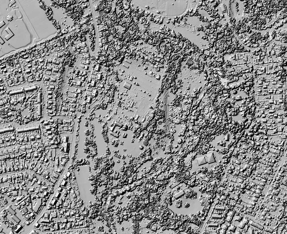
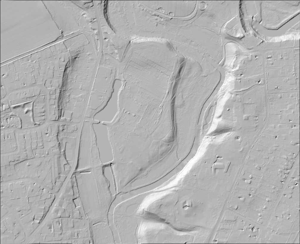
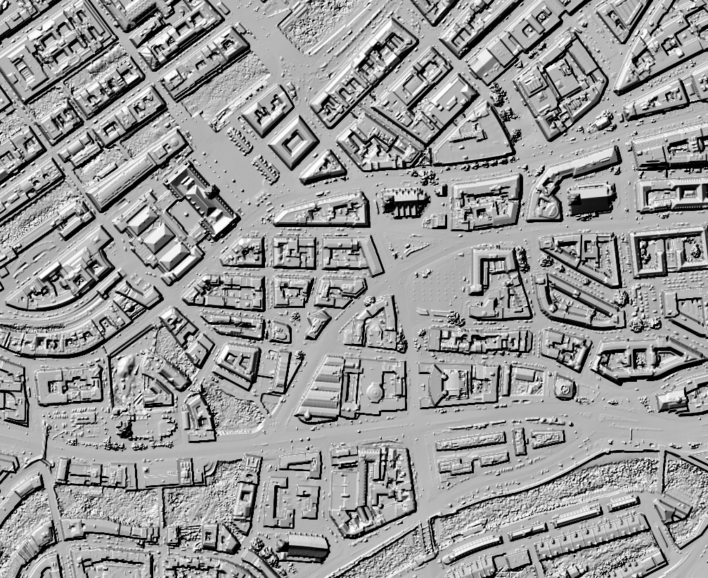
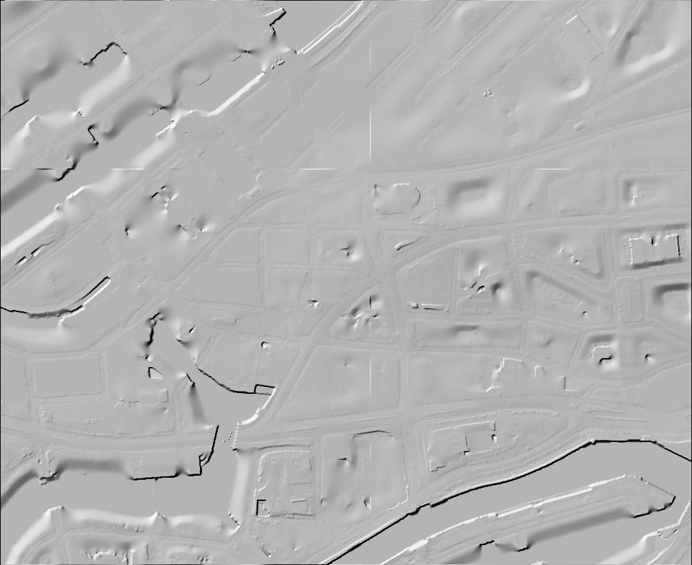
Hier mal im Vergleich mit dem DGM1 als Schummerungen:
Vermaschung als 3D-Modell
Leider habe ich keine gute Lösung für die 3D-Vermaschung gefunden. tin-terrain und dem2mesh kommen nicht mit so großen Datenmengen auf einmal klar und weiter hab ich nicht geschaut. Wer da was gutes weiß kann sich bei mir bei nächster Gelegenheit Kekse oder Bier abholen. ;)
Daten hinter den Bildern und den Viewern Datenlizenz Deutschland Namensnennung 2.0, Freie und Hansestadt Hamburg, Landesbetrieb Geoinformation und Vermessung (LGV)