Category Archives: map

#30DayMapChallenge as #1Day30MapsChallenge (2021)

Not sure why I never posted this last year but I did the #30DayMapChallenge in a single day, streamed live via a self-hosted Owncast instance. It was … insane and fun. This year I will do it again, on the 26th of November.

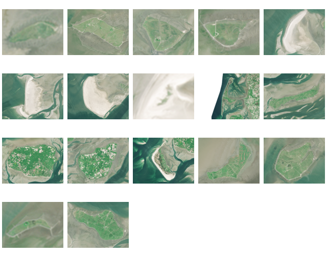
Here are most of the maps I made last year:

Some notes I kept, please bug me about recovering the others from my Twitter archive (I deleted old tweets a bit too early):

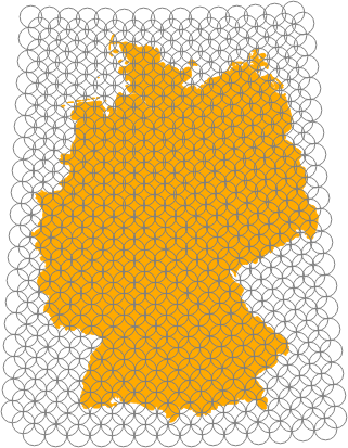
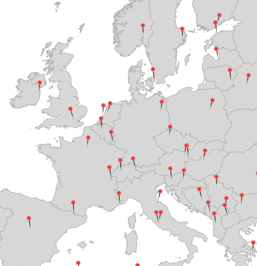
  • 1 Points: Pins via Geometry Generator in QGIS
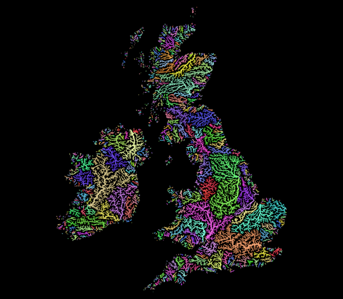
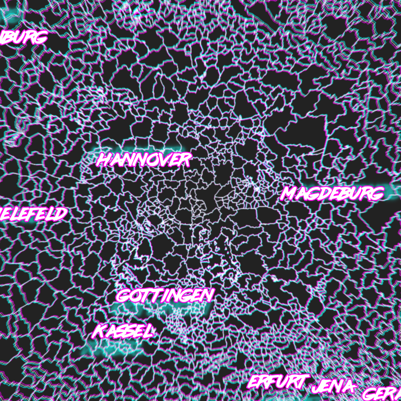
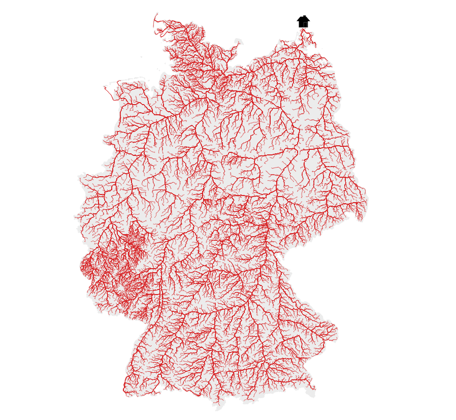
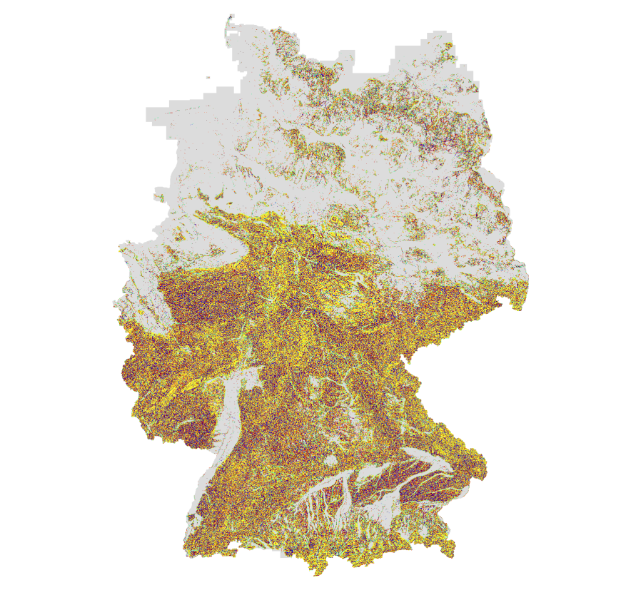
  • 2 Lines: River elevation profiles of Elbe, Rhein, Ems, Weser, Donau and Main. DEM: © GeoBasis-DE / BKG (2021)
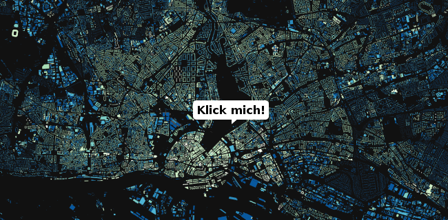
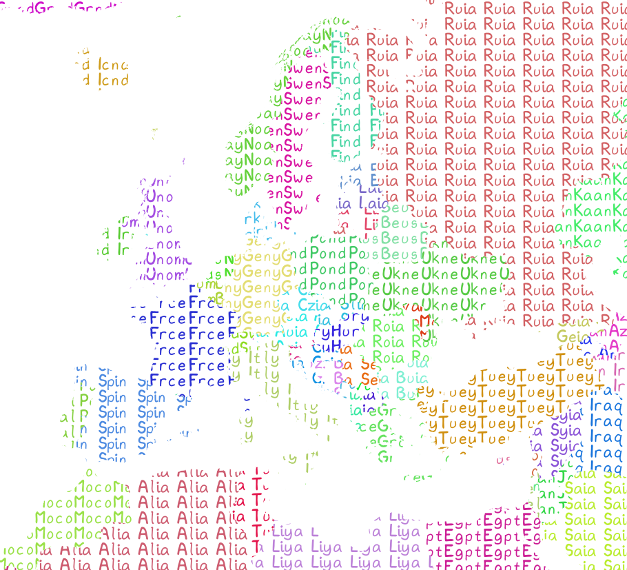
  • 13 NaEr I mean Natural Earth (Blame @tjukanov)
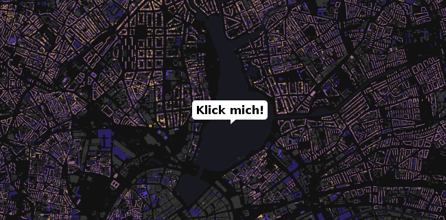
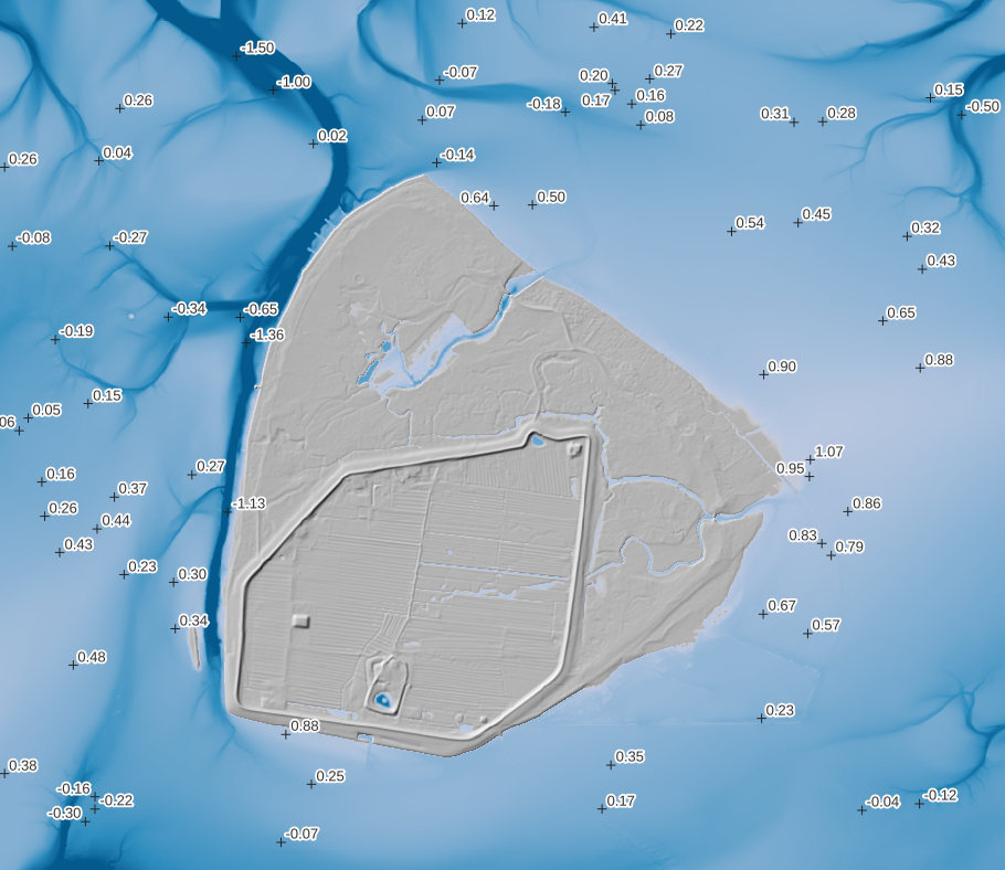
  • 18 Water (DGM-W 2010 Unter- und Außenelbe, Wasserstraßen- und Schifffahrtsverwaltung des Bundes, http://kuestendaten.de, 2010)
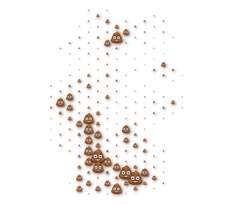
  • 20 Movement: Emojitions on a curvy trajectory. State changes depending on the curvyness ahead. Background: (C) OpenStreetMap Contributors <3
  • 21 Elevation with qgis2threejs (It’s art, I swear!
  • 22 Boundaries: Inspired by Command and Conquer Red Alert. Background by Spiney (CC-BY 3.0 / CC-BY-SA 3.0, https://opengameart.org/node/12098)
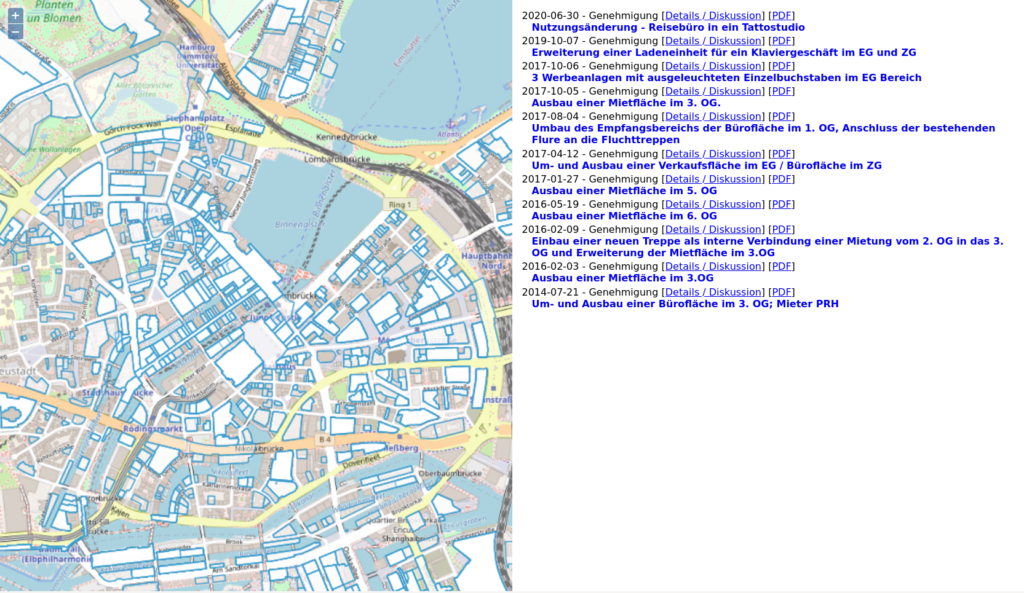
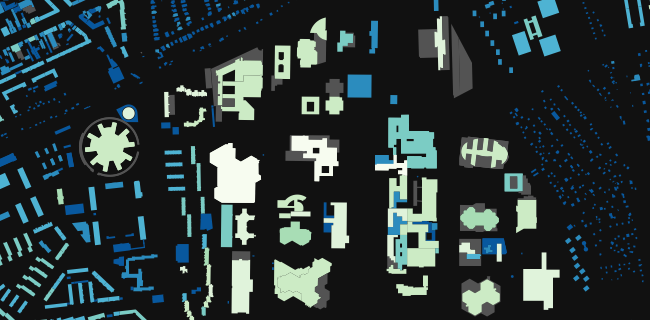
  • 24 Historical: Buildings in Hamburg that were built before the war (at least to some not so great dataset). Data Lizenz: Datenlizenz Deutschland Namensnennung 2.0 (Freie und Hansestadt Hamburg, Landesbetrieb Geoinformation und Vermessung (LGV))
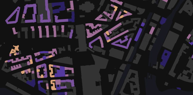
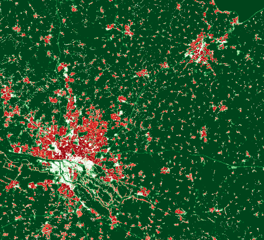
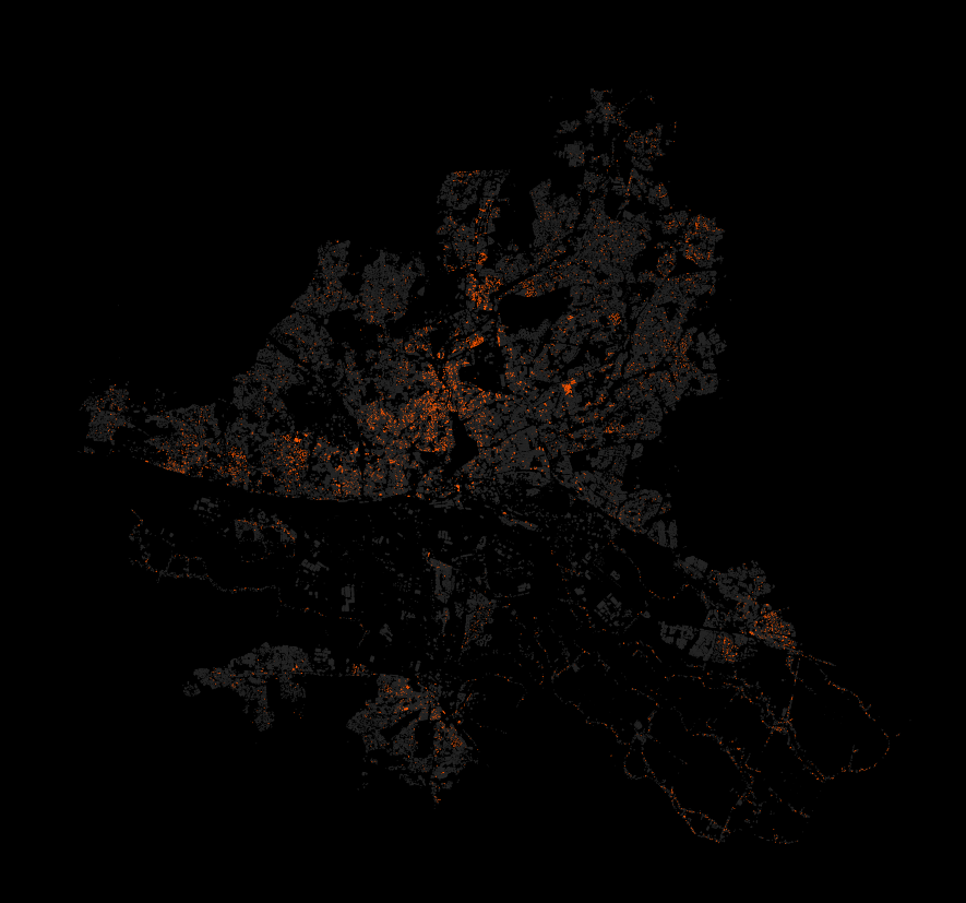
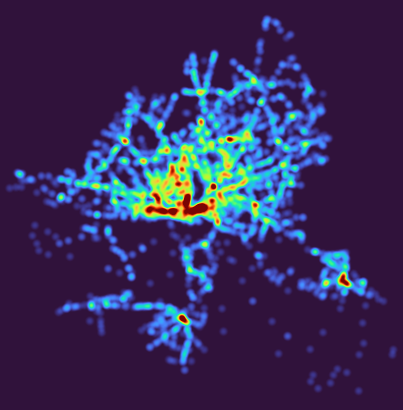
  • 27 Heatmap: Outdoor advertisements (or something like that) in Hamburg. Fuck everything about that! Data Lizenz: Datenlizenz Deutschland Namensnennung 2.0 (Freie und Hansestadt Hamburg, Behörde für Verkehr und Mobilitätswende, (BVM))
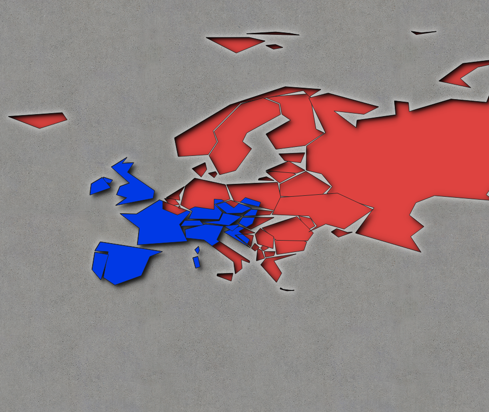
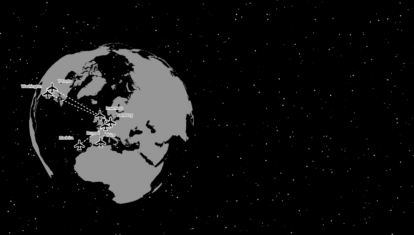
  • 28 Earth not flat. Using my colleague’s Beeline plugin to create lines between the airports I have flown too and the Globe Builder plugin by @gispofinland to make a globe.

Waggawaggawaggawagga animated ducks in QGIS

I used ne_110m_admin_0_countries.

Rendering updates for the layer at 0.1 seconds.

Geometry Generator for a Point for the marker location via line_interpolate_point:

with_variable(
  'biggest_geom',
  geometry_n(order_parts($geometry, 'area($geometry)', ascending:=False), 1),
  line_interpolate_point(
    boundary(@biggest_geom), 
    perimeter(@biggest_geom)*(round(epoch(now())/100)%100/100)
  )
)

Raster Image Marker with https://opengameart.org/content/character-spritesheet-duck, vertical anchor at bottom, sprite choice between walking and running (doesn’t actually work) plus the frame via

with_variable(
  'biggest_geom',
  geometry_n(order_parts($geometry, 'area($geometry)', ascending:=False), 1),
  '/your/path/Duck/Sprites/Walking-Running/'
  || if(perimeter(@biggest_geom) < 10, 'Walking', 'Running')
  || ' 00'
  || to_string(round(epoch(now())/200)%2+1)
  || '.png'
)

Rotation did not work, I tried line_interpolate_angle:

with_variable(
  'biggest_geom',
  geometry_n(order_parts($geometry, 'area($geometry)', ascending:=False), 1),
  line_interpolate_angle(
    boundary(@biggest_geom), 
    perimeter(@biggest_geom)*(round(epoch(now())/100)%100/100)
  )
)

Steps via two more Geometry Generators, both for Lines using line_substring and some nice style (inspired by the wonderful built-in cat trail preset):

with_variable(
	'biggest_geom',
	geometry_n(order_parts($geometry, 'area($geometry)', ascending:=False), 1),
  	line_substring(
	  boundary(@biggest_geom), 
	  0,
	  perimeter(@biggest_geom)*(round(epoch(now())/100)%100/100)
	)
)

Could be improved if (for example) Raster Image Marker would support:

  • Choice of resampling algorithm
  • Flipping
  • Rotation would work, no idea what’s wrong with my expression, it works with random values, so …
  • Whatever is broken with the choice between ‘Walking’ and ‘Running’ in the file path expression

Satellite composite of Earth 2020

A follow-up to Average Earth from Space 2018 with a how-to. For each day of 2020 I took one global true color image of the whole planet and merged them together by using the most typical color per pixel. You can see cloud patterns in astonishing detail, global wind, permafrost (careful, white can be ice and/or clouds here) and more. Scroll to the bottom for interactive full resolution viewers.

Basically we will want to overlay one satellite image per day into one image for the whole year. You need two things: The images and the GDAL suite of geospatial processing tools.

Imagery

You can get a daily satellite composite of (almost) the whole earth from NASA. For example of the Soumi NPP / VIIRS instrument. Check it out at WorldView.

You can download those images via Global Imagery Browse Services (GIBS).

As the API I used two years ago is gone, Joshua Stevens was so nice to share code he used previously. It was easy to adapt:

set -e
set -u

# run like: $ bash gibs_viirs.sh 2020-10-05
# you get: VIIRS_SNPP_CorrectedReflectance_TrueColor-2020-10-05.tif
# in ~15 minutes and at ~600 megabytes for 32768x16384 pixels

# based on https://gist.github.com/jscarto/6c0413f4820ed5141744e96e19f31205

# https://gibs.earthdata.nasa.gov/wmts/epsg4326/best/1.0.0/WMTSCapabilities.xml
# VIIRS_SNPP_CorrectedReflectance_TrueColor is not served as PNG by GIBS
# so this is using JPEG tiles as source

# -outsize 65536 32768 took ~50 minutes
# -outsize 32768 16384 took ~15 minutes
# you can run multiple instances at once without issues to reduce total time

# TODO probably should be using a less detailed tileset than 250m to put
# less stress on the server...!

layer=VIIRS_SNPP_CorrectedReflectance_TrueColor
caldate=$1  # 2020-09-09
tilelevel=8  # 8 is the highest for 250m, see Capa -> 163840 81920 would be the full outsize
# 2022 says: Dude, check what gdal says for "Input file size is x, y" and then compare it to the outsize. Use the tilelevel that gives 2x the outsize, that seems to be what's needed

# ready? let's go!
gdal_translate \
-outsize 32768 16384 \
-projwin -180 90 180 -90 \
-of GTIFF \
-co TILED=YES \
-co COMPRESS=DEFLATE \
-co PREDICTOR=2 \
-co NUM_THREADS=ALL_CPUS \
"<GDAL_WMS>
 <Service name=\"TMS\">
 <ServerUrl>https://gibs.earthdata.nasa.gov/wmts/epsg4326/best/"${layer}"/default/"${caldate}"/250m/\${z}/\${y}/\${x}.jpg</ServerUrl>
</Service>
<DataWindow>
 <UpperLeftX>-180.0</UpperLeftX><!-- makes sense -->
 <UpperLeftY>90</UpperLeftY><!-- makes sense -->
 <LowerRightX>396.0</LowerRightX><!-- wtf -->
 <LowerRightY>-198</LowerRightY><!-- wtf -->
 <TileLevel>"${tilelevel}"</TileLevel>
 <TileCountX>2</TileCountX>
 <TileCountY>1</TileCountY>
 <YOrigin>top</YOrigin>
</DataWindow>
<Projection>EPSG:4326</Projection>
<BlockSizeX>512</BlockSizeX><!-- correct for VIIRS_SNPP_CorrectedReflectance_TrueColor-->
<BlockSizeY>512</BlockSizeY><!-- correct for VIIRS_SNPP_CorrectedReflectance_TrueColor -->
<BandsCount>3</BandsCount>
</GDAL_WMS>" \
${layer}-${caldate}.tif

As this was no scientific project, please note that I have spent no time checking e. g.:

  • If one could reduce the (significantly) compression artifacts of imagery received through this (the imagery is only provided as JPEG using this particular API),
  • if the temporal queries are actually getting the correct dates,
  • if there might be more imagery available
  • or even if the geographic referencing is correct.

As it takes a long time to fetch an image this way, I decided to go for a resolution of 32768×16384 pixels instead of 65536×32768 because the latter took about 50 minutes per image. A day of 32768×16384 pixels took me about 15 minutes to download.

Overlaying the images

There are lots of options to overlay images. imagemagick/graphicsmagick might be the obvious choice but they are unfit for imagery of these dimensions (exhausting RAM). VIPS/nips2 is awesome but might require some getting used to and/or manual processing. GDAL is the hot shit and very RAM friendly if you are careful. So I used GDAL for this.

Make sure to store the images somewhere sensible for lots of I/O.

Got all the images you want to process? Cool, build a VRT for them:

gdalbuildvrt \
VIIRS_SNPP_CorrectedReflectance_TrueColor-2020.vrt \
VIIRS_SNPP_CorrectedReflectance_TrueColor-2020-*.tif

This takes some seconds.

We want to overlay the images with some fancy, highly complex mathematical formula (or not ;) ) and since GDAL’s VRT driver supports custom Python functions to manipulate pixel values, we can use numpy for that. Put this in a file called functions.py and remember the path to that file:

import numpy as np

def median(in_ar, out_ar, xoff, yoff, xsize, ysize, raster_xsize,
      raster_ysize, buf_radius, gt,  **kwargs):
    out_ar[:] = np.median(in_ar, axis = 0)

def mean(in_ar, out_ar, xoff, yoff, xsize, ysize, raster_xsize,
      raster_ysize, buf_radius, gt,  **kwargs):
    out_ar[:] = np.mean(in_ar, axis = 0)

def max(in_ar, out_ar, xoff, yoff, xsize, ysize, raster_xsize,
      raster_ysize, buf_radius, gt,  **kwargs):
    out_ar[:] = np.amax(in_ar, axis = 0)

def min(in_ar, out_ar, xoff, yoff, xsize, ysize, raster_xsize,
      raster_ysize, buf_radius, gt,  **kwargs):
    out_ar[:] = np.amin(in_ar, axis = 0)

You can now use a median, mean, min or max function for aggregating the images per pixel. For that you have to modify the VRT to include the function you want it to use. I used sed for that:

sed -e 's#<VRTRasterBand#<VRTRasterBand subClass="VRTDerivedRasterBand"#' \
-e 's#</ColorInterp>#</ColorInterp>\n<PixelFunctionLanguage>Python</PixelFunctionLanguage>\n<PixelFunctionType>functions.median</PixelFunctionType>#' \
VIIRS_SNPP_CorrectedReflectance_TrueColor-2020.vrt \
> VIIRS_SNPP_CorrectedReflectance_TrueColor-2020_median.vrt

That’s it, we are ready to use GDAL to build an image that combines all the daily images into one median image. For this to work you have to set the PYTHONPATH environment variable to include the directory of the functions.py file. If it is in the same directory where you launch gdal, you can use $PWD, otherwise enter the full path to the directory. Adjust the rest of the options as you like, e. g. to choose a different output format. If you use COG, enabling ALL_CPUS is highly recommended or building overviews will take forever.

PYTHONPATH=$PWD gdal_translate \
--config CPL_DEBUG VRT --config GDAL_CACHEMAX 25% \
--config GDAL_VRT_ENABLE_PYTHON YES \
-of COG -co NUM_THREADS=ALL_CPUS \
-co COMPRESS=DEFLATE -co PREDICTOR=2 \
VIIRS_SNPP_CorrectedReflectance_TrueColor-2020_median.vrt \
VIIRS_SNPP_CorrectedReflectance_TrueColor-2020_median.vrt.tif

This will take many hours. 35 hours for me on a Ryzen 3600 with lots of RAM and the images on a cheap SSD. The resulting file is about the same size as the single images (makes sense, doesn’t it) at ~800 megabytes.

Alternative, faster approach

A small note while we are at it: GDAL calculates overviews from the source data. And since we are using a custom VRT function here, on a lot of raster images, that takes a long time. To save a lot of that time, you can build the file without overviews first, then calculate them in a second step. With this approach they will be calculated from the final raster instead of the initial input which, when ever there is non-trivial processing involved, is way quicker:

PYTHONPATH=$PWD gdal_translate \
--config CPL_DEBUG VRT --config GDAL_CACHEMAX 25% \
--config GDAL_VRT_ENABLE_PYTHON YES \
-of GTiff -co NUM_THREADS=ALL_CPUS \
VIIRS_SNPP_CorrectedReflectance_TrueColor-2020_median.vrt \
VIIRS_SNPP_CorrectedReflectance_TrueColor-2020_median.vrt.noovr.tif

Followed by the conversion to a COG (which automatically will build the overviews as mandatory for that awesome format):

gdal_translate \
--config GDAL_CACHEMAX 25% \
-of COG -co NUM_THREADS=ALL_CPUS \
-co COMPRESS=DEFLATE -co PREDICTOR=2 \
/tmp/VIIRS_SNPP_CorrectedReflectance_TrueColor-2020_median.vrt.noovr.tif \
VIIRS_SNPP_CorrectedReflectance_TrueColor-2020_median.vrt.cog.tif

This took “just” 10 hours for the initial raster and then an additional 11 seconds for the conversion COG and the building of overviews. And the resulting file is bit-by-bit identical to the one from the direct-to-COG approach. So one third of processing time for the same result. Nice!

Result

Check it out in full, zoomable resolution:

Or download the Cloud-Optimized GeoTIFF file for your own software:

Closing remarks

Please do not consider a true representation of the typical weather or cloud cover throughout the year. The satellite takes the day imagery at local noon if I recall correctly so the rest of the day is not part of this “analysis”. I did zero plausibility or consistency checks. The data was probably reprojected multiple times through out the full (sensor->composite) pipeline. The composite is based on color alone, anything bright will lead to a white-ish color, be it snow, ice, clouds, algae, sand, …

It’s just some neat imagery to love our planet.

Update 2020-01-05

Added compression to GeoTIFF creation where useful, not sure how I missed that here. Reduces filesizes to 1/2 or 1/3 even.

Interaktive Karte der Baugenehmigungen in Hamburg

Ich habe endlich mal ein über mehrere Jahre gereiftes (eher gealtertes und verfrickeltes) Projekt in einen einigermaßen vorzeigbaren Zustand gebracht: Eine interaktive Karte der Baugenehmigungen in Hamburg.

Je weniger transparent eine Fläche dargestellt ist, desto mehr Dokumente sind mit ihr verknüpft (ja, es ist ein Feature je Dokument D;). Eigentlich war die Seite anders aufgebaut, mit einem PDF-Viewer auf der rechten Seite. Aber da daten.transparenz.hamburg.de kein HTTPS kann (seid ihr auch so gespannt auf die UMTS-Auktion nächste Woche?), geht das aus Sicherheitsgründen nicht ohne ein Spiegeln der Daten oder einen Proxy.

Die Daten kommen größtenteils aus dem Transparenzportal. Für das Matching der angebenen Flurstücks-“IDs” zu den tatsächlichen Flurstücken war aber ein erheblicher Aufwand nötig. Das Drama ging bis hin zum Parsen aus PDFs, die mal so, mal so formatiert waren und natürlich auch voller Eingabefehler auf Behördenseite. Vielleicht schreibe ich da noch beizeiten mal einen Rant. TL;DR: Ohne die zugehörige Gemarkung ist mit einer Flurstücks-“ID” wie in den Daten angegeben keine räumliche Zuordnung möglich. In den veröffentlichten Daten stecken nur die Nenner der Flurstücksnummern, nicht aber die Gemarkungsnummern. Ziemlich absurd.

Das ganze ist nur ein Prototyp, vermutlich voller Fehler und fehlender Daten. Aber interessant und spaßig ist es, viel Freude also!

Es wäre noch eine MENGE zu tun, um das ganze rund zu machen. Falls du Lust hast, melde dich gerne. Es geht vom wilden Parsen, über Sonderregeln für kaputte Dokumente, zu Kartenstyling bis zur UI. Schön wäre es auch alles in einer anständigen Datenbank zu halten und nicht nur nach der räumlichen Dimension durchsuchen zu können.

Replicating a media-hyped color by numbers Etsy map in 10 minutes

https://old.reddit.com/r/MapPorn/comments/ajaz42/the_arteries_of_the_world_map_shows_every_river/eeu3uj9/

Thats beautiful… how long it took?

Well, that looks like QGIS’ random colors applied to http://hydrosheds.org/

So I fired up QGIS, extracted the region from eu_riv_15s.zip, realised those rivers came without a corresponding basin, extracted the region from eu_bas_15s_beta.zip, set the map background to black, set the rivers to render in white, set the rivers’ line width to correspond to their UP_CELLS attribute (best with an exponential scale via Size Assistant), put the basins on top, colored them randomly by BASIN_ID, set the layer rendering mode to Darken or Multiply and that was it.

I should open an Etsy store.

Yes, I realise that replicating things is easier than creating them. But seriously, this is just a map of features colored by category and all the credit should go to http://hydrosheds.org/

Update

But Hannes, that original has some gradients!

Ok, then set the rivers not to white but a grey and the basin layer rendering mode to Overlay instead of Darken.

This product incorporates data from the HydroSHEDS database which is © World Wildlife Fund, Inc. (2006-2013) and has been used herein under license. WWF has not evaluated the data as altered and incorporated within, and therefore gives no warranty regarding its accuracy, completeness, currency or suitability for any particular purpose. Portions of the HydroSHEDS database incorporate data which are the intellectual property rights of © USGS (2006-2008), NASA (2000-2005), ESRI (1992-1998), CIAT (2004-2006), UNEP-WCMC (1993), WWF (2004), Commonwealth of Australia (2007), and Her Royal Majesty and the British Crown and are used under license. The HydroSHEDS database and more information are available at http://www.hydrosheds.org.

Update: Someone asked me for more details so I made a video. Because I did not filter the data to a smaller region I did not use a categorical style in this example (300,000 categories QGIS no likey) but simply a random assignment.

Fake chromatic aberration and dynamic label shadows in QGIS

Welcome to Part 43 of “Fun with Weird Hacks in QGIS”!

Fake Chromatic Aberration

Get some lines or polygons! I used German administrative polygons and a “Outline: Simple line” style.

Add a “Geometry Generator” to the same layer and set it to “LineString / MultiLineString”. If you used polygons, you will need to use “boundary($geometry)” to get the border lines of your polygons.

Translate (shift) the geometries radially away from the map center, with an amount of translation based on their distance to the map center. This will introduce ugly artifacts cool glitches for big geometries. Note the magic constant of 150 I divided the distances by, I cannot be arsed to turn this into percentages so you will have to figure out what works for you. Also, if your map is in a different CRS than the layer you do this with, you will need to transform the coordinates (I do that for the labels below).

 translate(
   boundary($geometry),
   (
    x(centroid($geometry))-x(@map_extent_center)
   )/150
   ,
   (
    y(centroid($geometry))-y(@map_extent_center)
   )/150
)

Color those lines in some fancy 80s color like #00FFFF.

We only want the color to appear in the edges of the map, so set the “Feature Blending” mode of the layer to “Lighten”. This will make sure the white lines do not get darker/colored.

I forgot to take an image for that and then it was lunch time. :x

Now do the same but for distances the other way around and color that in something else (like foofy #FF00FF).

 translate(
   boundary($geometry),
   (
    x(@map_extent_center)-x(centroid($geometry))
   )/150
   ,
   (
    y(@map_extent_center)-y(centroid($geometry))
   )/150
)

Oh, can you see it already? Move the map around! Ohhh!

For the final touch, use the layer’s “Draw Effects” to replace the “Source” with a “Blur”. Be aware that the “Blur type” can quite strongly influence the look and find a setting for the “Blur strength” that works for you. I used “Guassian blur (quality)” with a strength of 2.

Dynamic Label Shadows

Get some data to label! I used ne_10m_populated_places_simple. Label it with labels placed “Offset from Point” without any actual offset. This is just to make sure calculations on the geometry’s location make sense to affect the labeling later.

Pick a wicked cool font like Lazer 84!

Add a “Buffer” to the labels and pick an appropriate color (BIG BOLD #FF00FF works well again).

Time for magic! Add a “Shadow” to the labels and use an appropriate color (I used the other color from earlier again, #00FFFF).

We want to make the label shadows be further away from the label if the feature is further away from the map center. So OVERRIDE the offset with code that does exactly that. Note another magic constant (relating to meters in EPSG:25832) and that I needed to transform coordinates here (my map is in EPSG:25832 while this layer is EPSG:4326).

distance(  
	transform(
		$geometry, 'EPSG:4326', 'EPSG:25832'
	),
	@map_extent_center
)/10000

Cool. But that just looks weird. Time for another magical ingredient while OVERRIDING the angle at which the label is placed. You guessed it, radially away from the map center!

degrees(
	azimuth(  
		transform(
			$geometry, 'EPSG:4326', 'EPSG:25832'
		),  
		@map_extent_center)
	)
-180

By the way, it does look best if your text encoding is introducing bad character marks and missing umlauts!

That’s it, move the map around and be WOWed by the sweet effects and the time it takes to render :o)

And now it is your turn to apply this to some MURICA geodata and rake in meaningless internet points that make you feel good! Sad but true ;)

And also TODO: Make the constants percentages instead, that should make sure it works on any projection and any scale.

A bad map about gender differences in literacy

Wrote this in 2014, not sure why I did not publish it. It was a response to this bad map.

world bank 2011 female vs male literacy

No need for expensive software, you can use the free and open-source QGIS for this: https://qgis.org/

1. Install QGIS

2. Download and unzip the data http://databank.worldbank.org/data/download/WDI_excel.zip (not sure what license, they want attribution “World Development Indicators, The World Bank”)

3. Download and unzip country geometries http://www.naturalearthdata.com/http//www.naturalearthdata.com/download/50m/cultural/ne_50m_admin_0_countries.zip (public domain but be nice and add attribution “Geometries from Natural Earth”)

4. Open QGIS, Layer -> Add Vector Layer -> choose ne_50m_admin_0_countries.shp

5. Unfortunately the csv is not simple, it has more than one row per country as it includes time series. And it does not have the value we want to map precalculated.

Afghanistan,AFG,"Literacy rate, adult female (% of females ages 15 and above)",SE.ADT.LITR.FE.ZS,,,,,,,,,,,,,,,,,,,,4.98746100000000E+00,,,,,,,,,,,,,,,,,,,,,,,,,,,,,,,,,,
Afghanistan,AFG,"Literacy rate, adult male (% of males ages 15 and above)",SE.ADT.LITR.MA.ZS,,,,,,,,,,,,,,,,,,,,3.03077500000000E+01,,,,,,,,,,,,,,,,,,,,,,,,,,,,,,,,,,
Afghanistan,AFG,"Literacy rate, adult total (% of people ages 15 and above)",SE.ADT.LITR.ZS,,,,,,,,,,,,,,,,,,,,1.81576800000000E+01,,,,,,,,,,,,,,,,,,,,,,,,,,,,,,,,,,
Afghanistan,AFG,"Literacy rate, youth female (% of females ages 15-24)",SE.ADT.1524.LT.FE.ZS,,,,,,,,,,,,,,,,,,,,1.11428000000000E+01,,,,,,,,,,,,,,,,,,,,,,,,,,,,,,,,,,
Afghanistan,AFG,"Literacy rate, youth male (% of males ages 15-24)",SE.ADT.1524.LT.MA.ZS,,,,,,,,,,,,,,,,,,,,4.57960200000000E+01,,,,,,,,,,,,,,,,,,,,,,,,,,,,,,,,,,
Afghanistan,AFG,"Literacy rate, youth total (% of people ages 15-24)",SE.ADT.1524.LT.ZS,,,,,,,,,,,,,,,,,,,,3.00663500000000E+01,,,,,,,,,,,,,,,,,,,,,,,,,,,,,,,,,,

This step is probably the hardest. I will use some Unix tools as I am used to them and they work well. Sorry! You can probably do this with a good texteditor or spreadsheet application as well.

We have “csvcut -c 2 WDI_Data.csv | uniq | wc -l” -> 253 -> 252 country codes (without the header). We have 6 lines per country for the literacy data. We should have at max 252 unique values per field then. TheZeitgeist only used data from 2011.

To make it more convenient to work, I first split off the Literacy data into a new file with

head -n 1 WDI_Data.csv > Literacy.csv; grep Literacy WDI_Data.csv >> Literacy.csv

No idea if TheZeitgeist mixed Adult and Youth, let’s just use the Adult data for now.

head -n 1 WDI_Data.csv > Literacy_adult.csv; grep -E "Literacy rate, adult (fe)*male" Literacy.csv >> Literacy_adult.csv

Next let’s isolate the data for 2011. csvcut seems to have a bug with numerically named columns so we have to use the field’s index (56) instead of its name “2011”.

csvcut -c 2,3,56 Literacy_adult.csv > Literacy_adult_2011.csv

We need to get the data into one line per country, I am lazy so:

grep "Literacy rate, adult female" Literacy_adult_2011.csv > Literacy_adult_2011_female.csv
grep "Literacy rate, adult male" Literacy_adult_2011.csv | sed 's/.*15 and above)",/,/' > Literacy_adult_2011_male.csv
echo "Country Name,Country Code, Literacy Female, Literacy Male" > Literacy_adult_2011_oneline.csv; paste -d "" Literacy_adult_2011_female.csv Literacy_adult_2011_male.csv >> Literacy_adult_2011_oneline.csv

Enough of that commandline mumbojumbo! QGIS time!

Natural Earth has a column named “wb_a3” which is the WB 3 letter country codes, yay!

toreal("Literacy_adult_2011_oneline_Literacy Female") - toreal("Literacy_adult_2011_oneline_Literacy Male")

Figure out the rest yourself. This is where I apparently lost interest in writing back then. ;)
—–

Now make the map better by choosing a projection that does not make Greenland as big as Africa. Also, I would try adding another “attribute” to the display, change the alpha value depending on the absolute literacy.

And finally realise that a map is not a good visualisation because you cannot see the values of tiny countries. Make a bar chart instead. ;)

world bank 2011 female vs male literacy plus bar

WFS zu Shapefiles

Hier mal als Beispiel mit wget, grep, sed und ogr2ogr (von GDAL/OGR) in der Bash. Diese Anleitung geht davon aus, dass die Titel der Layer keine Sonderzeichen enthalten, also einfach in der Shell und als Dateinamen verwendet werden können. Generell nicht elegant, aber funktioniert meistens.

WFS finden, zum Beispiel über http://hmdk.de/freitextsuche?action=doSearch&q=wfs. Hier nehme ich einfach mal http://gateway.hamburg.de/OGCFassade/DE_HH_WFS_INSPIRE_A1_4_Verwaltungseinheiten.aspx?REQUEST=GetCapabilities&SERVICE=WFS&VERSION=1.1.0 als Beispiel.

Capabilities abfragen:

wget -O DE_HH_WFS_INSPIRE_A1_4_Verwaltungseinheiten.GetCapabilities.xml http://gateway.hamburg.de/OGCFassade/DE_HH_WFS_INSPIRE_A1_4_Verwaltungseinheiten.aspx?REQUEST=GetCapabilities&SERVICE=WFS&VERSION=1.1.0

Verfügbare Layertitel extrahieren:

grep “<wfs:Title>” DE_HH_WFS_INSPIRE_A1_4_Verwaltungseinheiten.GetCapabilities.xml | grep -Eo ‘>.*<‘ | sed ‘s/[<>]//g’ > DE_HH_WFS_INSPIRE_A1_4_Verwaltungseinheiten.wfsTitle

Das sind dann zum Beispiel:

Hafengebietsgrenzen
Stadtteile
Bezirk
Ortsteile

Layer runterladen:

while read title; do wget -O DE_HH_WFS_INSPIRE_A1_4_Verwaltungseinheiten-${title}.gml "http://gateway.hamburg.de/OGCFassade/DE_HH_WFS_INSPIRE_A1_4_Verwaltungseinheiten.aspx?REQUEST=GetFeature&SERVICE=WFS&VERSION=1.1.0&typeName="${title}; done < DE_HH_WFS_INSPIRE_A1_4_Verwaltungseinheiten.wfsTitle

GML in Shapefile umwandeln:

while read title; do ogr2ogr -a_srs "EPSG:25832" -f "ESRI Shapefile" -fieldTypeToString IntegerList,StringList DE_HH_WFS_INSPIRE_A1_4_Verwaltungseinheiten-${title}.shp DE_HH_WFS_INSPIRE_A1_4_Verwaltungseinheiten-${title}.gml; done < DE_HH_WFS_INSPIRE_A1_4_Verwaltungseinheiten.wfsTitle

Open Data Hackathon 2014

Am Samstag war ich auf dem Open Data Hackathon in Hamburg mit dabei. Es war klasse! Hier ein kleiner Bericht, was ich gemacht habe.

Im Etherpad zur Veranstaltung hatte ich im Vorfeld einige Ideen gepostet und dabei auch auf meine (meiner Meinung nach nur halbfertige) Hamburg Gebäudealter Karte verlinkt, welche auf einem freien Gebäude-Datensatz des Hamburger LGV basiert. Die Resonanz darauf war sehr gut und so war klar, dass wir mit den Daten noch etwas machen würden.

Von Achim Tack kam die Idee die Untergeschosse, also die “Hamburger Unterwelt” zu mappen. Leider haben nur rund 10% der Gebäude im Datensatz entsprechende Attribute. Stattdessen wurden es dann die Obergeschosse. Gemeinsam mit Christina Elmer, Patrick Stotz und Serge (vergesse ich nicht jemanden?) entschieden wir über die Klasseneinteilung und die Farbgebung. Der Rest war mit Tilemill ein Kinderspiel. Hier ist unsere Karte der Obergeschosse in Hamburg.

geschosse_hh_k
geschosse_detail

Nach ihrem Baujahr (bzw der “ersten baulichen Veränderung des Gebäudes”) hatte ich die Gebäude schon im letzten Herbst eingefärbt, dann aber die letzten 5% nie fertiggestellt. Auf dem ODH habe ich dann einmal eine möglicherweise bessere Klassen-Einteilung ausprobiert (nach Gebäudealter gegoogelt und die Klassen aus irgendeiner Bewertungsrichtlinie übernommen). Heute gefallen mir meine alten Klassen doch besser, da sie die älteren Gebäude hervorheben. Also habe ich die Karte eben nochmal mit dem alten Stil neu gerendert, diesmal ohne die höchste Zoomstufe: Karte des Gebäudealters in Hamburg. Leider sind die Daten sehr unvollständig, teilweise fehlerhaft und darüber hinaus auch noch irreführend (Baujahr ist wohl mit der ältesten dokumentierten Einmessung einer baulichen Veränderung gleichgesetzt). Wer ist beim LGV eigentlich auf die Idee gekommen die Zahl 1500 als “ja keine Ahnung von wann das Gebäude ist” zu missbrauchen…? Diese Karte ist also wirklich nur als Kunst zu gebrauchen, nicht für ernstgemeinte Analysen. Ich habe es leider nicht geschafft die Attribute beim Mouseover zu zeigen.

baujahr_hh_k
baujahr_detail

Beide Karten haben natürlich das Problem, dass kleine Gebäude schlecht sichtbar sind und der Gesamteindruck den Betrachter dadurch teilweise in die Irre führt. Klassen lassen sich auch nur bedingt identifizieren. Egal, schön ist schön!

Zwischendurch überlegten wir, was wir mit den Gebäude-Daten noch anstellen könnten. Ich wurde mit den tollen Daten des Urban Atlas bekannt gemacht und Christina Elmer hatte eine wunderbare Idee, welche sofort das kreative Kopfkino angeschmissen hat. Darüber sage ich jetzt erstmal nicht mehr, da wir nebenbei daran basteln. :)

Fazit: Ein toller, inspirierender und produktiver Tag mit netten Leuten, interessanten Projekten und leckerem Essen (danke Marco!). Ich freue mich auf’s Wiedersehen und Weiterhacken. Wer hat Lust die übrigen Attribute der Gebäude zu visualisieren? Und warum nicht bestimmte Jahre (Nachkriegszeit) oder typische Gebäudetypen einzeln hervorheben?

Kuckt euch auch die andere Projekte an, im Hackdash zur Veranstaltung sind sie aufgelistet.

PS: Die Gebäudedaten kommen in einem GML-Format. Man kann sie mit QGIS öffnen, wenn man GDAL installiert hat. Mit GDAL kann man sie auch einfach in Shapefiles konvertieren, wobei dann natürlich die Attributsnamen gekürzt werden und doppelte Attribute zusammengefasst werden müssen:

ogr2ogr -a_srs "EPSG:25832" -f "ESRI Shapefile" \
-fieldTypeToString IntegerList,StringList \
"$(basename ${file} .xml)".shp "${file}" AX_Gebaeude

Ich habe sie als Shapefile hochgeladen: NAS_gebaeude.7z (keine Garantie usw.)

Fuel prices in Germany: Collecting the data

Discontinued because I will be working on this data for my master thesis. I’ll try to post updates on that though.

Recently the German government required all most fuel stations to report their prices to a central agency to control price fixing and enable the public to inform themselves. Right now the project is in a test phase. Unfortunately the data is not publicly shared with anyone but a selected few companies. The Telekom Tankstellen website is one resulting frontend to the data. But since the display options and graphical representation did not satisfy me, I just had to make my own map(s). Most importantly I wanted to see the variety of prices in the whole country at once.

In a short series of posts (maybe just two or three) I will show you how to acquire the data from the website, how to get it into a GIS usable format, how to make a map with it and maybe how to automate all of it with the goal of turning it into an animation. Let’s start with the data acquisition.

Scraping data

Prerequisites

  • A web browser that let’s you inspect network traffic. I use Opera 12, it has very nice developer tools. You could also use ngrep, tcpdump, wireshark or something similar but I find a web browser most convenient.
  • curl or wget
  • Bash or some other way of automating curl/wget
  • Some basic understanding of HTTP

Inspecting the website

tanken.telekom.map

The Telekom Tankstellen website offers a search function where you can choose a type of fuel and a radius of up to 20 kilometers around a location in which you want it to return all fuel stations. There is an embedded map which shows the results with big brand labels while highlighting the nearest as well as the cheapest station in the area. When hovering the mouse pointer on the labels, the price is shown in a pop-up. Below the map is a list of all the affected stations, their brand, address and price.

Since the map is just an embedded dynamic Google map with custom markers you might already suspect that the raw coordinates of the stations are available to your web browser. Also note how the page does not reload if you make a new search, a great indicator for Ajax.

Enable your browser’s network monitor and reload the website. Now look through the list of requests. (In Opera you can easily filter by resource type, in this case you could filter for XHR.) You should see a file called search.xml. Inspect the details of that request.

opera network request

As you can see in the image above, the request is a HTTP POST to /api/v1/search.xml with the parameters lat, lng, radius and fuels.

The server’s response is an XML object showing you a multitude of information about the fuel stations:

<search>
  <gasStations type="Array">
    <gasStation
    ident="519b492fbed7139bf0d432c0"
    brand="HEM"
    name="Hem Berlin Holzmarktstraße"
    street="Holzmarktstraße 4"
    zip="10179"
    city="Berlin"
    lat="52.5147271"
    lng="13.4195317"
    highway="false"
    services="convenience_store,grocery_store"
    distance="0.431"
    is_open="true"
    >
  <openingTimes type="Array">
    (...)
  </openingTimes>
  <fuels type="Array">
    <fuel
    kind="Super"
    price="1.539"
    timestamp="1381593720">
    </fuel>
  </fuels>
</gasStation>
(...)

Excellent, we found the data source. If you were only interested in those selected few stations, you could just copy’n’paste the XML response but since our goal is to make a map of the whole country we need to be able to automate this data acquisition step for arbitrary coordinates.

With curl you can perform the request like this:

curl --data 'lat=52.5125&lng=13.4143&radius=5&fuels=super' http://tanken.t-online.de/api/v1/search.xml

By default curl will print the response to the terminal but you can tell it to save it to a file or alternatively just use wget instead.

I first tried if you could use a bigger radius than the 20 kilometers available on the website and yes, the maximum seems to be 50 kilometers. I also tried to find a way to make it return prices for all the fuel types but did not succeed. I could imagine that it would work if you pass them in a properly formatted array but poking around like that takes it too far in my opinion.

Performing a mass-scrape

Mass-scraping can be taxing to a service and is ethically questionable, so I will not share a snippet to copy and paste. If you decide to do it yourself, you will have to implement it yourself.

We can now download fuel stations within a radius of 50 kilometers around an arbitrary coordinate. So of course we can do that for many coordinates until we have complete coverage of Germany.

Roughly rounding the numbers the geographic extends of Germany are

     55.5 N
5.5 E    15.5 E
     47 N

tankstellen-circles

To fully cover an area with fixed size circles you can just put rows of circles into it, shifting each row by the radius of the circles. This will lead to quite some overlap but definitely cover all of it.

The problem here is that we specify coordinates in WGS84 (a geographic coordinate system) while the radius is specified in meters. The ratio between degrees and meters depends on the latitude: In the southern-most corner of Germany (~47° latitude) longitudes are 76 kilometers apart while in the north (~56° latitude) it is just 64 kilometers (Source). The distance between latitudes is always roughly 111 kilometers (Source).

tankstellen-circles-germany

The maximum radius we can use is 50 kilometers. At 47° latitude this is 50/((2*pi*6371*cos(47*pi/180))/360) = 0.65°. So we can step by 0.65° in the west/east direction and shift 0.65°/2 = 0.32° sideways on subsequent (north/south) lines which themselves are 0.22° (50/112/2) apart. You can see the resulting increase of overlap towards the north in the image on the right.

You could load the resulting list of coordinates and remove the unnecessary ones with QGIS. Or alternatively download them all once, see which ones returned zero data and remove those coordinates. Either way, you can significantly reduce the number of requests to the website.

I used a bash script to perform all the resulting requests. If you do it yourself please consider adding a pause between requests and using a custom user-agent with your contact details in case the service administrators want to contact you. If you do this nicely and handle the resulting dataset responsibly, you should not have anything to worry about. But always keep in mind that you are accessing an API that was not likely published to be used like that.

Next: Turning the XML into a data format that you can easily load into QGIS.