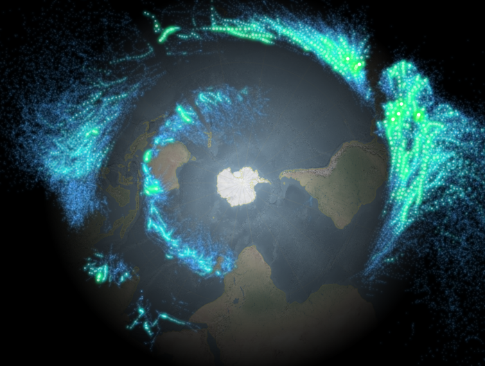
Cartography Inspirationator John Nelson made an awesome map of hurricanes and later posted detailed how-tos for ArcMap and recently ArcGIS Pro. Right after his first post I started rebuilding it in QGIS using draw effects for adding the colored outer glow instead of using image icons, adding a vignette on-the-fly and adjusting the background raster’s saturation on the fly. All in all, less manual work, more dynamic processing in QGIS. I quickly got frustrated though and gave up.
More than a year later (triggered by the new ArcGIS Pro how-to storymap) I revisited my draft and finished it. So here is the QGIS version. As no-one is paying me to write this, I currently cannot be arsed to make it as fancy as John’s posts. Sorry! :)
This project shows QGIS’ strength in features and struggle with performance. Also some bugs. I stopped working on this once I liked the looks. It is not optimized in any way. So this is just how I ended up doing it. You could do much better. I like proof of concepts. And short sentences.
Data sources (I host a lightning-fast mirror of Natural Earth at https://www.datenatlas.de/geodata/public/sources/www.naturalearthdata.com/ if downloads are 404 again…):
- NOAA: Allstorms.ibtracs_all_points.v03r09.shp
- Natural Earth: ne_110m_coastline.shp
- Natural Earth: ne_110m_graticules_20.shp
- Natural Earth: NE2_LR_LC_SR_W_DR.tif
That’s right, nothing but pure, unaltered geodata!
- Load the NE2_LR_LC_SR_W_DR.tif raster. Lower the saturation to about -50.
- Set your project’s projection to EPSG:3031 so that you get a nice polar viewpoint.
- Rotate the canvas by 150° because that’s what John did.
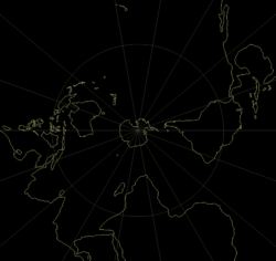
- Load the graticules. Use a rule-based style for ‘
"direction" = 'W' or "direction" = 'E' or "direction" is NULL‘ so that you get all longitudes but only the equator from the latitudes. Set the layer transparency to 60 or something like that. - Load the coastline.
- Add a vignette using this trick.
- Load the Allstorms.ibtracs_all_points.v03r09.shp Shapefile and then:
- Create a rule-based style with rules for the storm categories. I think I used this.
- Use white markers without outlines. Set their sizes using an expression on the wind speed or like me, manually to e.g. 0.7, 0.8, 1, 1, 1.6, 2 millimeters. This is something to play around with until it looks good.
- I used transparency for the markers of the lowest classes, 85% and 70%, the others are not transparent. This is something to play around with until it looks good. If I recall correctly I used transparency on the layer level here to keep the bubbly looks.
- By now you should be quite annoyed at how slow the rendering process is. >:) But wait, it gets much worse! :o)
- For each of the classes, enable draw effects on the markers.
- Set the source to use Addition blend mode. Set the source to be somewhat transparent, I used 50%, 80%, 80%, 50%, 40%, 0%. This is something to play around with until it looks good.
- Add outer glow and choose an appropriate color (Hint: Use a lot of saturation). Then play around with the spread, blur radius and transparency until it looks good. For some reason I ended up using 1mm/3/95%, 1mm/4/95%, 1mm/3/80%, 1.2mm/4/50%, 1.5mm/4/40%, 3mm/1/50%. Only now that I post this I realise how weirdly inconsistent this is and a quick test shows how irrelevant the blur radius changes are (except for the highest class). Oh well. It’s not fun to interate if you have to click so much and rendering that 40-50 seconds…
- That’s it! Done!
This was both fun and incredibly annoying. QGIS has the features but lacks in speed for this funky project (no wonder, blending 300,000 glowing points is not that nice). Here is a realtime video of how it rendered on my machine (take away some seconds from manually enabling the layers after another):
PS: Oh god this WordPress style sucks…


Pingback: A hurricane map in QGIS, from geodata and hacks – GeoNe.ws
Very nice. Thanks for sharing.