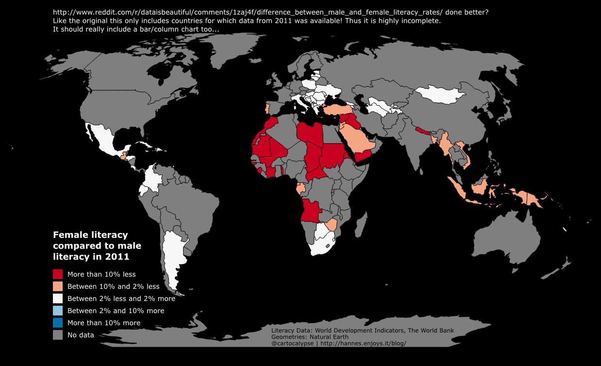
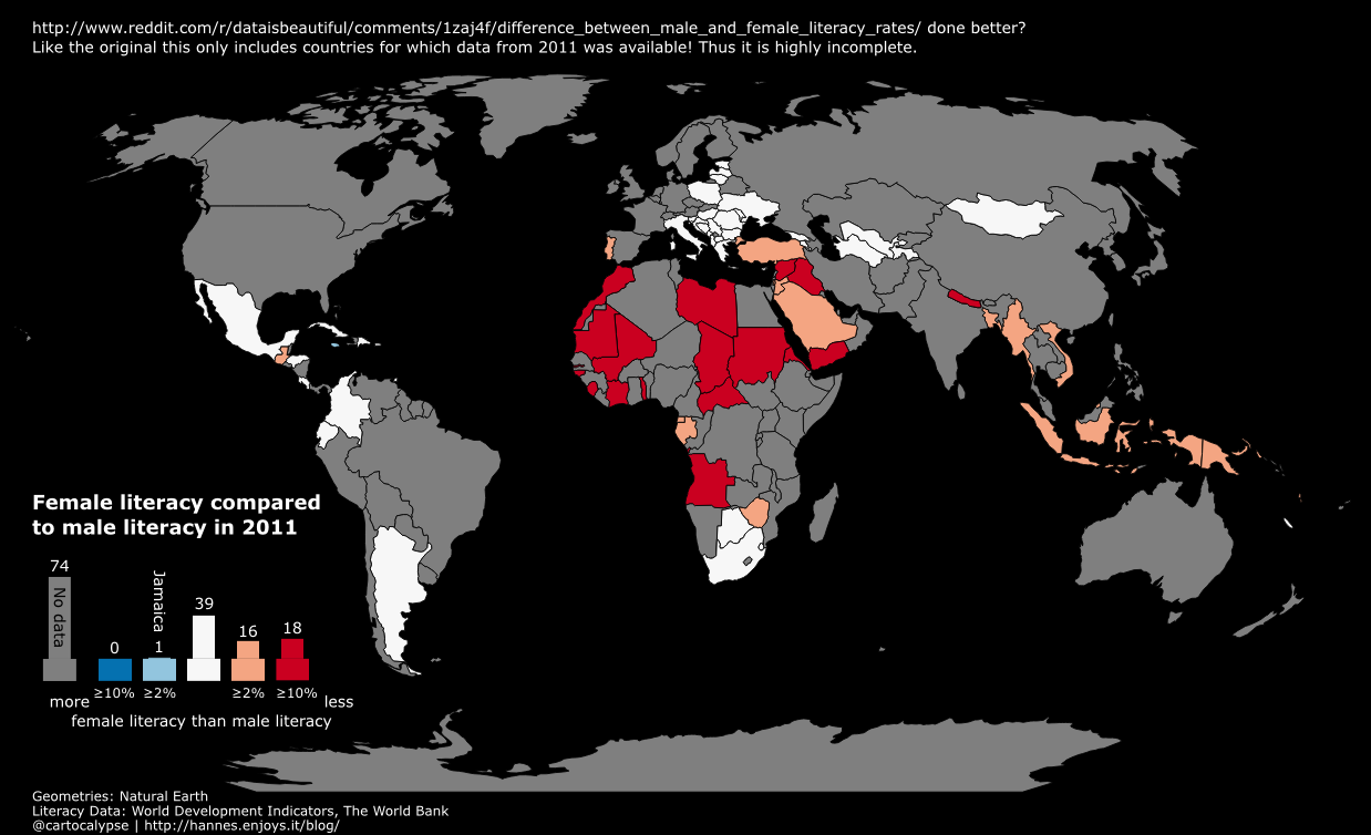
Wrote this in 2014, not sure why I did not publish it. It was a response to this bad map.

No need for expensive software, you can use the free and open-source QGIS for this: https://qgis.org/
1. Install QGIS
2. Download and unzip the data http://databank.worldbank.org/data/download/WDI_excel.zip (not sure what license, they want attribution “World Development Indicators, The World Bank”)
3. Download and unzip country geometries http://www.naturalearthdata.com/http//www.naturalearthdata.com/download/50m/cultural/ne_50m_admin_0_countries.zip (public domain but be nice and add attribution “Geometries from Natural Earth”)
4. Open QGIS, Layer -> Add Vector Layer -> choose ne_50m_admin_0_countries.shp
5. Unfortunately the csv is not simple, it has more than one row per country as it includes time series. And it does not have the value we want to map precalculated.
Afghanistan,AFG,"Literacy rate, adult female (% of females ages 15 and above)",SE.ADT.LITR.FE.ZS,,,,,,,,,,,,,,,,,,,,4.98746100000000E+00,,,,,,,,,,,,,,,,,,,,,,,,,,,,,,,,,, Afghanistan,AFG,"Literacy rate, adult male (% of males ages 15 and above)",SE.ADT.LITR.MA.ZS,,,,,,,,,,,,,,,,,,,,3.03077500000000E+01,,,,,,,,,,,,,,,,,,,,,,,,,,,,,,,,,, Afghanistan,AFG,"Literacy rate, adult total (% of people ages 15 and above)",SE.ADT.LITR.ZS,,,,,,,,,,,,,,,,,,,,1.81576800000000E+01,,,,,,,,,,,,,,,,,,,,,,,,,,,,,,,,,, Afghanistan,AFG,"Literacy rate, youth female (% of females ages 15-24)",SE.ADT.1524.LT.FE.ZS,,,,,,,,,,,,,,,,,,,,1.11428000000000E+01,,,,,,,,,,,,,,,,,,,,,,,,,,,,,,,,,, Afghanistan,AFG,"Literacy rate, youth male (% of males ages 15-24)",SE.ADT.1524.LT.MA.ZS,,,,,,,,,,,,,,,,,,,,4.57960200000000E+01,,,,,,,,,,,,,,,,,,,,,,,,,,,,,,,,,, Afghanistan,AFG,"Literacy rate, youth total (% of people ages 15-24)",SE.ADT.1524.LT.ZS,,,,,,,,,,,,,,,,,,,,3.00663500000000E+01,,,,,,,,,,,,,,,,,,,,,,,,,,,,,,,,,, |
This step is probably the hardest. I will use some Unix tools as I am used to them and they work well. Sorry! You can probably do this with a good texteditor or spreadsheet application as well.
We have “csvcut -c 2 WDI_Data.csv | uniq | wc -l” -> 253 -> 252 country codes (without the header). We have 6 lines per country for the literacy data. We should have at max 252 unique values per field then. TheZeitgeist only used data from 2011.
To make it more convenient to work, I first split off the Literacy data into a new file with
head -n 1 WDI_Data.csv > Literacy.csv; grep Literacy WDI_Data.csv >> Literacy.csv |
No idea if TheZeitgeist mixed Adult and Youth, let’s just use the Adult data for now.
head -n 1 WDI_Data.csv > Literacy_adult.csv; grep -E "Literacy rate, adult (fe)*male" Literacy.csv >> Literacy_adult.csv |
Next let’s isolate the data for 2011. csvcut seems to have a bug with numerically named columns so we have to use the field’s index (56) instead of its name “2011”.
csvcut -c 2,3,56 Literacy_adult.csv > Literacy_adult_2011.csv |
We need to get the data into one line per country, I am lazy so:
grep "Literacy rate, adult female" Literacy_adult_2011.csv > Literacy_adult_2011_female.csv grep "Literacy rate, adult male" Literacy_adult_2011.csv | sed 's/.*15 and above)",/,/' > Literacy_adult_2011_male.csv echo "Country Name,Country Code, Literacy Female, Literacy Male" > Literacy_adult_2011_oneline.csv; paste -d "" Literacy_adult_2011_female.csv Literacy_adult_2011_male.csv >> Literacy_adult_2011_oneline.csv |
Enough of that commandline mumbojumbo! QGIS time!
Natural Earth has a column named “wb_a3” which is the WB 3 letter country codes, yay!
toreal("Literacy_adult_2011_oneline_Literacy Female") - toreal("Literacy_adult_2011_oneline_Literacy Male")
Figure out the rest yourself. This is where I apparently lost interest in writing back then. ;)
—–
Now make the map better by choosing a projection that does not make Greenland as big as Africa. Also, I would try adding another “attribute” to the display, change the alpha value depending on the absolute literacy.
And finally realise that a map is not a good visualisation because you cannot see the values of tiny countries. Make a bar chart instead. ;)
