Author Archives: Hannes

Wie man eine bivariate Farbskala nicht erstellen sollte

Ich hatte diese Kritik im Rahmen des (wahnsinnig tollen) Daten-Labors 2015 nebenbei geäußert und dann aufgrund des Interesses versprochen meine Gedanken aufzuschreiben. Hier sind sie nun endlich.

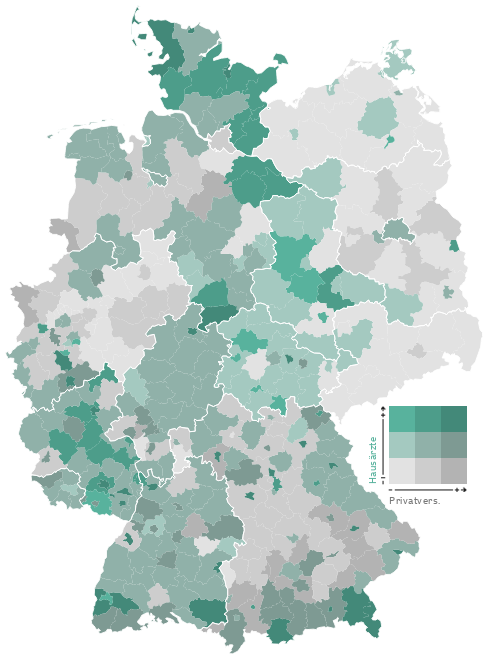
Geld zieht Ärzte an, so titelte die Zeit Online vor einigen Monaten über einer Recherche zum Verhältnis der räumlichen Verteilung von Ärzten im Vergleich mit verschiedenen demographischen Faktoren. Integraler Bestandteil des Artikels sind komplexe Karten und Diagramme. Die Redakteure versuchten sich an der Verwendung einer bivariaten Klassen-/Farb-Skala, doch leider ging die Wahl der Farben daneben, so dass das Endprodukt ineffektiv und irreführend ist. Es geht mir hier ausschließlich um die kartografische Darstellung. Zum Inhalt und der Datenanalyse kann ich nichts sagen!

zeit karte
karten-prinzip
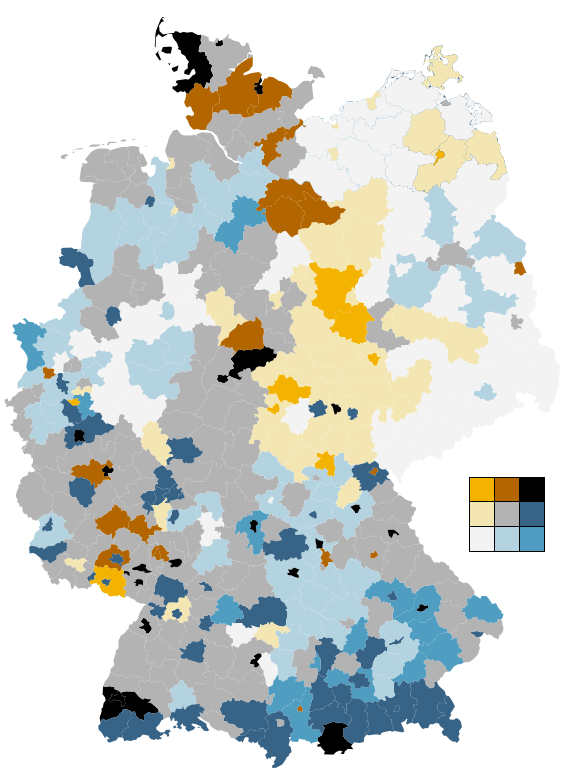
So funktionieren die Karten: Grau steht für Privatpatienten, Grün für Ärzte. Zu den drei Helligkeitsstufen (je dunkler, desto höher der Anteil der Privatversicherten) kommt die Farbe dazu (je intensiver, desto mehr Ärzte pro Einwohner) So ergeben sich neun verschiedene Werte für die Einfärbung der Karten.
Quelle: http://www.zeit.de/feature/gesundheit-arzt-privat-versicherung-praxis

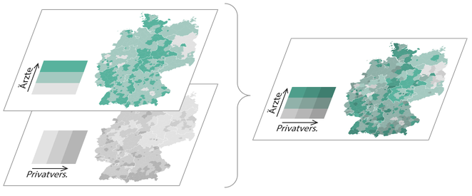
In einer bivariaten Skala wird das Verhältnis zweier Variablen zueinander/miteinander in vollem Detail dargestellt. Anstelle einer einzelnen Verhältniszahl sind hier mehrere Achsen im Gebrauch und damit die einzelnen Werte der Variablen nachvollziehbar. Solche Skalen sind in der Kartographie an sich nichts neues, werden allerdings (aufgrund der Komplexität meiner Meinung nach zu Recht) eher selten verwendet. Im Frühjahr 2015 veröffentlichte Joshua Stevens einen fantastischen Artikel, dessen Lektüre ich vor dem Weiterlesen sehr empfehle.

Joshua zeigt dort, wie aus den jeweiligen Farbskalen der beiden Attribute eine gemischte “Matrix” entsteht. Die Diagonale wird hierbei zu einem neuen sequenziellen Farbverlauf, der das neutrale Verhältnis der Variablen anzeigt. Die Farbskalen müssen dementsprechend mit Bedacht gewählt werden, so dass sich bei ihrer Vermischung eine sinnvolle, geordnete und “eigenständige” Skala entsteht.

js_bivariateMix
js_bivariatePaths
Quelle: http://www.joshuastevens.net/cartography/make-a-bivariate-choropleth-map/

In Joshuas Beispiel sind (relativ) klar differenzierbar und identifizierbare Achsen entstanden, die dem Kartenbetrachter (mit etwas Anstrengung) ermöglichen, die Karte korrekt zu interpretieren. Man kann anhand der Farbe das jeweilige Verhältnis und die absoluten Werte lesen. Die Farbachsen sind intuitiv korrekt sortierbar.

Wie sieht es mit dem Farbschema der Zeit aus? Leider nicht gut.

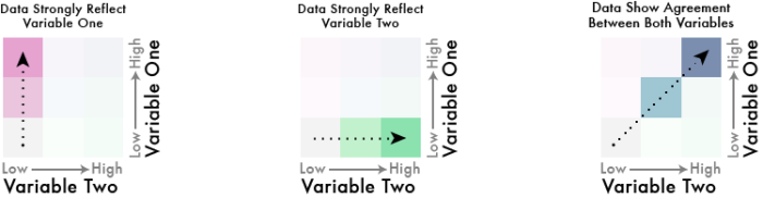
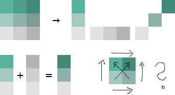
Die Redakteure wählten für die eine Variable einen Farbverlauf von Grau nach Grün, für die andere einen von Grau nach Dunkelgrau (siehe oben). Die diagonale Farbskala entsteht also aus der Vermischung von Grün und Grau. Was passiert, wenn man Grün und Grau mischt? Man bekommt Farbtönen zwischen Grün und Grau… Die Farben auf der Diagonalen werden also sehr ähnlich zu zumindest einer der Hauptachsen. Damit zeigen sich Farben im Kartenbild, deren Ordnung der Betrachter unmöglich intuitiv und auch mithilfe der Legende kaum mental durchführen kann. Und genau das können wir hier sehen:

zeit karte exploded

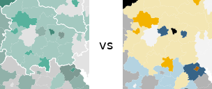
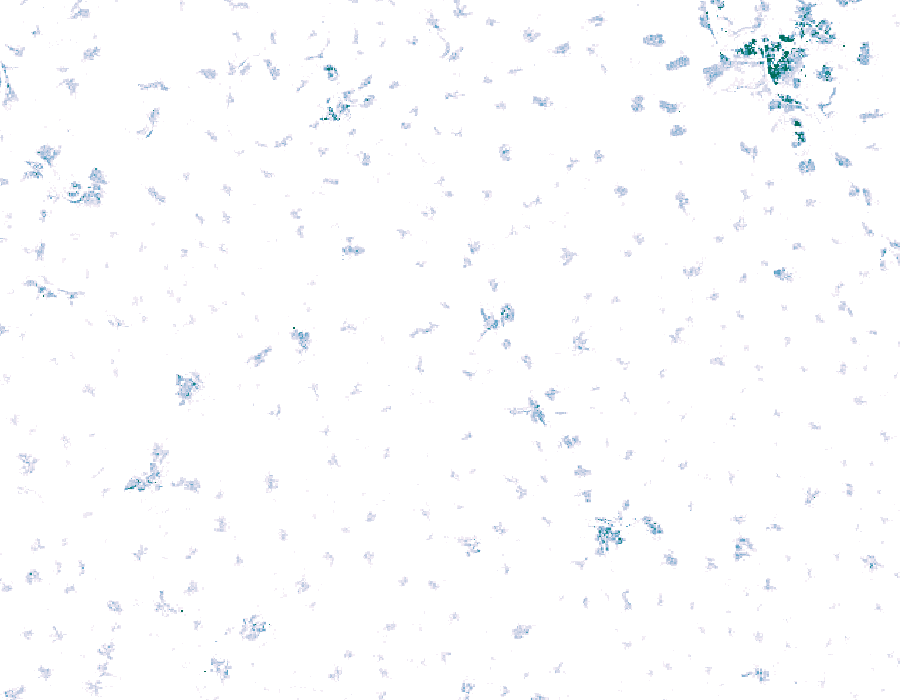
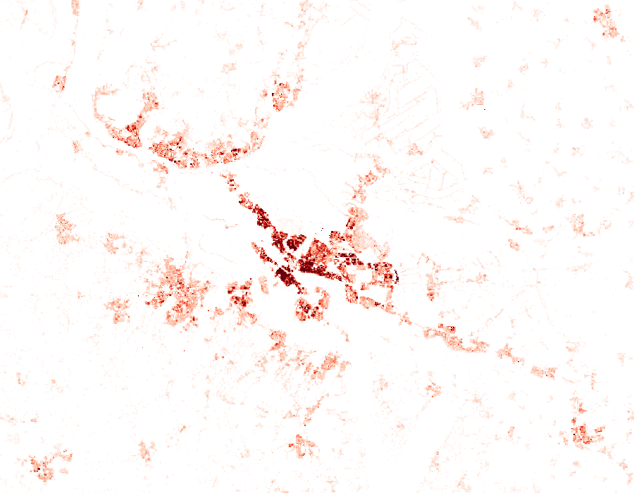
Als kleine Demonstration wieviele Details und Strukturen tatsächlich in den Daten stecken, habe ich einfach mal eine bivariate Farbskala von Cynthia Brewer auf die Daten geworfen. Achtung: Ich habe die Klassen nicht genau so legen können (Faulheit), wie sie in der Ursprungskarte vorliegen! Grundsätzlich dürfte die Aussage der Karte aber stimmen. Die Ästhetik steht erstmal an zweiter Stelle. ;)

1iNCPHg

zeit karte vs

UTM coordinate grids of Hamburg

The coordinates are wrong, I should have be xmin and ymin to match the official grid. Will update the PDFs soonish, sorry!

The LGV offers their official UTM grid for Hamburg in the Transparenzportal. Since many datasets are indexed by those grid tiles, it can be handy to have a quick references. Queue QGIS!

Load the layers “utm_raster1km any” and “utm_raster2km any” of the GML file. The CRS is EPSG:25832. Set their styles to have no fill.

Label with substr(x_min($geometry),0,4) || '\n' || substr(y_min($geometry),0,5) to truncate the coordinate display to just the interesting bits, the three leading numbers of X and the four leading numbers of Y.

Print them. You now have nice maps of the grid that you can use as reference when browsing through files with names like dgm1_32552_5936_2_fhh.xyz, LoD1_571_5939_1_HH.xml or dop20c_32576_5953.jpg (ignore the leading 32…).

I added the Stadtteile as background (and Wished QGIS could style by the 4 color theorem).

Click to download PDFs (they should be DIN A4, ask the composer why they are not):
1km2km

Converting coordinates with cs2cs

In the spirit of Blog Little Things and after reading WEBKID’s You Might Not Need QGIS earlier, here you go:

So you have thousands or millions of coordinates in “the wrong” or “that stupid” coordinate reference system and want to convert them to “the one you need”? Easily done with proj‘s cs2cs tool. You feed it a list of coordinates and tell it how you want them transformed and put out.

Let’s say you have these crazy accurate super coordinates in EPSG:4326 (WGS84) in a file called MyStupidCoordinates.txt (for example from copying columns out of Excel).


9.92510775592794303 53.63833616755876932
9.89715616602172332 53.61639299685715798
9.91541274879985579 53.63589289755918799
9.91922922611725966 53.63415202989637010
9.92072211107566382 53.63179675033637750
9.89998015840083490 53.62284810375095390
9.90427723676020832 53.60740624866674153
9.95012889485460583 53.64563499608360075
9.89590860878436196 53.62979225409544171
9.92944379841924452 53.60061248161031955

and you want them in the much superior and wonderfully metric EPSG:25832 (ETRS89 / UTM zone 32N). You simply use +init=sourceCRS +to +init=targetCRS. if you have no idea what CRS your coordinates are in, enjoy 5 minutes with http://projfinder.com/ and you will either know or you might want to take a walk (don’t forget to try them flipped though).

cs2cs +init=epsg:4326 +to +init=epsg:25832 MyStupidCoordinates.txt

and it will print


561164.00 5943681.64 0.00
559346.79 5941216.81 0.00
560526.52 5943401.54 0.00
560781.36 5943211.12 0.00
560883.46 5942950.37 0.00
559524.51 5941937.29 0.00
559830.54 5940223.00 0.00
562807.40 5944515.43 0.00
559245.50 5942706.43 0.00
561505.49 5939488.65 0.00

You probably want more decimal places though, since your input coordinates were accurate down to the attodegree. For this, you can specify the output format with -f

cs2cs +init=epsg:4326 +to +init=epsg:25832 -f "%.17f" MyStupidCoordinates.txt


561164.00100000295788050 5943681.64279999211430550 0.00000000000000000
559346.79200000269338489 5941216.80899999570101500 0.00000000000000000
560526.52400000276975334 5943401.53899999428540468 0.00000000000000000
560781.36300000245682895 5943211.12199999392032623 0.00000000000000000
560883.46400000224821270 5942950.37499999348074198 0.00000000000000000
559524.51200000231619924 5941937.29399999510496855 0.00000000000000000
559830.54200000269338489 5940223.00299999490380287 0.00000000000000000
562807.39800000295508653 5944515.43399999290704727 0.00000000000000000
559245.50000000221189111 5942706.42899999395012856 0.00000000000000000
561505.48800000257324427 5939488.65499999187886715 0.00000000000000000

Perfect!

You could direct these transformed coordinates into a new file called MyCoolCoordinates.txt by adding a redirection of its output:

cs2cs +init=epsg:4326 +to +init=epsg:25832 MyStupidCoordinates.txt > MyCoolCoordinates.txt

You can find out more about cs2cs by reading its manpage:

man cs2cs

PS: You can handle that Z coordinate, right?

Fancy shaded and scaled contour lines in QGIS

Daniel P. Huffman shared this gorgeous map earlier. ArcMap just got the functionality to create such contour lines.

CFnWnA5UkAAuFm9

Naturally I had to try to re-create that style in QGIS. I semi-succeeded:

You have a DEM, eg mtsthelens_after.zip. Generate a hillshade from DEM. Generate contour lines from DEM.
dem hillshade contours

Split the lines by segment, for example with the “Network” plugin. Select all features on your layer and then use its “Split” function.
Calculate the azimuth of each line. See this magical formula (I wish QGIS would have a function ready).
Rotate the angle according to your hillshade light angle. For example:
CASE
 WHEN ("azimuth"+270) > 360
  THEN ("azimuth"+270-360)/500
 ELSE ("azimuth"+270)/500
END

And use that to scale your lines’ widths (the 500 is a constant factor here to get them small enough).

Disable all layers but hillshade and contour lines.
Move hillshade above contour lines.
Set map background to black (equals 0 in the blending multiplication later).
Use black to white as color ramp for the hillshade.
Set hillshade’s blending mode to multiply.
You now have the bright parts of the contour lines. Unfortunately QGIS does not yet support blending modes for whole groups so you will have to combine this with the next step in a raster graphics tool of your choice. Gimp works fine.
Take a screenshot of something.

Invert hillshade color ramp to white to black.
Rotate your angle by 180 (so it would be 90 instead of 270 in the example above).
You now have the dark lines.
Take another screenshot.
conscalehilmul270 conscalehilmul90
Add both images to a image in Gimp, Color to Alpha with black, invert the dark one, choose nice background, done!

scaled line width

This is still pretty rough as it’s mostly hack after hack and not “done properly”™. The blending adds some shadows where there should not be. In a way the lines end up being same width because of this. The scaling was done arbitrarily, there is probably some smart way with a better scale. Some fancy smoothing of the lines would look great. Coloring the areas between the lines would probably improve it as well. Once QGIS gets support for blending modes of groups, this will be much easier.

Merge GML files into one SQLite or Spatialite file

For example the buildings in Hamburg, Germany:

layer=$1
for file in *.xml
do
 if [ -f "${layer}".spatialite ]
 then
  ogr2ogr -f "SQLite" -update -append "${layer}".spatialite "${file}" "${layer}" -dsco SPATIALITE=YES
 else
  ogr2ogr -a_srs EPSG:25832 -f "SQLite" "${layer}".spatialite "${file}" "${layer}" -dsco SPATIALITE=YES
 fi
done

Remove the -dsco SPATIALITE=YES and change the output filename for SQLite. QGIS can work with both.

$ bash mergexmltospatialite.sh AX_Gebaeude

Be aware that Spatialite is much more sensitive to geometric problems. You might get things like

ERROR 1: sqlite3_step() failed:
ax_gebaeude.GEOMETRY violates Geometry constraint [geom-type or SRID not allowed] (19)
ERROR 1: ROLLBACK transaction failed: cannot rollback - no transaction is active
ERROR 1: Unable to write feature 1712 from layer AX_Gebaeude.

ERROR 1: Terminating translation prematurely after failed translation of layer AX_Gebaeude (use -skipfailures to skip errors)

but on the other hand, you get spatial indexing which makes queries or high zoom interaction much quicker.

Be aware that if you try to merge files into a Shapefile and fields are getting truncated, those fields will only be filled with data for the first file you merge. On the later files OGR will try to match the input field names to the merged file’s fieldnames, notice the difference and discard them. If you still want to convert to Shapefiles, check out the -fieldTypeToString IntegerList,StringList options.

A GeoTIFF of the German 2011 census population density

tl;dr: GMT is documented for people who use it since the 80s.

update 2: You can use gmtinfo to calculate the extents, using -I- will make it output the -R parameter! xyz2grd $(gmtinfo -I- *.xyz) ...

update: xyz2grd supports GeoTIFF via its GDAL driver (now?)! For example -Gfile.tif=gd:GTiff. See eg http://gmt.soest.hawaii.edu/doc/5.2.1/grdconvert.html. So the way below is overly complicated. I do not know how to apply the advanced settings of GDAL though like compression and prediction etc.

zensus2011_berlinzensus2011_irgendwozensus2011_bremen

The Statistische Ämter des Bundes und der Länder offer a 100 meter grid of Germany’s population density: csv_Bevoelkerung_100m_Gitter.zip (110MB). Datensatzbeschreibung_Bevoelkerung_100m_Gitter.xlsx provides additional information.

Let’s turn that dataset into a GeoTIFF so we can use it in our GIS. We will use free and open-source tools from GMT and GDAL. GDAL loves to interpolate values but our data is discrete/regular. We do not want any kind of interpolation. So xyz2grd from GMT is the best choice for turning the xyz data into a “continuous” GIS format (tell me if not).

Getting to know the data

Inside the zip is a 1.3GB file Zensus_Bevoelkerung_100m-Gitter.csv with about 36 million lines.

Gitter_ID_100m;x_mp_100m;y_mp_100m;Einwohner
100mN26840E43341;4334150;2684050;-1
100mN26840E43342;4334250;2684050;-1

100mN27407E44044;4404450;2740750;3
100mN27407E44045;4404550;2740750;31
100mN27407E44046;4404650;2740750;13
100mN27407E44047;4404750;2740750;14
100mN27407E44048;4404850;2740750;10

Datensatzbeschreibung_Bevoelkerung_100m_Gitter.xlsx says the coordinates are in ETRS89-LAEA Europe – EPSG:3035.

First we need to find out the geographic extends of the data, you could use your favourite cli tools for that, I wrote a quick .vrt file and used ogrinfo on that:

$ cat Zensus_Bevoelkerung_100m-Gitter.csv.vrt

<OGRVRTDataSource>
 <OGRVRTLayer name="Zensus_Bevoelkerung_100m-Gitter">
  <LayerSRS>EPSG:3035</LayerSRS>
  <SrcDataSource>Zensus_Bevoelkerung_100m-Gitter.csv</SrcDataSource>
  <GeometryType>wkbPoint</GeometryType>
  <GeometryField encoding="PointFromColumns" x="x_mp_100m" y="y_mp_100m" />
 </OGRVRTLayer>
</OGRVRTDataSource>

$ ogrinfo -al Zensus_Bevoelkerung_100m-Gitter.csv.vrt

INFO: Open of `Zensus_Bevoelkerung_100m-Gitter.csv.vrt’ using driver `VRT’ successful.

Layer name: Zensus_Bevoelkerung_100m-Gitter
Geometry: Point
Feature Count: 35785840
Extent: (4031350.000000, 2684050.000000) – (4672550.000000, 3551450.000000)

Creating a netcdf/grd file from the xyz data with xyz2grd

xyz2grd wants xyz, nothing else. The Gitter_ID_100m column is redundant in any case, you can calculate it yourself from the x and y fields if needed. So first let’s convert it to a “x y z” format with awk. The separator is ;

awk 'FS=";" {print $2" "$3" "$4}' Zensus_Bevoelkerung_100m-Gitter.csv > Zensus_Bevoelkerung_100m-Gitter.xyz

Now we can write our xyz2grd commandline.

We have our extends:
-R4031350/4672550/2684050/3551450

We know the spacing is 100 units (meters):
-I100

There is one header line:
-h1

And of course we know that we want a “classic” netcdf4 chunk size, whatever that means. We knew that right away, not after googling helplessly for an hour and eventually finding the hint on some mailing list. Not knowing this might have lead to QGIS only seeing NaN values for z, R’s ncdf/raster saying “Error in substr(w, 1, 3) : invalid multibyte string at ‘<89>HDF” and GDAL “0ERROR 1: nBlockYSize = 130, only 1 supported when reading bottom-up dataset”.
--IO_NC4_CHUNK_SIZE=c

The resulting commandline:
xyz2grd -Vl -R4031350/4672550/2684050/3551450 -I100 -h1 --IO_NC4_CHUNK_SIZE=c -GZensus_Bevoelkerung_100m-Gitter.cdf Zensus_Bevoelkerung_100m-Gitter.xyz

You can inspect the file with grdinfo and gdalinfo now if you want.

Creating a GeoTIFF from the netcdf/grd file

Let’s turn it into a GeoTIFF with gdal_translate. We will need a bunch of commandline parameters.

The spatial reference system is EPSG:3035, so:
-a_srs EPSG:3035

Values of -1 mean “no data”:
-a_nodata -1

TIFF is uncompressed by default, we want good lossless compression:
-co COMPRESS=DEFLATE

The resulting commandline:
gdal_translate -co COMPRESS=DEFLATE -a_srs EPSG:3035 -a_nodata -1 Zensus_Bevoelkerung_100m-Gitter.cdf Zensus_Bevoelkerung_100m-Gitter.tif

The resulting file is about 8 Megabytes and should work in any reasonable GIS. Have fun!

Downloads

http://hannes.enjoys.it/opendata/Zensus_Bevoelkerung_100m-Gitter.tif
TODO: What license is this now?

zensus2011_hamburg
zensus2011_altersheimzensus2011_schrebergärten

Feinstaub zum Jahreswechsel 2014/2015

Auf den großartigen Seiten des Hamburger Luftmessnetz kann man schöne Diagramme der verschiedenen Messwerte sehen, zum Beispiel von Feinstaub: PM10 oder PM2,5. Leider kann man nicht auf Diagramme sämtlicher Stationen verlinken, stattdessen muss der Benutzer sie per Hand zusammenstellen. Weil ich die Kurven gerne auf /r/dataisbeautiful verlinken wollte und die neuen Regeln dort etwas eigen sind, habe ich die Diagramme einfach mal mit Gnumeric nachgebaut.

Erstmal die Teilchen mit einem aerodynamischen Durchmesser von weniger als 10 Mikrometer (10 µm), PM10. Hiervon darf 35 mal Im Jahr ein Tagesmittelwert von 50µg/m³ überschritten werden.

Feinstaub in Hamburg, Silvester 2014_2015 PM10

Und dann noch die fieseren PM2,5 (kleiner 2,5µm), diese werden nur an drei Stationen gemessen:

Feinstaub in Hamburg, Silvester 2014_2015 PM2,5

In Berlin gibt es diese Werte leider nur täglich, aber der Feinstaub-Monitor der Berliner Morgenpost ist einen Blick wert (auch wenn er leider 2014 zu Ende gegangen ist?).

English version: This image shows the amount of particulate matter with a diameter of 10 micrometres or less in the days before and during new year 2014/2015 in Hamburg, Germany. This image shows the amount of particulate matter with a diameter of 2.5 micrometres or less.

Auch bundesweit gibt es schöne Werte, leider nur täglich. Das Umweltbundesamt stellt interpolierte Karten bereit, ich hab die letzten vier Tage mal zusammengefasst:
Feinstaub in Deutschland, Silvester 2014_2015

Schade, dass die Farbskala ein fixes Maximum hat, die Werte lagen ja wohl eher über 50µg/m³.

Wie auch immer, frohes neues!

Wunschzettel für das Hamburger Transparenzportal

Lieber Transparenzmensch, ich wünsche mir für das Hamburger Transparenzportal:

  • Dateien sollten sinnvoll benannt werden. Kreuzungsskizzen.zip mag im originalen Kontext funktionieren, aber ohne Datum, Herkunft oder Readme ist das Archiv für sich nicht sehr offensichtlich. Dass die Dateien darin dann zum Beispiel Poldata_poly.gml heißen, hilft dem Unkundigen nicht wirklich weiter. Mithilfe von Namespaces, zum Beispiel der veröffentlichenden Stelle, dem Datum usw wären lesbare, informative Dateinamen möglich.
  • Jede heruntergeladene Datei sollte auf irgendeine Weise Informationen über ihre Herkunft und Lizenz beinhalten. Bei Archiven wäre dies einfach über eine Textdatei mit demselben Namen möglich. Am besten auch noch gleich die Herkunfts-URL(s) mit rein. Ja, auch CSV-Dateien können mehr als Daten enthalten, einfach ein paar Headerzeilen rein und fertig.
  • Mehr Daten, weniger PDFs bitte. Du könntest doch bestimmt auch viel besser arbeiten, wenn alle Kinder ihre Wunschzettel standardisiert als Textdateien oder schönen strukturierten, freien Formaten einreichen würden oder?
  • Weniger Javascript, mehr Performanz für das Transparenzportal.
  • Mehr Homogenität in den Metadaten. Baugenehmigungen haben schöne beschreibende Titel, öffentliche Beschlüsse dagegen sind “total langweilige Nummern”.
  • Sortierung nach dem Datum der Daten, nicht nur der Veröffentlichung.
  • Eine schöne Einführung in die API, mit vielen Beispielen und Codeschnipseln.
  • Volltextsuche in allen Dokumenten, nicht nur den Metadaten im Portal. Ja, das wäre wirklich schön…
  • Redundanz! Die Downloads sollten redundant (und performant) vorgehalten werden, es nervt etwas, wenn man 10 Gigabyte Luftbilder mit 500 Kilobytes/s herunterladen muss oder wegen Wartungsarbeiten nicht an die Daten kommt.
  • Jeder Eintrag sollte einen direkten Link zum Download haben.
  • Jede Datei sollte mit einem Hash veröffentlicht werden (SHA1 oder SHA256 oder sowas). Änderungen von Daten müssen offensichtlich gemacht und dokumentiert werden. Daten dürfen nicht “heimlich” geändert werden, auch wenn es nur der erneute Upload eines defekten Archivs ist.
  • Und sag mir doch bitte unter welcher Lizenz die Texte und Grafiken im Transparenzportal selbst verfügbar sind?

Wie auch immer, ich danke dir für die vielen Stunden, die ich mit deinen Datengaben dieses Jahr schon spielen konnte. Schenkst du uns nächstes Jahr die Verpflichtung der Anstalten öffentlichen Rechts zur Veröffentlichung? Die drücken sich im Moment noch. Und sag bitte dem Bundestransparenzmenschen, dass die MTS-K-Daten doch nun wirklich einfach freigegeben werden sollten. Das wäre auch für die dortigen Mitarbeiter eine enorme Arbeitsentlastung.

Partial 3D model of Comet 67P/Churyumov-Gerasimenko through photogrammetry

The ESA asked people to use their imagery of the Comet 67P/Churyumov-Gerasimenko. They released an archive of photos under the CC BY-SA. I took them, threw them into a trial version of Agisoft Photoscan and generated a textured mesh in it. I then exported it as .obj-model, loaded it in Blender and exported it to a WebGL scene with blend4web. In other words, I just threw some programs at it.

67p_photoscan_blend2web

You can see the result in your browser at http://hannes.enjoys.it/geo/67p.html (~7 Megabytes). Be aware that while I used a lower quality version for this web version, the higher quality versions I tried were not actually that much “better”. The quality is limited by the resolution of the imagery and of course the fact that we do not have full coverage of a well-lit comet. Still totally fascinating and lots of fun to try.

You can download a higher quality .obj at http://hannes.enjoys.it/geo/67p.7z (~12 Megabytes), you can import that straight into Blender.

Now could someone turn the VisualSFM suite into something that is fun to use on Linux so I can try without Photoscan? ;)

PS: I should add that I have not used Photoscan without ground control points for a completely foreign object before. Someone with more experience should be able to get a better result out of it. If you do and you read this, please share your wisdom!

“Commandline File Hosts”

These are the “terminal to URL” file hosts I know. Please tell me about others. The speed tests are not scientific at all, my servers might be uncapable of better speeds because of saturation or bad routing.

https://transfer.sh/

curl --upload-file "01_Name_Game_(Intro).mp3" https://transfer.sh/

Maximum Filesize: 5 Gigabytes
Expiration after: 2 weeks
Uses HTTPS!
Serves error 500 for non-existing files. Does not serve direct downloads anymore. Bleh.
Download URLs are modeled after your original filename (“special” characters are replaced): https://transfer.sh/SGNl/01-name-game-intro.mp3
1GB.zip upload: ~30-110 Megabit/s
1GB.zip download: ~240 Megabit/s

http://curl.io/

curl -F "file=@01_Name_Game_(Intro).mp3" http://curl.io/send/abcd1234

Maximum Filesize: 20 Gigabytes
Expiration after: 4 hours
Requires you to visit their website to get a key (URL) assigned.
Download URLs are random and but it serves original filename with content-disposition: http://curl.io/get/kegcxfza/85866a9bcfaf6f8eccab136238c07f659d580b25
1GB.zip upload: ~60-75 Megabit/s
1GB.zip download: 100 Megabit/s

http://chunk.io

curl --upload-file 01_Name_Game_\(Intro\).mp3 chunk.io

Maximum Filesize: 50 Megabytes
Expiration after: 6 months
They might increase filesize and expiration if there is enough interest, as of now you can not “sign-up” for those.
Download URLs are unreadable, filenames are lost: http://chunk.io/f/afb01d527ceb4d03b9bf9e62bb32263e
1GB.zip upload: ~8 Megabit/s (until it errored :) )

http://purrrl.link/
Requires sign-up.