Category Archives: qgis

#30DayMapChallenge: Day 3 – Polygons OR Lego® style brick raster in QGIS using Geometry Generator expressions

I showed this at the annual meeting of the swiss user group in June 2019 and promptly forgot to post it for everyone to see. Let’s blame the scenery?

Have a raster.

Processing -> Create Grid, covering it with points in a spacing of your choice. Use the same CRS as your raster (unless you want to figure out expression-based geometry transformations on your own, like in my elevation lines code)

Change the Symbol layer type to Geometry Generator and enter

with_variable(
  'radius',
  3333,
  buffer($geometry, @radius, 16)
)

where radius should be a value about one third of your spacing.

You should see circles!

For the fill color use this expression and adjust the name of your raster layer:

with_variable(
    'raster_layer',
    'DHM200.xyz',
    ramp_color('Blues',  -- change to an other named ramp here if you like
        scale_linear(
            raster_value(
                @raster_layer, 1, 
                centroid($geometry)  -- back to our point
            ),
            raster_statistic(
                @raster_layer, 1, 
                'min'
            ),
            raster_statistic(
                @raster_layer, 1, 
                'max'
            ),
            0, 1  -- new scale as color ramps go 0 to 1
        )
    )
)

This will get the raster value below our grid point and fit it onto a color ramp between the min and max of all the raster values.

For the stroke use the same expression but wrap darker(..., 150) around it so you get a darker color.

Using Draw Effects add a small Drop Shadow to your circles. I used an offset of 0.5 mm and a blur radius of 1 mm.

Now add another Geometry Generator symbol layer below your existing one and use the following expression:

bounds(buffer($geometry, 5000))

with_variable(
  'radius',
  5000,
  bounds(
    buffer($geometry, @radius)
  )
)

with the radius being half your grid spacing.

Use the same expressions for the colors as above but set the darker value to 200.

For some more fanciness maybe add a “QGIS” text on top of the nupsies?

Exercise: Make it so that the result perfectly covers the raster, instead of being one grid cell off like mine.

Thanks Topi.

#30DayMapChallenge: Day 2 – Lines

Thanks Topi.

Addresses in Hamburg: http://suche.transparenz.hamburg.de/dataset/alkis-adressen-hamburg15

Convert the housenumber from string to integer: to_int("hausnr")

Processing -> Points to Path using above housenumber as order field and strname as group field.

Color those ziggyzaggety lines as you like.

Maybe explode the lines and style each segment by its housenumber?

And put them on an interactive slippy map.

Dynamic elevation profile lines as QGIS geometry generator

Load a raster layer in QGIS.

Add a new Scratch Layer of Polygon type (in any CRS). Set its Symbology to Inverted Polygons. Use a Geometry Generator as symbol layer type. Set it to LineString/MultiLineString. Enter the expression below and adjust the layer ID (best enter the expression editor and find it in the “layers” tree). Then adjust the scaling factor at the very bottom.

-- UPPER CASE comments below are where you can change things

with_variable(
	'raster_layer',
	'long_and_complicated_layer_id',  -- RASTER LAYER to sample from
	-- this collects all the linestrings generated below into one multilinestring
	collect_geometries(
		-- a loop for each y value of the grid
		array_foreach(
			-- array_foreach loops over all elements of the series generated below
			-- which is a range of numbers from the bottom to the top of y values
			-- of the map canvas extent coordinates.
			-- the result will be an array of linestrings
			generate_series(
				y(@map_extent_center)-(@map_extent_height/2), -- bottom y
				y(@map_extent_center)+(@map_extent_height/2),  -- top y
				@map_extent_height/50  -- stepsize -> HOW MANY LINES
			),
			
			-- we want to enter another loop so we assign the name 'y' to
			-- the current element of the array_foreach loop
			with_variable(
				'y',
				@element,
				
				-- now we are ready to generate the line for this y value
				make_line(
					-- another loop, this time for the x values. same logic as before
					-- the result will be an array of points
					array_foreach(
						generate_series(
							x(@map_extent_center)-(@map_extent_width/2), -- left x
							x(@map_extent_center)+(@map_extent_width/2),  -- right x
							@map_extent_width/50  -- stepsize -> HOW MANY POINTS PER LINE
						),
						-- and here we create each point of the line
						make_point(
							@element,  -- the current value from the loop over the x value range
							@y  -- the y value from the outer loop
							+   -- will get an additional offset to generate the effect
							-- we look for values at _this point_ in the raster, and since
							-- the raster might not have any value here, we must use coalesce
							-- to use a replacement value in those cases
							coalesce(  -- coalesce to catch raster null values
								raster_value(
									@raster_layer,
									1,  -- band 1, *snore*
									-- to look up the raster value we need to look in the right position
									-- so we make a sampling point in the same CRS as the raster layer
									transform( 
										make_point(@element, @y),
										@map_crs,
										layer_property(@raster_layer,'crs')
									)
								),
								0  -- coalesce 0 if raster_value gave null
							-- here is where we set the scaling factor for the raster -> y values
							-- if things are weird, set it to 0 and try small multiplications or divisions
							-- to see what happens.
							-- for metric systems you will want to multiply
							-- for geographic coordinates you will want to divide
							)*10  -- user-defined factor for VERTICAL EXAGGERATION
						)
					)
				)
			)
		)
	)
)  -- wee

If you don’t have your raster data on a SSD this can be a bit slow.

Yes, this works if you change your CRS!

Anaglyph 3D contour lines

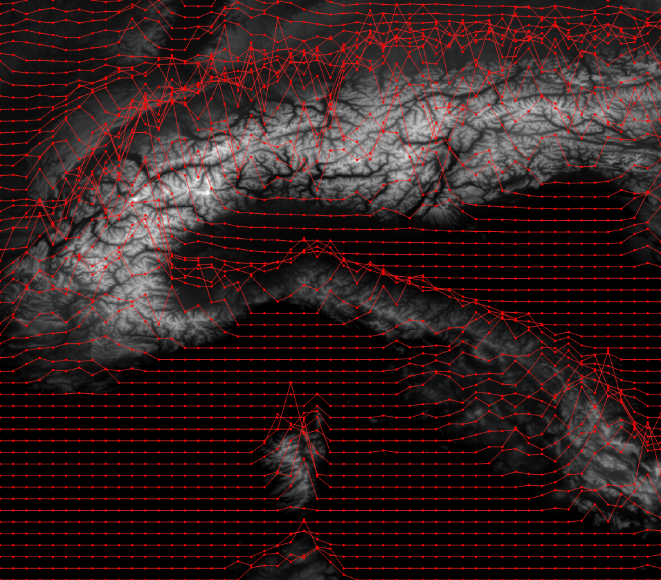
A slight misunderstanding about a weird pattern I posted to Twitter earlier made me wonder how easy it might be to present elevation data with real depth ™ as anaglyph 3D in QGIS. Anaglyph 3D, you know, those red and cyan glasses that rarely ever worked.

You might remember my post on fake chromatic aberration and dynamic label shadows in QGIS some months ago. Maybe with some small adjustments of the technique…?

Wikipedia has an detailed article on the topic if you are interested. It boils down to: One eye gets to see not the red but the cyan stuff. The other sees the red but not the cyan. By copying, coloring and shifting elements left-right increasingly the human vision gets tricked into seeing fake depth.

Got your anaglyph glasses? Oogled some images you found online to get in the mood? Excellent, let’s go!

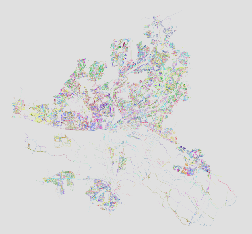
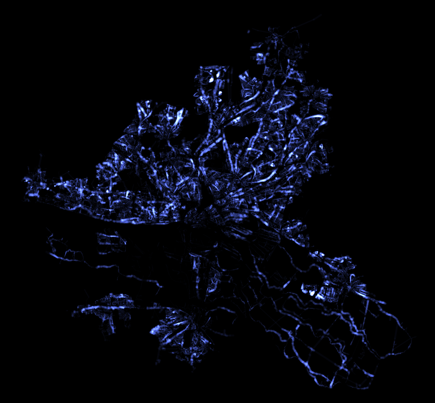
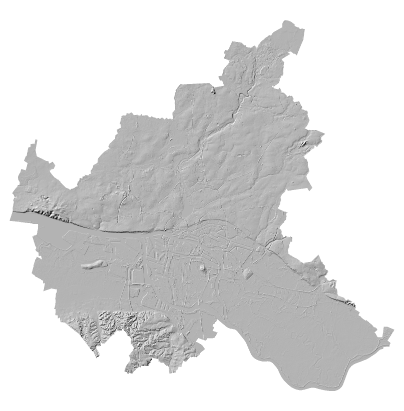
Get some DEM data. I used a 10 meter DEM of Hamburg and a 200 meter DEM of Germany for testing. Make sure both your data and your project/canvas CRS match or you have a hard time with the math.

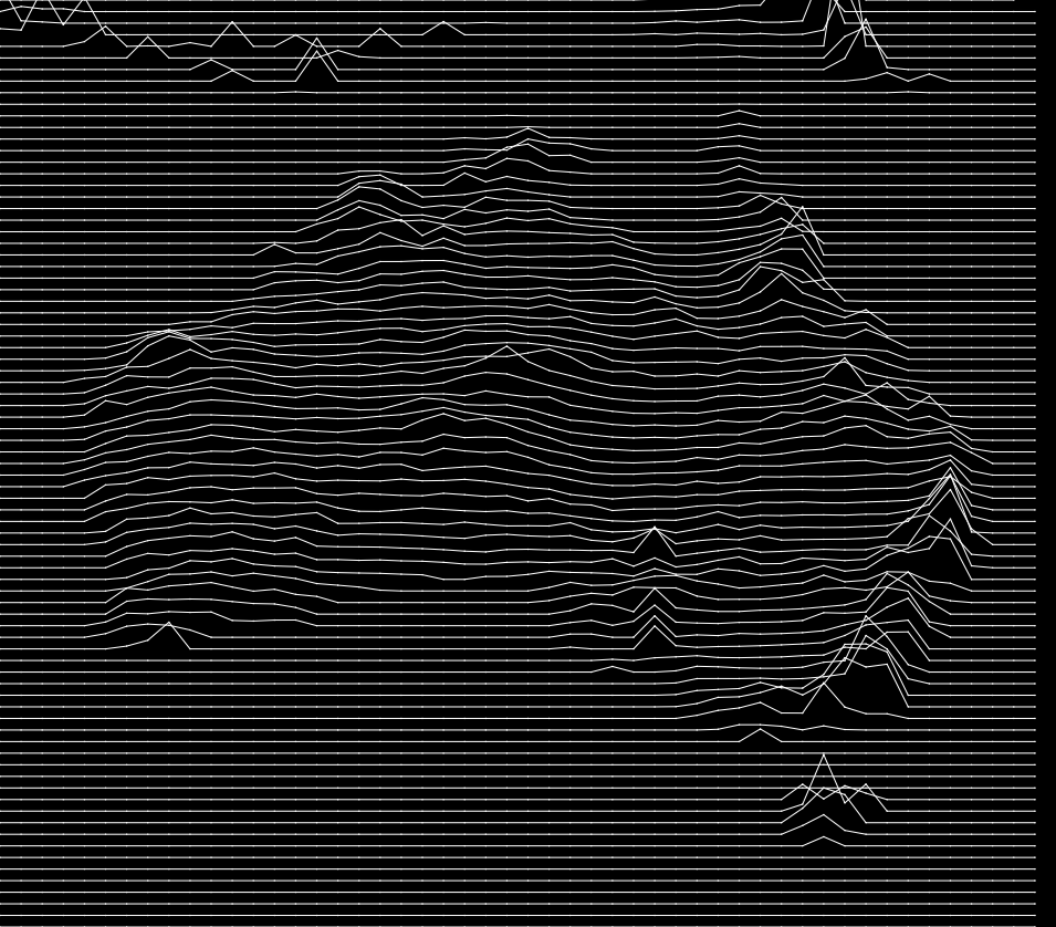
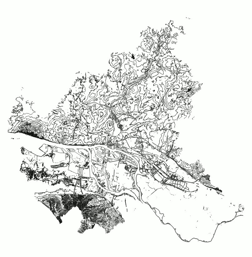
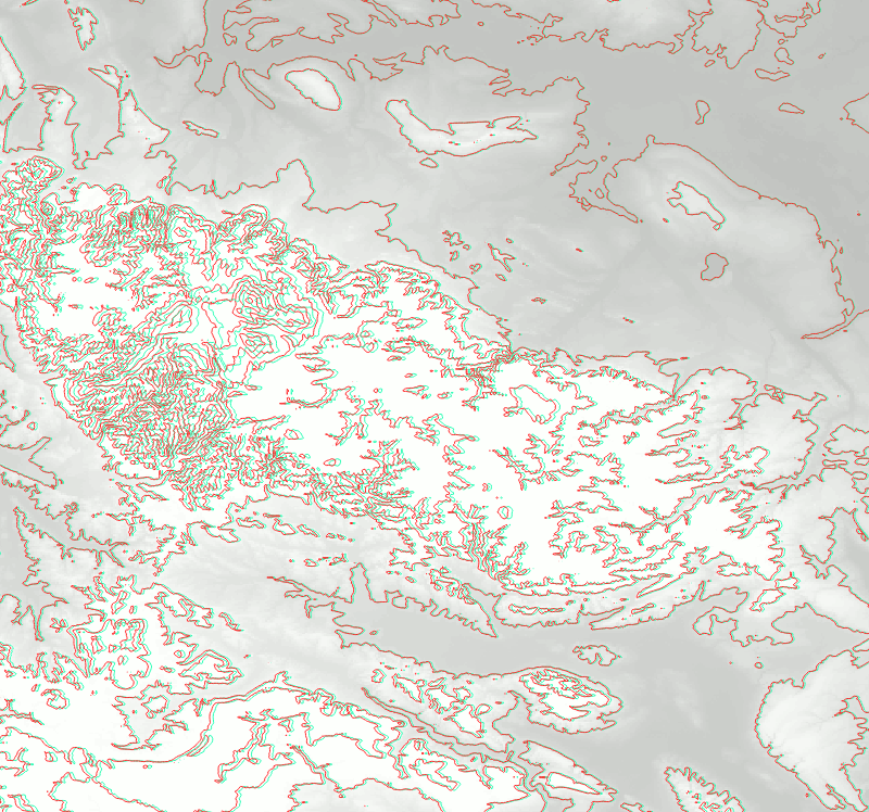
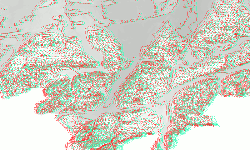
Extract contours at a reasonable interval. What’s reasonable depends on your data. I used an interval of 5 meters for the 10 meter DEM as Hamburg is rather flat (which you will NOT see here).

You may want to simplify or smooth this.

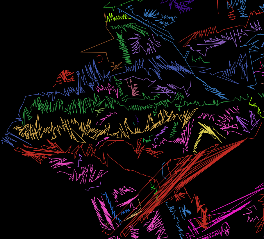
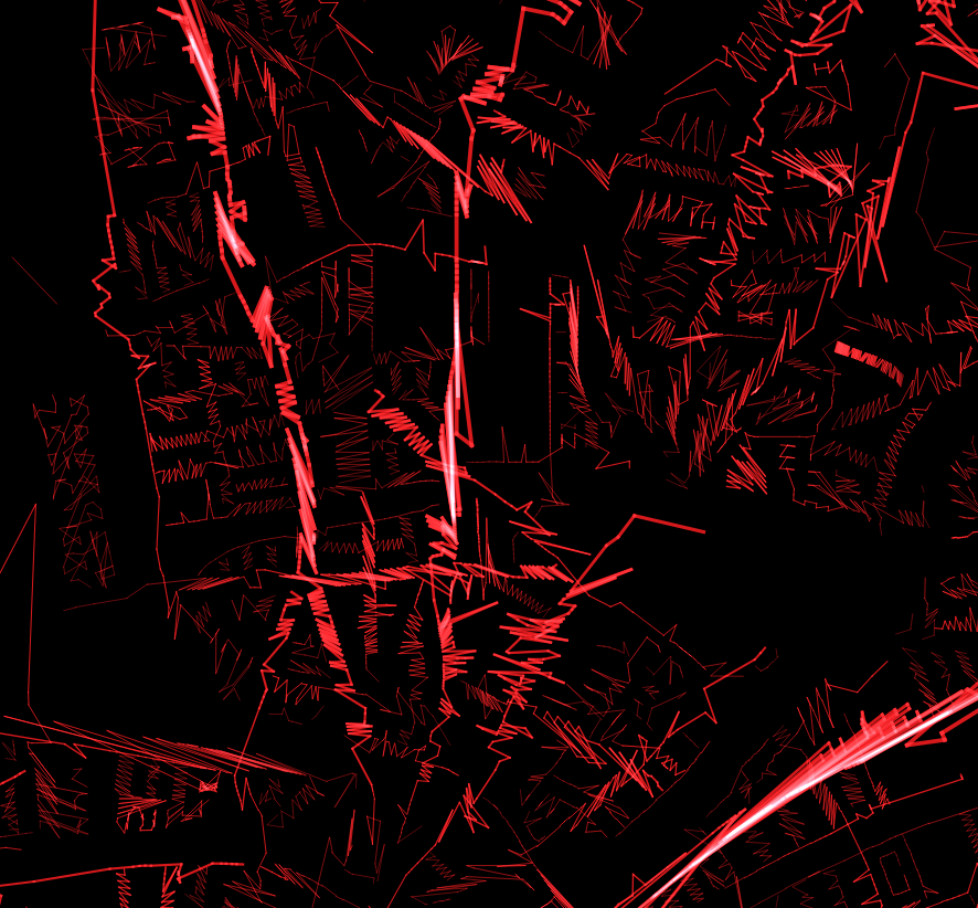
Now it’s time to zoom in, because the effect only works if the line density is appropriately light.

Now we need to duplicate those, color them and move them left and right.

Change the symbol layer of your contours to a Geometry Generator.

Let’s use that first layer for the left, red part. So change the color to red. Use a red that vanishes when you look through your left (red) eye but is clearly visible through the right (cyan) eye. The exact color depends on your glasses.

Set the Geometry Generator to LineString. I will now explain an intermediate step so if you just want the result, scroll a bit.

translate(
  $geometry,
  -  -- there is a minus here!
  (
    x_max(@map_extent) - x(centroid($geometry))
  )
  /100  -- magic scale value…
  ,
  0  -- no translation in y
)

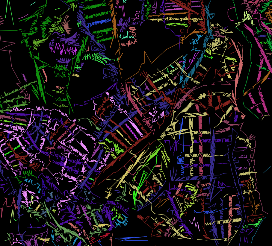
This moves each contour line to the left for a value that increases with the geometry’s distance to the right side. Since we don’t want to move the geometries too far, a magic scale factor needs to be added and adjusted according to your coordinate values.

(Yes, that is a bug right here (centroid is a bad metric and some of the contours are huge geometries) but hey it works well enough. Segmentizing could fix this. Or just extract the vertices, that looks cool too TODO imagelink)

For the right, cyan side we need to add another Geometry Generator symbol layer, color it in cyan (so that you can only see it through your left eye) and do the geometry expression the other way around:

translate(
  $geometry,
  (
    x(centroid($geometry))-x_min(@map_extent)
  )
  /100  -- magic scale value…
  ,
  0  -- no translation in y
)

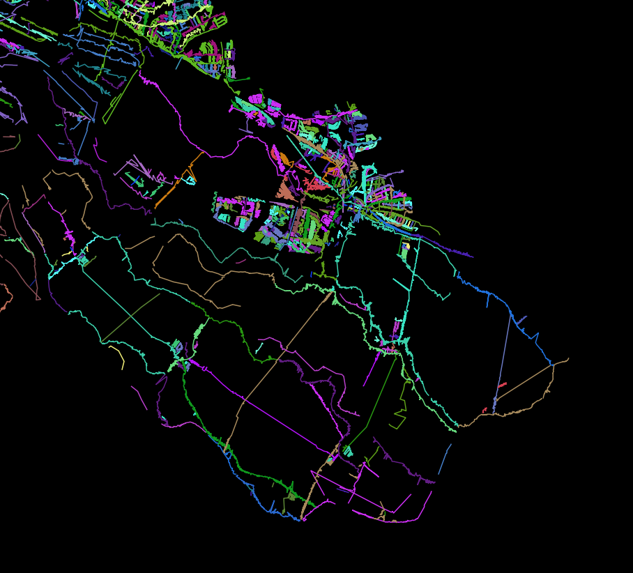
Cool! But this is lacking a certain depth, don’t you think? We need to scale the amount of horizontal shift by the elevation value of the contour lines. And then we also need to adjust the magic scale value again because reasons.

For the red symbol layer:

translate(
  $geometry,
  -- move to the LEFT
  -- scaled by the distance to the RIGHT side of the map
  -- scaled by the elevation

  -- minus so it goes to the left
  -
  "ELEV" -- the attribute field with the elevation values
  *
  (x_max(@map_extent)-x(centroid($geometry)))
  
  -- MAGIC scale value according to CRS and whatever
  /10000
  ,
  -- no change for y
  0
)

For the cyan symbol layer:

translate(
  $geometry,
  -- move to the RIGHT
  -- scaled by the distance to the LEFT side of the map
  -- scaled by the elevation
 
  "ELEV" -- the attribute field with the elevation values
  *
  (x(centroid($geometry))-x_min(@map_extent))
  
  -- MAGIC scale value according to CRS and whatever
  /10000
  ,
  -- no change for y
  0
)

That’s it!

Now, who is going to do Autostereograms? Also check out http://elasticterrain.xyz.

Make sure you actually do use spatial indexes


Ever ran some GIS analysis in QGIS and it took longer than a second? Chances are that your data did not have spatial indexes for QGIS to utilise and that it could have been magnitudes faster.

I realised just today, after years of using QGIS, that it did not automatically create a spatial index when saving a Shapefile. And because of that, lots of GIS stuff I did in the past, involving saving subsets of data to quick’n’dirty Shapefiles, was slower than necessary.

Sadly QGIS does not communicate lack of spatial indexing to the user in any way. I added a feature request to make Processing warn if no indexing is available.

An example: Running ‘Count points in polygon’ on 104 polygons with 223210 points:

  • Points in original GML file: 449 seconds
    • GML is not a format for processing but meant for data transfer, never ever think of using it for anything else
  • Points in ESRI Shapefile: 30 seconds
  • Points in GeoPackage: 3 seconds
  • Points in ESRI Shapefile with spatial index: 3 seconds
    • Same Shapefile as before but this time I had created a .qix index

So yeah, make sure you don’t only use a reasonable format for your data. And also make sure you do actually have an spatial index.

For Shapefiles, look for a .qix or .sbn side-car file somewhere in the heap of files. In QGIS you can create a spatial index for a vector layer either using the “Create spatial index” algorithm in Processing or the button of the same title in the layer properties’ source tab.

PS: GeoPackages always have a spatial index. That’s reason #143 why they are awesome.

Open Layers View Tracker

I built this last year for some research and then swiftly forgot about releasing it to the public. Here it is now:

https://gitlab.com/Hannes42/OpenLayersViewTracker

Try it online: https://hannes42.gitlab.io/OpenLayersViewTracker/

Some awful but working JavaScript code to track a website user’s interaction with a Open Layers map. You can use this to do awesome user studies and experiments.

  • Runs client-side
  • You will get a polygon of each “view”!
  • You can look at them in the browser!
  • There are also timestamps! Hyperaccurate in milliseconds since unix epoch!
  • And a GeoJSON export!
  • This works with rotated views!
  • Written for Open Layers 4 using some version of JSTS, see the libs/ directory. No idea if it works with the latest versions or if Open Layers changed their API again.

Please do some funky research with it and tell me about your experiences! Apart from that, you are on your own.

There is a QGIS project with example data included. Check out the Atlas setup in the Print Layout!

Screenshot from a browser session

Resulting GeoJSON in QGIS

So if Time Manager supports the timestamp format you could interactively scroll around. I did not try, that plugin is so finicky.

Replaying what I looked at in a Open Layers web map, using QGIS Atlas

Replicating a media-hyped color by numbers Etsy map in 10 minutes

https://old.reddit.com/r/MapPorn/comments/ajaz42/the_arteries_of_the_world_map_shows_every_river/eeu3uj9/

Thats beautiful… how long it took?

Well, that looks like QGIS’ random colors applied to http://hydrosheds.org/

So I fired up QGIS, extracted the region from eu_riv_15s.zip, realised those rivers came without a corresponding basin, extracted the region from eu_bas_15s_beta.zip, set the map background to black, set the rivers to render in white, set the rivers’ line width to correspond to their UP_CELLS attribute (best with an exponential scale via Size Assistant), put the basins on top, colored them randomly by BASIN_ID, set the layer rendering mode to Darken or Multiply and that was it.

I should open an Etsy store.

Yes, I realise that replicating things is easier than creating them. But seriously, this is just a map of features colored by category and all the credit should go to http://hydrosheds.org/

Update

But Hannes, that original has some gradients!

Ok, then set the rivers not to white but a grey and the basin layer rendering mode to Overlay instead of Darken.

This product incorporates data from the HydroSHEDS database which is © World Wildlife Fund, Inc. (2006-2013) and has been used herein under license. WWF has not evaluated the data as altered and incorporated within, and therefore gives no warranty regarding its accuracy, completeness, currency or suitability for any particular purpose. Portions of the HydroSHEDS database incorporate data which are the intellectual property rights of © USGS (2006-2008), NASA (2000-2005), ESRI (1992-1998), CIAT (2004-2006), UNEP-WCMC (1993), WWF (2004), Commonwealth of Australia (2007), and Her Royal Majesty and the British Crown and are used under license. The HydroSHEDS database and more information are available at http://www.hydrosheds.org.

Update: Someone asked me for more details so I made a video. Because I did not filter the data to a smaller region I did not use a categorical style in this example (300,000 categories QGIS no likey) but simply a random assignment.

Data-defined images in QGIS Atlas

Say you want to display a feature specific image on each page of a QGIS Atlas.

In my example I have a layer with two features:

{
  "type": "FeatureCollection",
  "features": [
    {
      "type": "Feature",
      "properties": {
        "image_path": "/tmp/1.jpeg"
      },
      "geometry": {
        "type": "Polygon",
        "coordinates": [[[9,53],[11,53],[11,54],[9,54],[9,53]]]
      }
    },
    {
      "type": "Feature",
      "properties": {
        "image_path": "/tmp/2.jpeg"
      },
      "geometry": {
        "type": "Polygon",
        "coordinates": [[[13,52],[14,52],[14,53],[13,53],[13,52]]]
      }
    }
  ]
}

And I also have two JPEG images, named “1.jpeg” and “2.jpeg” are in my /tmp/ directory, just as the “image_path” attribute values suggest.

The goal is to have a map for each feature and its image displayed on the same page.

Create a new print layout, enable Atlas, add a map (controlled by Atlas, using the layer) and also an image.

For the “image source” enable the data-defined override and use attribute(@atlas_feature, 'image_path') as expression.

That’s it, now QGIS will try to load the image referenced in the feature’s “image_path” value as source for the image on the Atlas page. Yay kittens!

Fake chromatic aberration and dynamic label shadows in QGIS

Welcome to Part 43 of “Fun with Weird Hacks in QGIS”!

Fake Chromatic Aberration

Get some lines or polygons! I used German administrative polygons and a “Outline: Simple line” style.

Add a “Geometry Generator” to the same layer and set it to “LineString / MultiLineString”. If you used polygons, you will need to use “boundary($geometry)” to get the border lines of your polygons.

Translate (shift) the geometries radially away from the map center, with an amount of translation based on their distance to the map center. This will introduce ugly artifacts cool glitches for big geometries. Note the magic constant of 150 I divided the distances by, I cannot be arsed to turn this into percentages so you will have to figure out what works for you. Also, if your map is in a different CRS than the layer you do this with, you will need to transform the coordinates (I do that for the labels below).

 translate(
   boundary($geometry),
   (
    x(centroid($geometry))-x(@map_extent_center)
   )/150
   ,
   (
    y(centroid($geometry))-y(@map_extent_center)
   )/150
)

Color those lines in some fancy 80s color like #00FFFF.

We only want the color to appear in the edges of the map, so set the “Feature Blending” mode of the layer to “Lighten”. This will make sure the white lines do not get darker/colored.

I forgot to take an image for that and then it was lunch time. :x

Now do the same but for distances the other way around and color that in something else (like foofy #FF00FF).

 translate(
   boundary($geometry),
   (
    x(@map_extent_center)-x(centroid($geometry))
   )/150
   ,
   (
    y(@map_extent_center)-y(centroid($geometry))
   )/150
)

Oh, can you see it already? Move the map around! Ohhh!

For the final touch, use the layer’s “Draw Effects” to replace the “Source” with a “Blur”. Be aware that the “Blur type” can quite strongly influence the look and find a setting for the “Blur strength” that works for you. I used “Guassian blur (quality)” with a strength of 2.

Dynamic Label Shadows

Get some data to label! I used ne_10m_populated_places_simple. Label it with labels placed “Offset from Point” without any actual offset. This is just to make sure calculations on the geometry’s location make sense to affect the labeling later.

Pick a wicked cool font like Lazer 84!

Add a “Buffer” to the labels and pick an appropriate color (BIG BOLD #FF00FF works well again).

Time for magic! Add a “Shadow” to the labels and use an appropriate color (I used the other color from earlier again, #00FFFF).

We want to make the label shadows be further away from the label if the feature is further away from the map center. So OVERRIDE the offset with code that does exactly that. Note another magic constant (relating to meters in EPSG:25832) and that I needed to transform coordinates here (my map is in EPSG:25832 while this layer is EPSG:4326).

distance(  
	transform(
		$geometry, 'EPSG:4326', 'EPSG:25832'
	),
	@map_extent_center
)/10000

Cool. But that just looks weird. Time for another magical ingredient while OVERRIDING the angle at which the label is placed. You guessed it, radially away from the map center!

degrees(
	azimuth(  
		transform(
			$geometry, 'EPSG:4326', 'EPSG:25832'
		),  
		@map_extent_center)
	)
-180

By the way, it does look best if your text encoding is introducing bad character marks and missing umlauts!

That’s it, move the map around and be WOWed by the sweet effects and the time it takes to render :o)

And now it is your turn to apply this to some MURICA geodata and rake in meaningless internet points that make you feel good! Sad but true ;)

And also TODO: Make the constants percentages instead, that should make sure it works on any projection and any scale.