Welcome to Part 43 of “Fun with Weird Hacks in QGIS”!
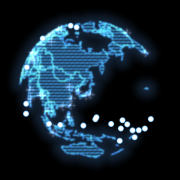
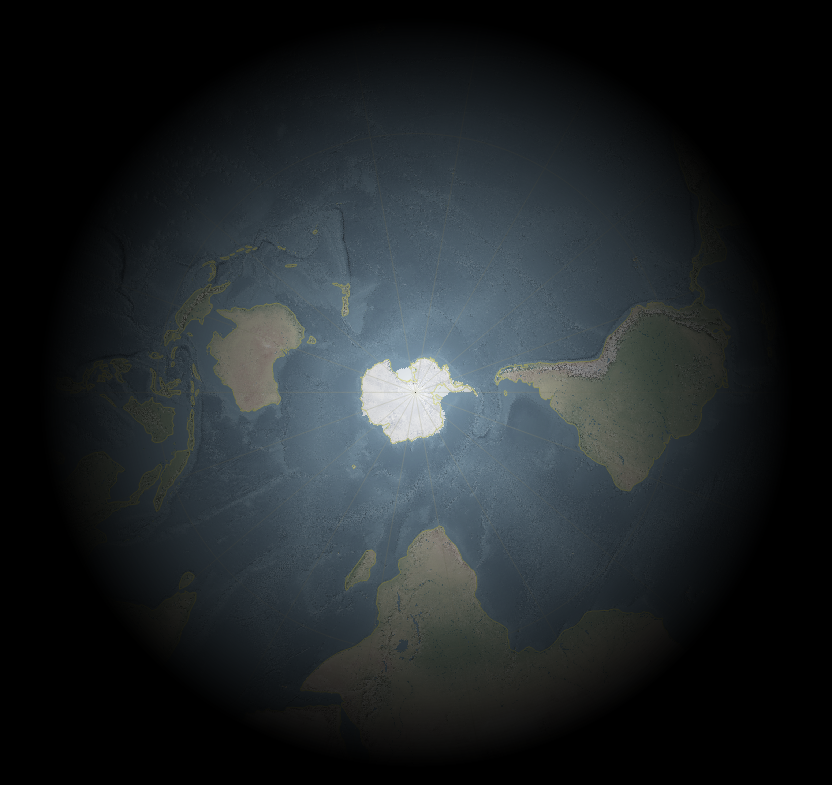
Fake Chromatic Aberration
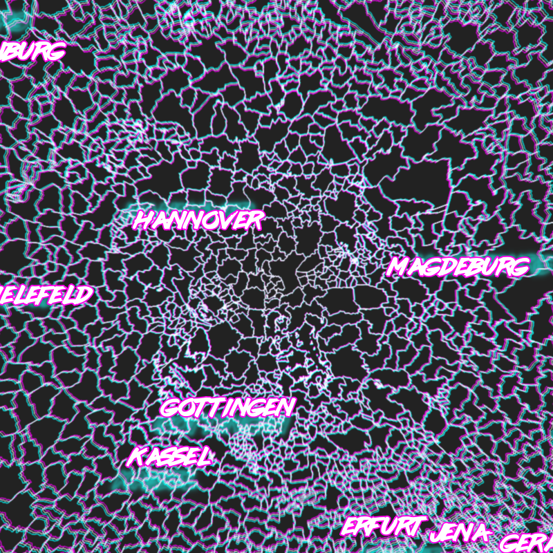
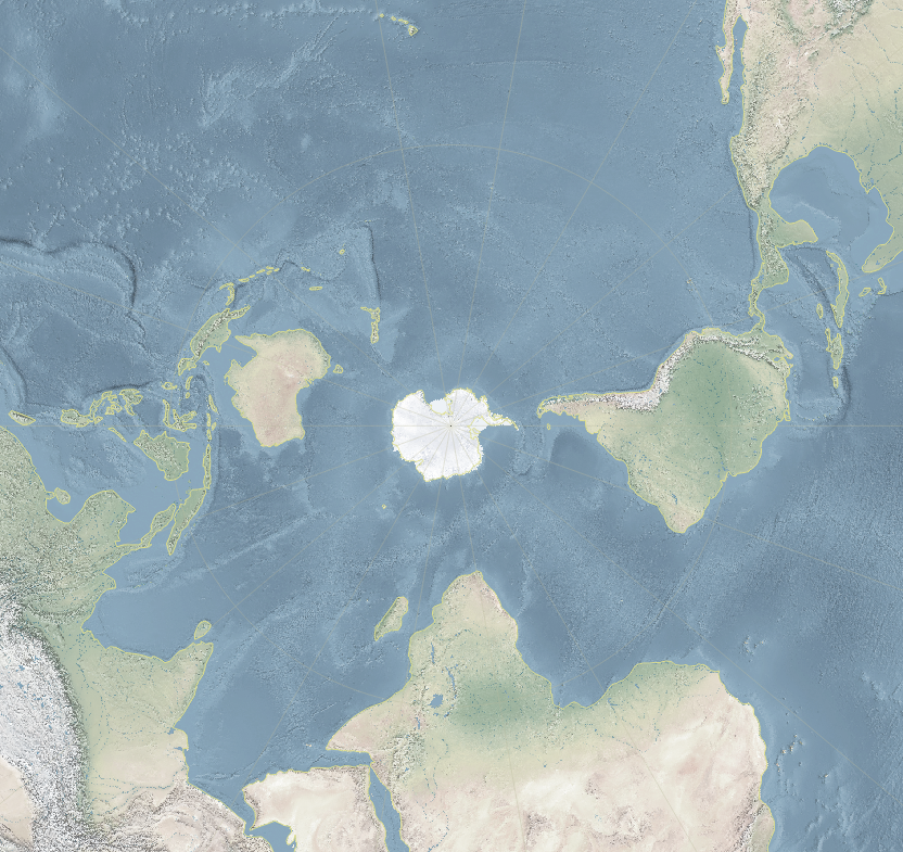
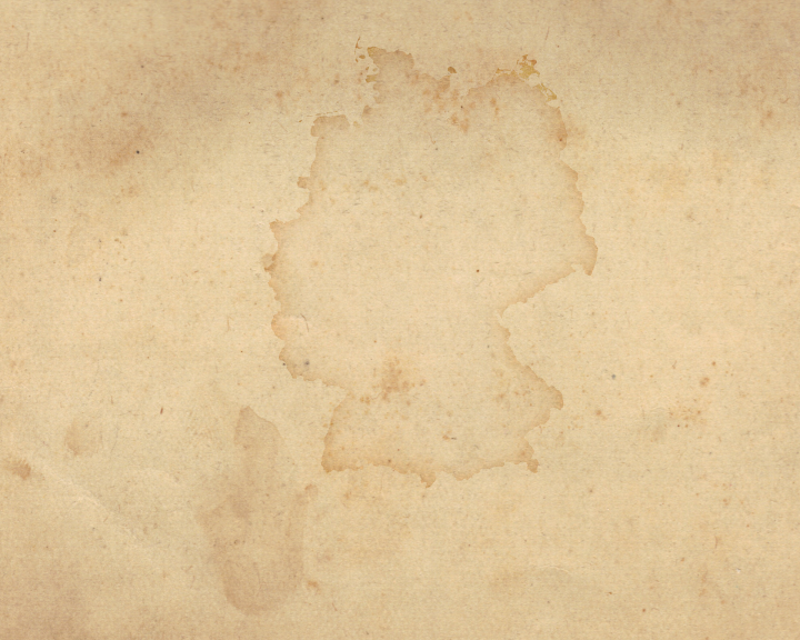
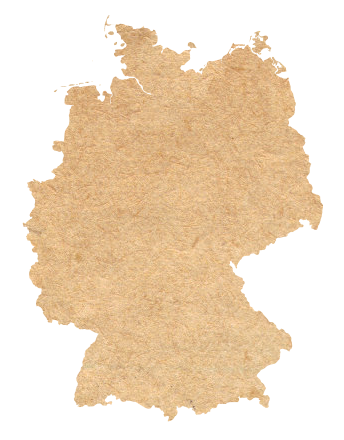
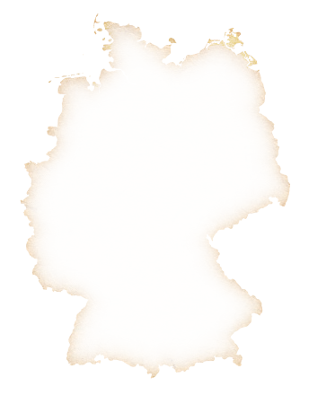
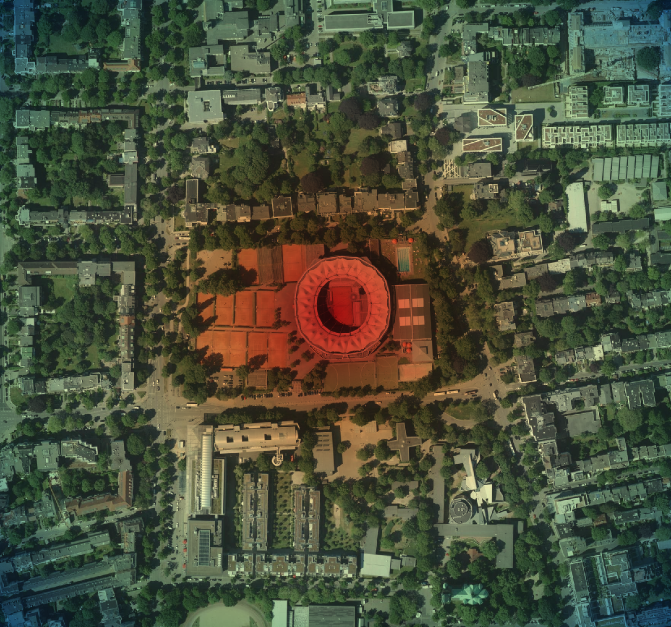
Get some lines or polygons! I used German administrative polygons and a “Outline: Simple line” style.

Add a “Geometry Generator” to the same layer and set it to “LineString / MultiLineString”. If you used polygons, you will need to use “boundary($geometry)” to get the border lines of your polygons.

Translate (shift) the geometries radially away from the map center, with an amount of translation based on their distance to the map center. This will introduce ugly artifacts cool glitches for big geometries. Note the magic constant of 150 I divided the distances by, I cannot be arsed to turn this into percentages so you will have to figure out what works for you. Also, if your map is in a different CRS than the layer you do this with, you will need to transform the coordinates (I do that for the labels below).
 translate(
   boundary($geometry),
   (
    x(centroid($geometry))-x(@map_extent_center)
   )/150
   ,
   (
    y(centroid($geometry))-y(@map_extent_center)
   )/150
)

Color those lines in some fancy 80s color like #00FFFF.

We only want the color to appear in the edges of the map, so set the “Feature Blending” mode of the layer to “Lighten”. This will make sure the white lines do not get darker/colored.
Now do the same but for distances the other way around and color that in something else (like foofy #FF00FF).
 translate(
   boundary($geometry),
   (
    x(@map_extent_center)-x(centroid($geometry))
   )/150
   ,
   (
    y(@map_extent_center)-y(centroid($geometry))
   )/150
)

Oh, can you see it already? Move the map around! Ohhh!
For the final touch, use the layer’s “Draw Effects” to replace the “Source” with a “Blur”. Be aware that the “Blur type” can quite strongly influence the look and find a setting for the “Blur strength” that works for you. I used “Guassian blur (quality)” with a strength of 2.

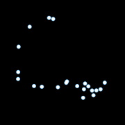
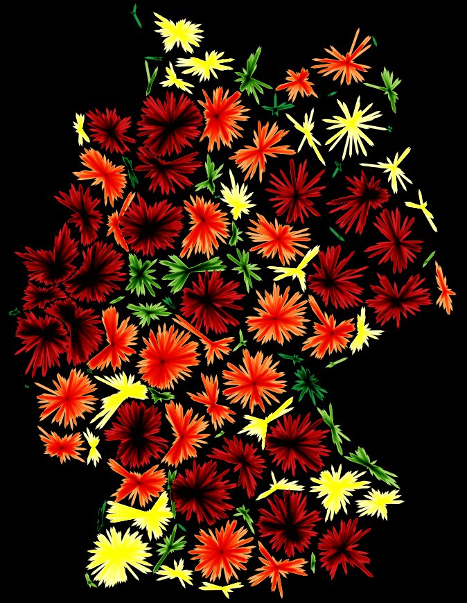
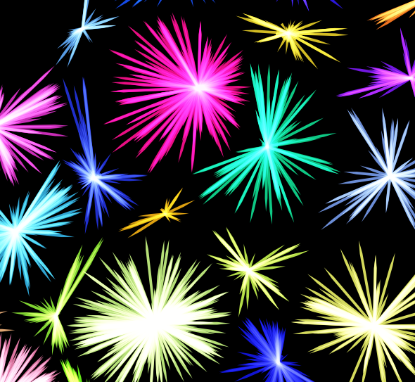
Dynamic Label Shadows
Get some data to label! I used ne_10m_populated_places_simple. Label it with labels placed “Offset from Point” without any actual offset. This is just to make sure calculations on the geometry’s location make sense to affect the labeling later.
Pick a wicked cool font like Lazer 84!

Add a “Buffer” to the labels and pick an appropriate color (BIG BOLD #FF00FF works well again).

Time for magic! Add a “Shadow” to the labels and use an appropriate color (I used the other color from earlier again, #00FFFF).

We want to make the label shadows be further away from the label if the feature is further away from the map center. So OVERRIDE the offset with code that does exactly that. Note another magic constant (relating to meters in EPSG:25832) and that I needed to transform coordinates here (my map is in EPSG:25832 while this layer is EPSG:4326).
distance(
	transform(
		$geometry, 'EPSG:4326', 'EPSG:25832'
	),
	@map_extent_center
)/10000

Cool. But that just looks weird. Time for another magical ingredient while OVERRIDING the angle at which the label is placed. You guessed it, radially away from the map center!
degrees(
	azimuth(
		transform(
			$geometry, 'EPSG:4326', 'EPSG:25832'
		),
		@map_extent_center)
	)
-180

By the way, it does look best if your text encoding is introducing bad character marks and missing umlauts!
That’s it, move the map around and be WOWed by the sweet effects and the time it takes to render :o)
And now it is your turn to apply this to some MURICA geodata and rake in meaningless internet points that make you feel good! Sad but true ;)
And also TODO: Make the constants percentages instead, that should make sure it works on any projection and any scale.


 Hillshading
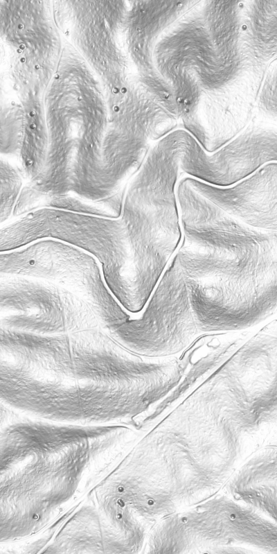 Overhead Hillshading
 Hillshading blended with Overhead Hillshading (Darken mode)
 Multidirectional Hillshading


