Open Layers View Tracker

I built this last year for some research and then swiftly forgot about releasing it to the public. Here it is now:

https://gitlab.com/Hannes42/OpenLayersViewTracker

Try it online: https://hannes42.gitlab.io/OpenLayersViewTracker/

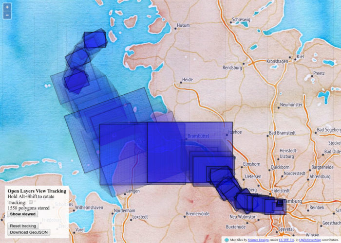
Some awful but working JavaScript code to track a website user’s interaction with a Open Layers map. You can use this to do awesome user studies and experiments.

  • Runs client-side
  • You will get a polygon of each “view”!
  • You can look at them in the browser!
  • There are also timestamps! Hyperaccurate in milliseconds since unix epoch!
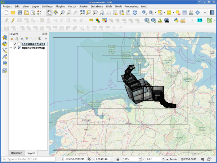
  • And a GeoJSON export!
  • This works with rotated views!
  • Written for Open Layers 4 using some version of JSTS, see the libs/ directory. No idea if it works with the latest versions or if Open Layers changed their API again.

Please do some funky research with it and tell me about your experiences! Apart from that, you are on your own.

There is a QGIS project with example data included. Check out the Atlas setup in the Print Layout!

Screenshot from a browser session

Resulting GeoJSON in QGIS

So if Time Manager supports the timestamp format you could interactively scroll around. I did not try, that plugin is so finicky.

Replaying what I looked at in a Open Layers web map, using QGIS Atlas

Fantec QB-X8US3/H82-SU3S2 keeps resetting

Hoping that *you* found this post via Google and this helps you:

If your Fantec QB-X8US3 enclosure keeps resetting and you get lots of sd or usb errors in dmesg, check your harddisks and *remove* flaky ones. I had random, frequent resets (unmounting all your drives forcefully…) when I thought I could use a dying drive as temporary storage in the enclosure. As soon as I removed that bad drive, the device was rock-stable again. 10++ would buy again.

See also http://forum.mediasonic.ca/viewtopic.php?f=115&t=3413.

Fantec QB-X8US3 is apparently the same as a H82-SU3S2 ProBox. Here’s a review.

Sincerely yours, DenverCoder9

Replicating a media-hyped color by numbers Etsy map in 10 minutes

https://old.reddit.com/r/MapPorn/comments/ajaz42/the_arteries_of_the_world_map_shows_every_river/eeu3uj9/

Thats beautiful… how long it took?

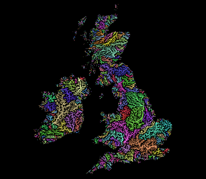
Well, that looks like QGIS’ random colors applied to http://hydrosheds.org/

So I fired up QGIS, extracted the region from eu_riv_15s.zip, realised those rivers came without a corresponding basin, extracted the region from eu_bas_15s_beta.zip, set the map background to black, set the rivers to render in white, set the rivers’ line width to correspond to their UP_CELLS attribute (best with an exponential scale via Size Assistant), put the basins on top, colored them randomly by BASIN_ID, set the layer rendering mode to Darken or Multiply and that was it.

I should open an Etsy store.

Yes, I realise that replicating things is easier than creating them. But seriously, this is just a map of features colored by category and all the credit should go to http://hydrosheds.org/

Update

But Hannes, that original has some gradients!

Ok, then set the rivers not to white but a grey and the basin layer rendering mode to Overlay instead of Darken.

This product incorporates data from the HydroSHEDS database which is © World Wildlife Fund, Inc. (2006-2013) and has been used herein under license. WWF has not evaluated the data as altered and incorporated within, and therefore gives no warranty regarding its accuracy, completeness, currency or suitability for any particular purpose. Portions of the HydroSHEDS database incorporate data which are the intellectual property rights of © USGS (2006-2008), NASA (2000-2005), ESRI (1992-1998), CIAT (2004-2006), UNEP-WCMC (1993), WWF (2004), Commonwealth of Australia (2007), and Her Royal Majesty and the British Crown and are used under license. The HydroSHEDS database and more information are available at http://www.hydrosheds.org.

Update: Someone asked me for more details so I made a video. Because I did not filter the data to a smaller region I did not use a categorical style in this example (300,000 categories QGIS no likey) but simply a random assignment.

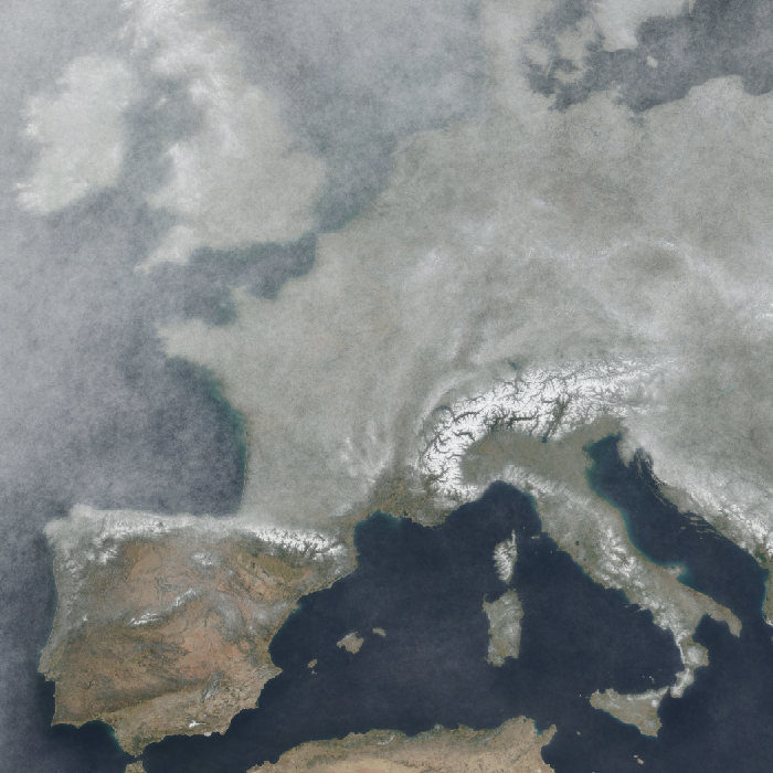
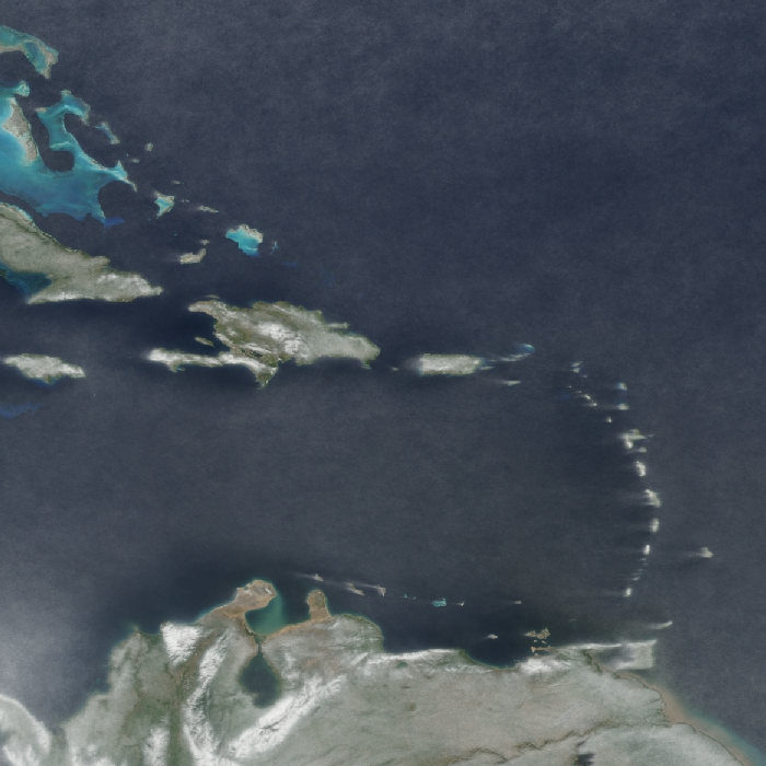
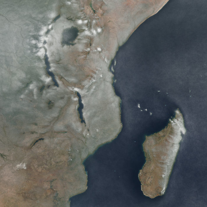
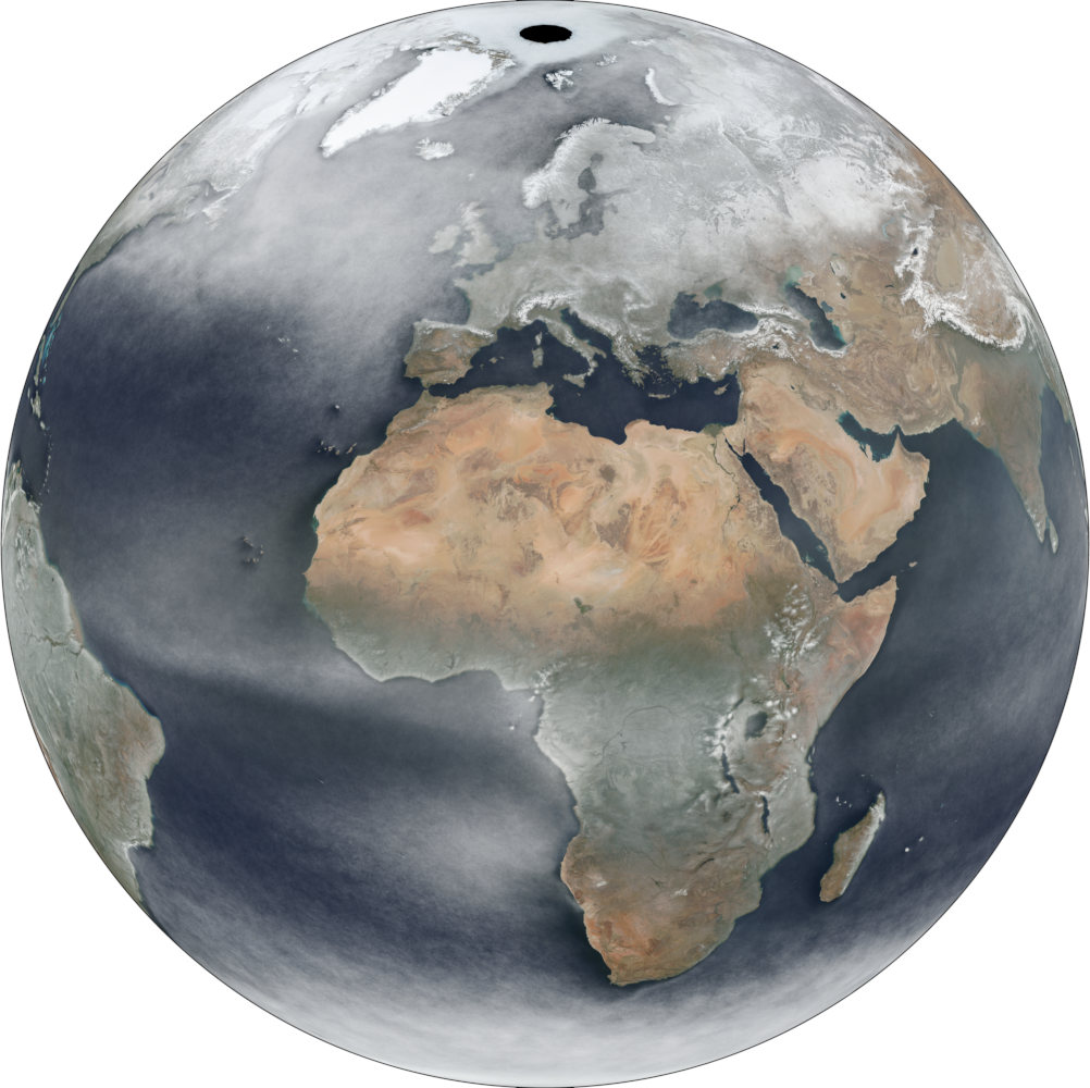
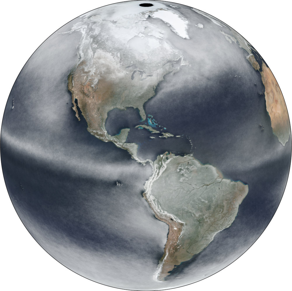
Average Earth from Space 2018

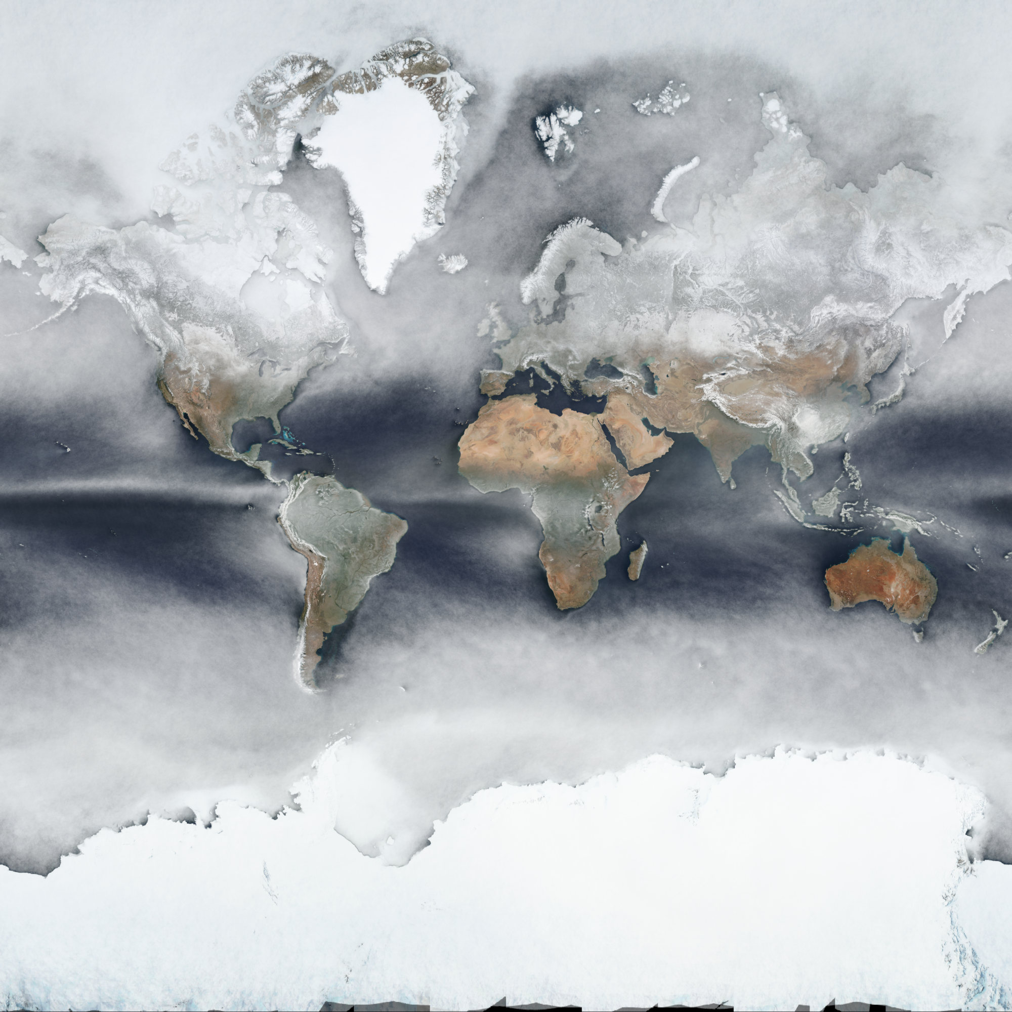
I collected all the daily images of the satellite-based Soumi VIIRS sensor and calculated the per-pixel average over the whole year of 2018.

You can explore it in full resolution in an interactive webmap.

WGS84 / Equirectangular
Web Mercator

You can see fascinating patterns, e.g. “downstream” of islands in the ocean or following big rivers like the Amazon. Be wary though as snow and clouds look the same here.

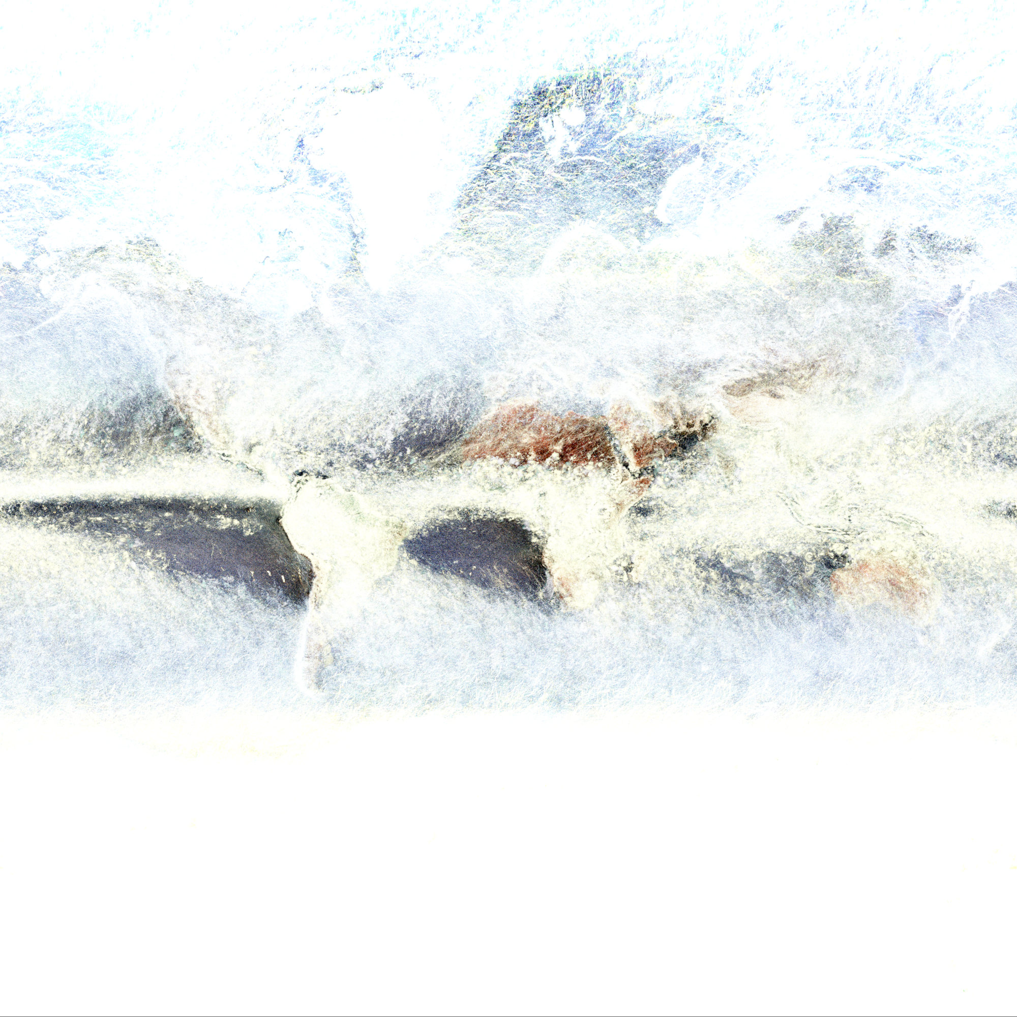
It’s also fun to look at the maximum to see cloudless regions (this image is highly exaggerated and does not make too much sense anyways):

Many thanks to Joshua Stevens for motivation and infos on data availability! The initial idea was of course inspired by Charlie ‘vruba’ Lyod‘s Cloudless atlas works. I explored imagery on https://worldview.earthdata.nasa.gov/, grabbed Soumi VIIRS images via https://wiki.earthdata.nasa.gov/display/GIBS/GIBS+API+for+Developers and processed it in GDAL. Poke me repeatedly to blog about the process please. (2022: Or don’t, I didn’t document it back then and can’t remember the final specifics. I think I did use imagemagick’s -evaluate-sequence median but might have done something in vips2 instead. The 2020 approach via GDAL is much easier.)

Full resolution, georeferenced imagery as Cloud-Optimized GeoTIFF:

*I said average but of course it is the median. The average or mean does not make much sense to use nor does it look any good. ;-)

Data-defined images in QGIS Atlas

Say you want to display a feature specific image on each page of a QGIS Atlas.

In my example I have a layer with two features:

{
  "type": "FeatureCollection",
  "features": [
    {
      "type": "Feature",
      "properties": {
        "image_path": "/tmp/1.jpeg"
      },
      "geometry": {
        "type": "Polygon",
        "coordinates": [[[9,53],[11,53],[11,54],[9,54],[9,53]]]
      }
    },
    {
      "type": "Feature",
      "properties": {
        "image_path": "/tmp/2.jpeg"
      },
      "geometry": {
        "type": "Polygon",
        "coordinates": [[[13,52],[14,52],[14,53],[13,53],[13,52]]]
      }
    }
  ]
}

And I also have two JPEG images, named “1.jpeg” and “2.jpeg” are in my /tmp/ directory, just as the “image_path” attribute values suggest.

The goal is to have a map for each feature and its image displayed on the same page.

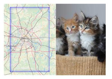
Create a new print layout, enable Atlas, add a map (controlled by Atlas, using the layer) and also an image.

For the “image source” enable the data-defined override and use attribute(@atlas_feature, 'image_path') as expression.

That’s it, now QGIS will try to load the image referenced in the feature’s “image_path” value as source for the image on the Atlas page. Yay kittens!

Genauigkeitsfetischismus

https://www.spiegel.de/spiegel/fergus-falls-in-minnesota-in-der-kleinen-welt-der-waehler-von-donald-trump-a-1140600.html

Fergus Falls liegt im Westen Minnesotas, zwischen den Bundesstaaten Wisconsin und North Dakota, am nördlichen Rand der USA. Die Jahresdurchschnittstemperatur nahe der Grenze zu Kanada liegt bei plus 3 Grad Celsius, im Winter bei minus 20 Grad. Von den Hochhäusern New Yorks und den Stränden San Franciscos sind es mehr als 2200 Kilometer bis nach Fergus Falls. Von El Paso, der mexikanischen Grenze, braucht ein Auto 22 Stunden. Wie viele Mexikaner zieht es in diese Gegend? Wer stellt hier so ein Schild auf?

https://www.spiegel.de/kultur/gesellschaft/fall-claas-relotius-us-kleinstadt-fergus-falls-vom-betrug-beim-spiegel-betroffen-a-1244806.html

Der SPIEGEL hat in einem ersten Schritt seine Dokumentationsabteilung das Manuskript der Relotius-Geschichte noch einmal in Stichproben prüfen lassen – und musste feststellen, dass bei der Verifikation tatsächlich nicht sauber gearbeitet wurde. (Mehr zu den Sicherheitsmechanismen des Hauses lesen Sie hier.)

Ein paar Detail-Beispiele, die auffielen:

So sind es von Fergus Falls nicht 2200 Kilometer nach New York, wie es im Text steht, sondern nur 1888.

Ich *hasse* diesen Zahlenfetischismus (passt genau in diese gefühlsmanipulative Art von Reportagen), daher war mein Interesse geweckt (während im Hintergrund gerade “for king and country” aus den Lautsprechern schallte.

Warum sollten es exakt 1888 Kilometer sein? Was hatte die Spiegel-Dokumentation denn da gemessen? Rathaus zu Rathaus? Zentroid zu Zentroid der administrativen Ortsgrenzen? Die kürzeste Distanz?

Da im nächsten Satz des Artikels eine Reisedauer mit dem Auto angegeben wurde, scheint es naheliegend, dass der Autor auch für die Distanzen eine solche Reise angenommen hatte.
Und siehe da, Google Maps gibt für die Reise mit dem Auto von Fergus Falls (Minnesota 56537) nach New York 2218 Kilometer, alternativ 2335 Kilometer an.

Graphhopper bestätigt die 2218 Kilometer (exakt!!!11).

Bing bietet Routen von 2208 bis 2372 Kilometer an.

Yandex rundet sinnvoll auf 2300 bzw. 2400 Kilometer

Vier verschiedene Routenplaner bestätigen also eine Entfernung von grob 2200 Kilometern (oder mehr) und damit die Angabe im Artikel des Autors.

Was hat die Spiegel-Dokumentation also dann wohl gemacht?

Auf Wikipedia gibt es repräsentative Koordinaten für beide Orte, 46°16′59″N 96°04′39″W für Fergus Falls (irgendwo), 40°42′46″N 74°00′21″W für New York City (Rathaus).

Betrachtet man die Erde als Spheroid läge die direkte Distanz zwischen diesen bei etwa 1878 Kilometern.

Mit einem besser passenden Ellipsoid (WGS84) wären es 1882 Kilometer.

Die Spiegel-Dokumentation hat also wohl irgendwelche Koordinaten, relativ zentral in den beiden Orten, gewählt und die direkte Distanz zwischen ihnen berechnet. Immerhin geodätisch!

Fazit: Ach, watt weiß ich, dieses Detail im Faktencheck der Spiegel-Dokumentation ist definitiv verständnisloser Aktionismus. Distanzen sind ein kompliziertes Konzept. Ist eine Reisedistanz gemeint? Diese kann durch unterschiedliche Routen oder Umleitungen stark abweichen. Ist eine direkte Distanz gemeint? Falls ja, wie genau kann das Ergebnis jetzt sein? Was sind die exakten Punkte, zwischen denen gemessen wurde und welche Art von Genauigkeit bzw. Unsicherheit haben diese? Wann ist es sinnvoll eine Stadt mit einer Koordinate zu beschreiben?

1888 Kilometer ist in jedem Fall nichts als ein blindes Vortäuschen von Exaktheit.

PS: Zahlen vergöttern die, die sie nicht verstehen. Mir schwindelte.

Fake chromatic aberration and dynamic label shadows in QGIS

Welcome to Part 43 of “Fun with Weird Hacks in QGIS”!

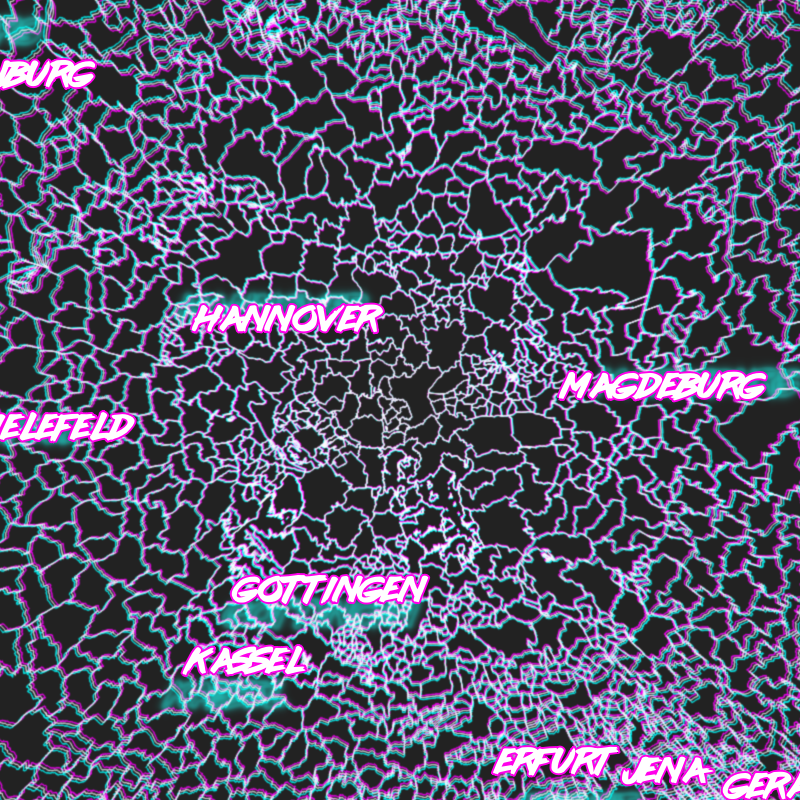
Fake Chromatic Aberration

Get some lines or polygons! I used German administrative polygons and a “Outline: Simple line” style.

Add a “Geometry Generator” to the same layer and set it to “LineString / MultiLineString”. If you used polygons, you will need to use “boundary($geometry)” to get the border lines of your polygons.

Translate (shift) the geometries radially away from the map center, with an amount of translation based on their distance to the map center. This will introduce ugly artifacts cool glitches for big geometries. Note the magic constant of 150 I divided the distances by, I cannot be arsed to turn this into percentages so you will have to figure out what works for you. Also, if your map is in a different CRS than the layer you do this with, you will need to transform the coordinates (I do that for the labels below).

 translate(
   boundary($geometry),
   (
    x(centroid($geometry))-x(@map_extent_center)
   )/150
   ,
   (
    y(centroid($geometry))-y(@map_extent_center)
   )/150
)

Color those lines in some fancy 80s color like #00FFFF.

We only want the color to appear in the edges of the map, so set the “Feature Blending” mode of the layer to “Lighten”. This will make sure the white lines do not get darker/colored.

I forgot to take an image for that and then it was lunch time. :x

Now do the same but for distances the other way around and color that in something else (like foofy #FF00FF).

 translate(
   boundary($geometry),
   (
    x(@map_extent_center)-x(centroid($geometry))
   )/150
   ,
   (
    y(@map_extent_center)-y(centroid($geometry))
   )/150
)

Oh, can you see it already? Move the map around! Ohhh!

For the final touch, use the layer’s “Draw Effects” to replace the “Source” with a “Blur”. Be aware that the “Blur type” can quite strongly influence the look and find a setting for the “Blur strength” that works for you. I used “Guassian blur (quality)” with a strength of 2.

Dynamic Label Shadows

Get some data to label! I used ne_10m_populated_places_simple. Label it with labels placed “Offset from Point” without any actual offset. This is just to make sure calculations on the geometry’s location make sense to affect the labeling later.

Pick a wicked cool font like Lazer 84!

Add a “Buffer” to the labels and pick an appropriate color (BIG BOLD #FF00FF works well again).

Time for magic! Add a “Shadow” to the labels and use an appropriate color (I used the other color from earlier again, #00FFFF).

We want to make the label shadows be further away from the label if the feature is further away from the map center. So OVERRIDE the offset with code that does exactly that. Note another magic constant (relating to meters in EPSG:25832) and that I needed to transform coordinates here (my map is in EPSG:25832 while this layer is EPSG:4326).

distance(  
	transform(
		$geometry, 'EPSG:4326', 'EPSG:25832'
	),
	@map_extent_center
)/10000

Cool. But that just looks weird. Time for another magical ingredient while OVERRIDING the angle at which the label is placed. You guessed it, radially away from the map center!

degrees(
	azimuth(  
		transform(
			$geometry, 'EPSG:4326', 'EPSG:25832'
		),  
		@map_extent_center)
	)
-180

By the way, it does look best if your text encoding is introducing bad character marks and missing umlauts!

That’s it, move the map around and be WOWed by the sweet effects and the time it takes to render :o)

And now it is your turn to apply this to some MURICA geodata and rake in meaningless internet points that make you feel good! Sad but true ;)

And also TODO: Make the constants percentages instead, that should make sure it works on any projection and any scale.

Making a Star Wars hologram in QGIS

I like doing silly things in QGIS.

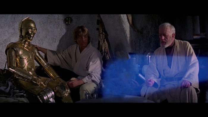
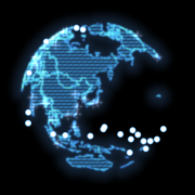
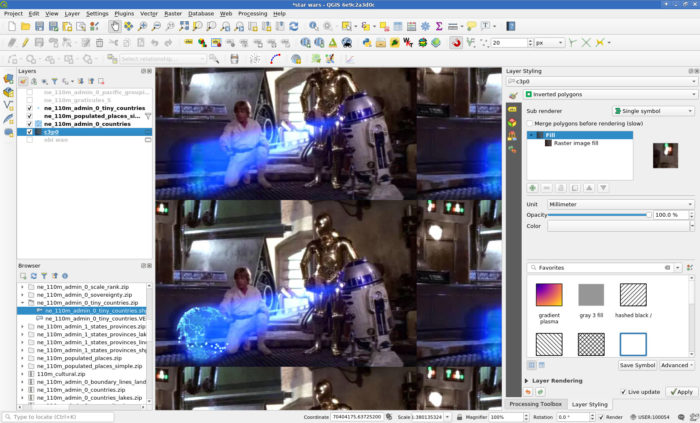
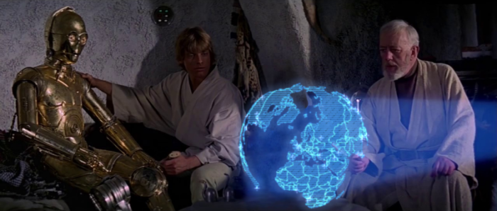
So I wanted to make a Star Wars hologram (you know, that “You’re my only hope” Leia one) showing real geodata. What better excuse for abusing QGIS’ Inverted Polygons and Raster Fills. So, here is what I did:

  1. Find some star wars hologram leia image.
  2. Crudly remove the princess (GIMP’s Clone and Healing tools work nicely for this).
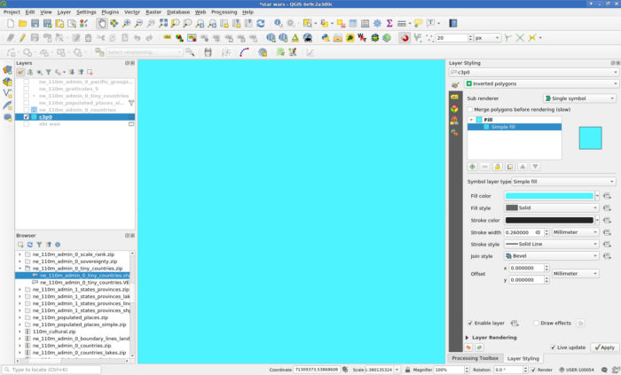
  3. In QGIS create an empty Polygon-geometry Scratchpad layer and set the renderer to Inverted Polygons to fill the whole canvas.
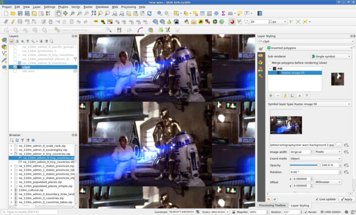
  4. Set the Fill to a Raster image Fill and load your image.
  5. Load some geodata, style it accordingly and rejoice.
    1. Get some geodata. I used Natural Earth’s countries, populated places and tiny countries (to have some stuff in the oceans), all in 110m.
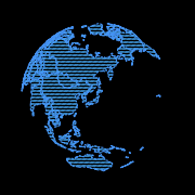
    2. Select a nice projection, I used “+proj=ortho +lat_0=39 +lon_0=139 +x_0=0 +y_0=0 +a=6371000 +b=6371000 +units=m +no_defs”.
    3. I used a three layer style for the countries:
      • A Simple Line outline with color #4490f3, stroke width 0.3mm and the Dash Dot Line stroke style.
      • A Line Pattern Fill with a spacing of 0.8mm, color #46a8f3 and a stroke width of 0.4mm.
      • And on top of those, for some noisiness a black Line Pattern Fill rotated 45° with a spacing of 1mm and stroke width 0.1mm.
      • Then the Feature Blending Mode Dodge to the Layer Rendering and aha!
      • More special effects come from Draw Effects, I disabled Source and instead used a Blur (Gaussian, strength 2) to lose the crispness and also an Outer Glow (color #5da6ff, spread 3mm, blur radius 3) to, well, make it glow.


    4. I used a three layer style for the populated places:
      • I used a Simple Marker using the “cross” symbol and a size of 1.8mm. The Dash Line stroke style gives a nice depth effect when in Draw Effects the Source is replaced with a Drop Shadow (1 Pixel, Blur radius 2, color #d6daff).
      • A Blending Mode of Addition for the layer itself makes it blend nicely into the globe.
    5. I used a three layer style for the tiny countries:
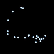
      • I used a white Simple Marker with a size of 1.2mm and a stroke color #79c7ff, stroke width 0.4mm.
      • Feature Blending Mode Lighten makes sure that touching symbols blob nicely into each other.


  6. You can now export the image at your screen resolution (I guess) using Project -> Import/Export or just make a screenshot.
  7. Or add some more magic with random offsets and stroke widths in combination with refreshing the layers automatically at different intervals:

Building QGIS with debugging symbols

As I keep searching the web for way too long again and again, I hope this post will be #1 next I forget how to build QGIS with debugging symbols.

Add CMAKE_BUILD_TYPE=Debug to the cmake invocation.

E.g.:

cmake -G "Unix Makefiles" ../ \
    -DCMAKE_BUILD_TYPE=Debug
    ...

For a not as safe but more performant compilation, you can use RelWithDebInfo. I just found out today but will use that in the future rather than the full-blown Debug. See https://cmake.org/pipermail/cmake/2001-October/002479.html for some background.

On Archlinux, also add options=(debug !strip) in your PKGBUILD to have them not stripped away later.

Writing one WKT file per feature in QGIS

Someone in #qgis just asked about this so here is a minimal pyqgis (for QGIS 3) example how you can write a separate WKT file for each feature of the currently selected layer. Careful with too many features, filesystems do not like ten thousands of files in the same directory. I am writing them to /tmp/ with $fid.wkt as filename, adjust the path to your liking.

layer = iface.activeLayer()
features = layer.getFeatures()

for feature in features:
  geometry = feature.geometry()
  wkt = geometry.asWkt()
  
  fid = feature.attribute("fid")
  filename = "/tmp/{n}.wkt".format(n=fid)
  
  with open(filename, "w") as output:
    output.write(wkt)