I scraped the numbers of live readers per article published by Süddeutsche Zeitung on their website for more than 3 years, never did anything too interesting with it and just decided to stop. Basically they publish a list of stories and their estimated current concurrent number of readers. Meaning you get a timestamp -> story/URL -> number of current readers. Easy enough and interesting for sure.
Here is how it worked, some results and data for you to build upon. Loads of it is stupid and silly, this is just me dumping it publicly so I can purge it.
Database
For data storage I chose the dumbest and easiest approach because I did not care about efficiency. This was a bit troublesome later when the VPS ran out of space but … shrug … I cleaned up and resumed without changes. Usually it’s ok to be lazy. :)
So yeah, data storage: A SQLite database with two tables:
CREATE TABLE visitors_per_url (
    timestamp TEXT,    -- 2022-01-13 10:58:00
    visitors INTEGER,  -- 13
    url TEXT           -- /wissen/zufriedenheit-stadt-land-1.5504425
);

CREATE TABLE visitors_total (
    timestamp TEXT,    -- 2022-01-13 10:58:00
    visitors INTEGER   -- 13
);
Can you spot the horrible bloating issue? Yeah, when the (same) URLs are stored again and again for each row, that gets big very quickly. Well, I was too lazy to write something smarter and more “relational”. Like this it is only marginally better than a CSV file (I used indexes on all the fields as I was playing around…). Hope you can relate. :o)
Scraping
#!/usr/bin/env python3

from datetime import datetime
from lxml import html
import requests
import sqlite3
import os

# # TODO
# - store URLs in a separate table and reference them by id, this will significantly reduce size of the db :o)
#     - more complicated insertion queries though so ¯\\\_(ツ)\_/¯

# The site updates every 2 minutes, so a job should run every 2 minutes.

# # Create database if not exists
sql_initialise = """
CREATE TABLE visitors_per_url (timestamp TEXT, visitors INTEGER, url TEXT);
CREATE TABLE visitors_total (timestamp TEXT, visitors INTEGER);
CREATE INDEX idx_visitors_per_url_timestamp ON visitors_per_url(timestamp);
CREATE INDEX idx_visitors_per_url_url ON visitors_per_url(url);
CREATE INDEX idx_visitors_per_url_timestamp_url ON visitors_per_url(timestamp, url);
CREATE INDEX idx_visitors_total_timestamp ON visitors_total(timestamp);
CREATE INDEX idx_visitors_per_url_timestamp_date ON visitors_per_url(date(timestamp));
"""

if not os.path.isfile("sz.db"):
    conn = sqlite3.connect('sz.db')
    with conn:
        c = conn.cursor()
        c.executescript(sql_initialise)
    conn.close()

# # Current time
# we don't know how long fetching the page will take nor do we
# need any kind of super accurate timestamps in the first place
# so let's truncate to full minutes
# WARNING: this *floors*, you might get visitor counts for stories
# that were released almost a minute later! timetravel wooooo!
now = datetime.now()
now = now.replace(second=0, microsecond=0)
print(now)

# # Get the webpage with the numbers
page = requests.get('https://www.sueddeutsche.de/news/activevisits')
tree = html.fromstring(page.content)
entries = tree.xpath('//div[@class="entrylist__entry"]')

# # Extract visitor counts and insert them to the database
# Nothing smart, fixed paths and indexes. If it fails, we will know the code needs updating to a new structure.

total_count = entries[0].xpath('span[@class="entrylist__count"]')[0].text
print(total_count)

visitors_per_url = []
for entry in entries[1:]:
    count = entry.xpath('span[@class="entrylist__socialcount"]')[0].text
    url = entry.xpath('div[@class="entrylist__content"]/a[@class="entrylist__link"]')[0].attrib['href']
    url = url.replace("https://www.sueddeutsche.de", "")  # save some bytes...
    visitors_per_url.append((now, count, url))

conn = sqlite3.connect('sz.db')
with conn:
    c = conn.cursor()
    c.execute('INSERT INTO visitors_total VALUES (?,?)', (now, total_count))
    c.executemany('INSERT INTO visitors_per_url VALUES (?,?,?)', visitors_per_url)
conn.close()
This ran every 2 minutes with a cronjob.
Plots
I plotted the data with bokeh, I think because it was easiest to get a color category per URL (… looking at my plotting script, ugh, I am not sure that was the reason).
#!/usr/bin/env python3

import os
import sqlite3
from shutil import copyfile
from datetime import datetime, date

from bokeh.plotting import figure, save, output_file
from bokeh.models import ColumnDataSource

# https://docs.python.org/3/library/sqlite3.html#sqlite3.Connection.row_factory
def dict_factory(cursor, row):
    d = {}
    for idx, col in enumerate(cursor.description):
        d[col[0]] = row[idx]
    return d

today = date.isoformat(datetime.now())

conn = sqlite3.connect('sz.db')
conn.row_factory = dict_factory
with conn:
    c = conn.cursor()
    c.execute(
        """
        SELECT * FROM visitors_per_url
        WHERE visitors > 100
        AND date(timestamp) = date('now');
        """
    )

    ## i am lazy so i group in sql, then parse from strings in python :o)
    #c.execute('SELECT url, group_concat(timestamp) AS timestamps, group_concat(visitors) AS visitors FROM visitors_per_url GROUP BY url;')

    visitors_per_url = c.fetchall()
conn.close()

# https://bokeh.pydata.org/en/latest/docs/user_guide/data.html so that the data is available for hover

data = {
    "timestamps": [datetime.strptime(e["timestamp"], '%Y-%m-%d %H:%M:%S') for e in visitors_per_url],
    "visitors": [e["visitors"] for e in visitors_per_url],
    "urls": [e["url"] for e in visitors_per_url],
    "colors": [f"#{str(hash(e['url']))[1:7]}" for e in visitors_per_url]  # lol!
}

source = ColumnDataSource(data=data)

# https://bokeh.pydata.org/en/latest/docs/gallery/color_scatter.html
# https://bokeh.pydata.org/en/latest/docs/gallery/elements.html for hover

p = figure(
    tools="hover,pan,wheel_zoom,box_zoom,reset",
    active_scroll="wheel_zoom",
    x_axis_type="datetime",
    sizing_mode='stretch_both',
    title=f"Leser pro Artikel auf sueddeutsche.de: {today}"
)

# radius must be huge because of unixtime values maybe?!
p.scatter(
    x="timestamps", y="visitors", source=source,
    size=5, fill_color="colors", fill_alpha=1, line_color=None,
    #legend="urls",
)

# click_policy does not work, hides everything
#p.legend.location = "top_left"
#p.legend.click_policy="hide"  # mute is broken too, nothing happens

p.hover.tooltips = [
    ("timestamp", "@timestamps"),
    ("visitors", "@visitors"),
    ("url", "@urls"),
]

output_file(f"public/plot_{today}.html", title=f"SZ-Leser {today}", mode='inline')
save(p)

os.remove("public/plot.html")  # will fail once :o)
copyfile(f"public/plot_{today}.html", "public/plot.html")
Results and findings
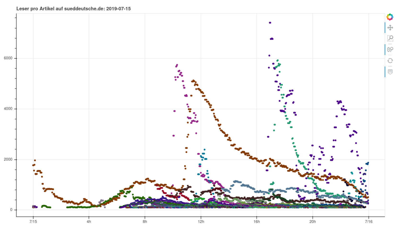
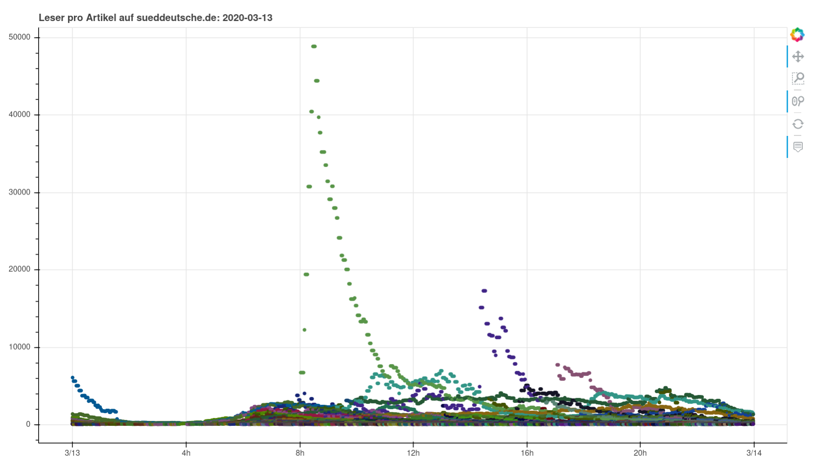
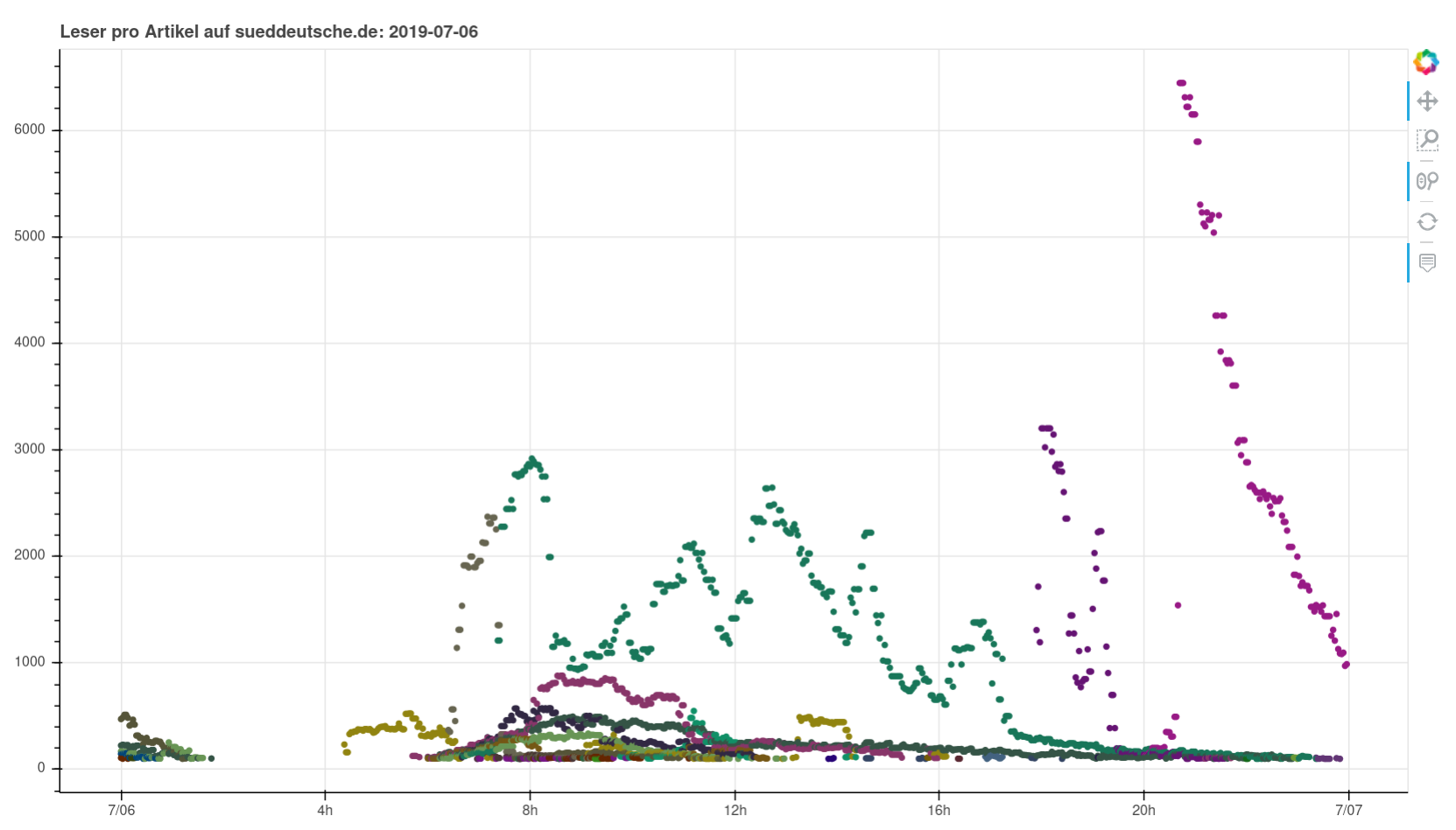
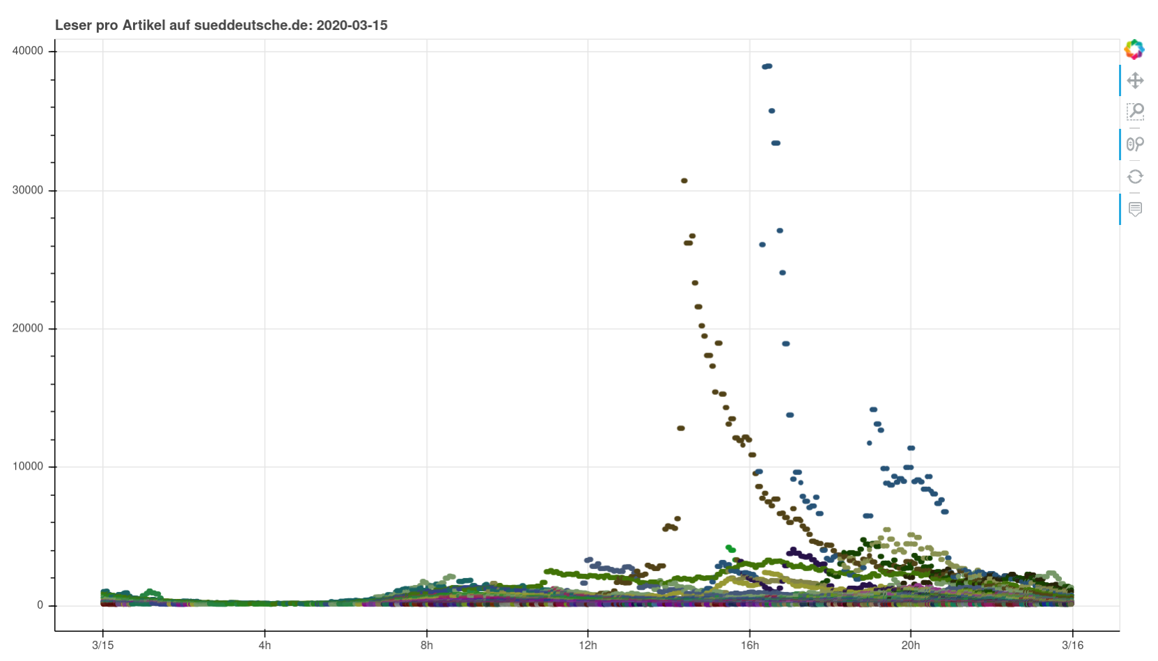
Nothing particularly noteworthy comes to mind. You can see perfectly normal days, you can see a pandemic wrecking havoc, you can see fascists being fascists. I found it interesting to see how you can clearly see when articles were pushed on social media or put on the frontpage (or off).


Data
https://hannes.enjoys.it/stuff/sz-leser.db.noindexes.7z
https://hannes.enjoys.it/stuff/sz-leser.plots.7z
If there is anything broken or missing, that’s how it is. I did not do any double checks just now. :}